Looks cool but your name at the bottom is enough, I don't think you need a huge sig down your box. The picture is about the box not your name ya know? I love the show and this is a cool box. Good job.
#8, When I was going through school, I had to credit EVERYTHING from any app I used to any resource I used to get any artwork I didn't create completely on my own, lol.
Looks cool. I don't think the front and back concepts really agrees though. Simple and subtle on the front versus more dynamic, colorful, and "comic-ish" layout approach of the back. It's almost as if the front and back belong to different boxes.
#10, To me, I was going for the same kind of design used on the Heroes: Season 1 DVD where the front was just the logo (with metallic/holofoil paper) while the back was basically the artwork Isaac did in Season 1 of New York blowing up. I don't believe they did comic-style panels, but that idea came from looking at their official gallery page based on the 9th Wonders comic found in the series.
I can, however, see your point. If I can figure out a way to do the back and still make it feel like it's exciting, I'll revise it.
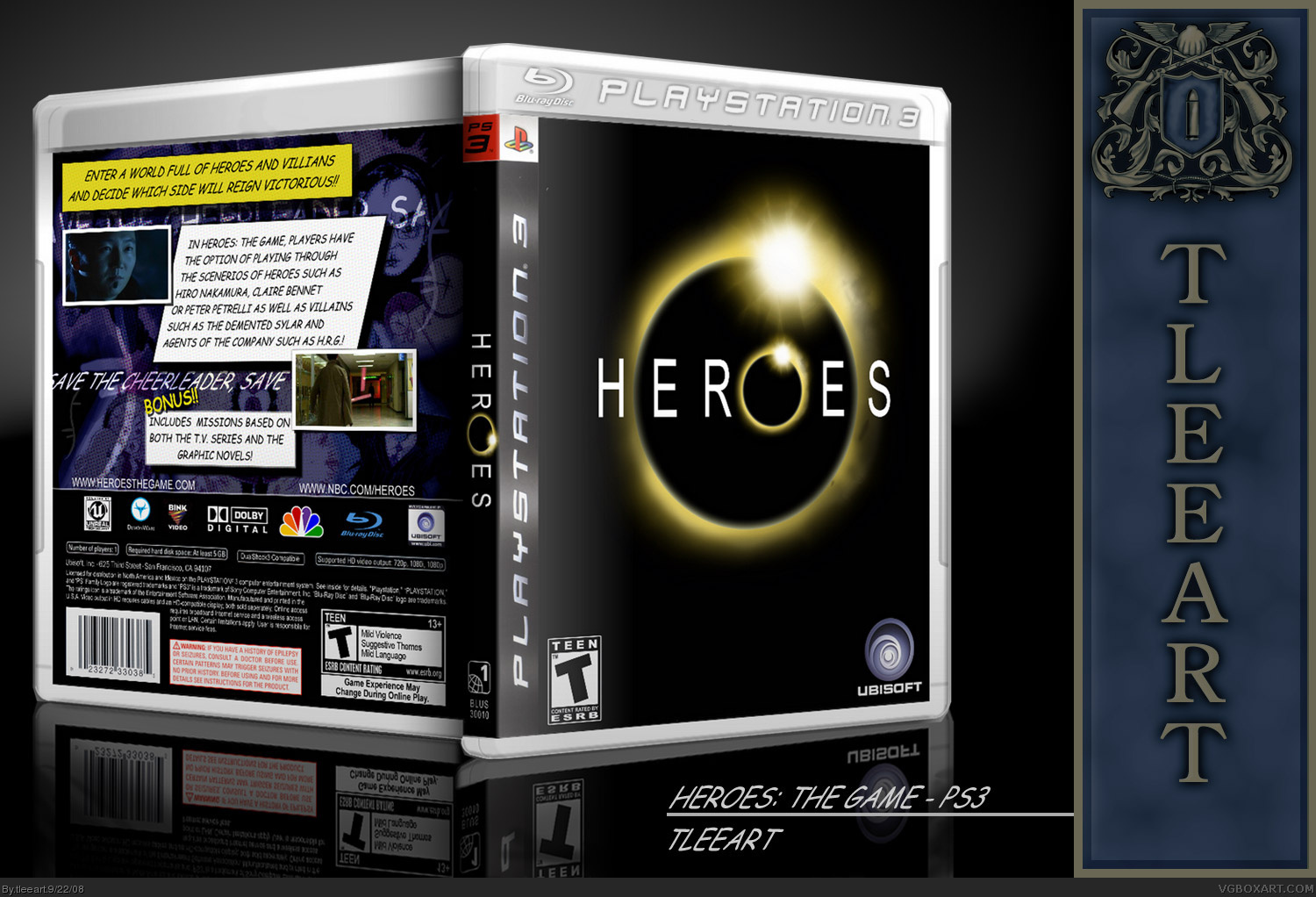
I'm on a roll updating tonight! Here's my new PS3 template. Custom template created from scratch, the only thing I used was AFDF's Logo collection for the Blu Ray logo.
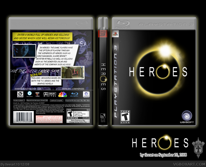
 Heroes: The Game Box Cover Comments
I know it's not too dynamic, so next time I'll pick something out with a little more perk to it to have a little more fun with the design.
Okay, some quick credits to this piece:
I recreated the Heroes eclipse logo myself, as I couldn't find any reliable resolution logos. I also recreated the helix logo...
IMANDIX used for the 3D render.
Lumberjack42's PS3 template used for the insert, it can be found here: link
Screenshots and Original Heroes Artwork found here: link
Everybody remember, Heroes Season 3 begins tonight, September 22, 2008!
[ Reply ]
good job +fav
[ Reply ]
i'd buy it. fave!! and season 3 is gonna be awesome!!
i guarantee this will make hall eventually. :)
Edited at 1 decade ago
[ Reply ]
Looks good can't wait to see the new season tonight.
[ Reply ]
Thanks for everybody's kind words!!!
[ Reply ]
Looks cool but your name at the bottom is enough, I don't think you need a huge sig down your box. The picture is about the box not your name ya know? I love the show and this is a cool box. Good job.
[ Reply ]
#6, Oh well, just trying on branding myself, ya know? Hmm, I'll prolly remove the banner and update the images.
Thanks about the box though.
[EDIT] Changed the box to omit the banner. I'll prolly just use some variation of that for my actual sig.
Edited at 1 decade ago
[ Reply ]
Looks better. If you want it its your choice but I think that it takes away from the box. The box is cool and I'm watching a Heroes thing right now.
Oh you don't have to credit everything. Mostly just people who made the temps or helped with logos.
[ Reply ]
#8, When I was going through school, I had to credit EVERYTHING from any app I used to any resource I used to get any artwork I didn't create completely on my own, lol.
I'll try to be a little less formal.
[ Reply ]
Looks cool. I don't think the front and back concepts really agrees though. Simple and subtle on the front versus more dynamic, colorful, and "comic-ish" layout approach of the back. It's almost as if the front and back belong to different boxes.
[ Reply ]
#10, To me, I was going for the same kind of design used on the Heroes: Season 1 DVD where the front was just the logo (with metallic/holofoil paper) while the back was basically the artwork Isaac did in Season 1 of New York blowing up. I don't believe they did comic-style panels, but that idea came from looking at their official gallery page based on the 9th Wonders comic found in the series.
I can, however, see your point. If I can figure out a way to do the back and still make it feel like it's exciting, I'll revise it.
Thanks for the crit.
[ Reply ]
simple, yet dynamic
[ Reply ]
5/5
Edited at 1 decade ago
[ Reply ]
I'm on a roll updating tonight! Here's my new PS3 template. Custom template created from scratch, the only thing I used was AFDF's Logo collection for the Blu Ray logo.
[ Reply ]
#14, like the changes
5/5 + fav
[ Reply ]
#15, Thank you very much!
[ Reply ]