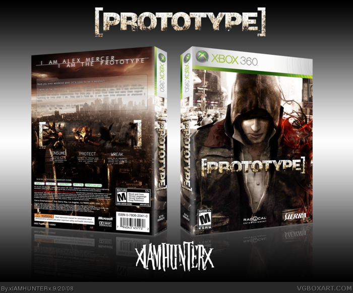
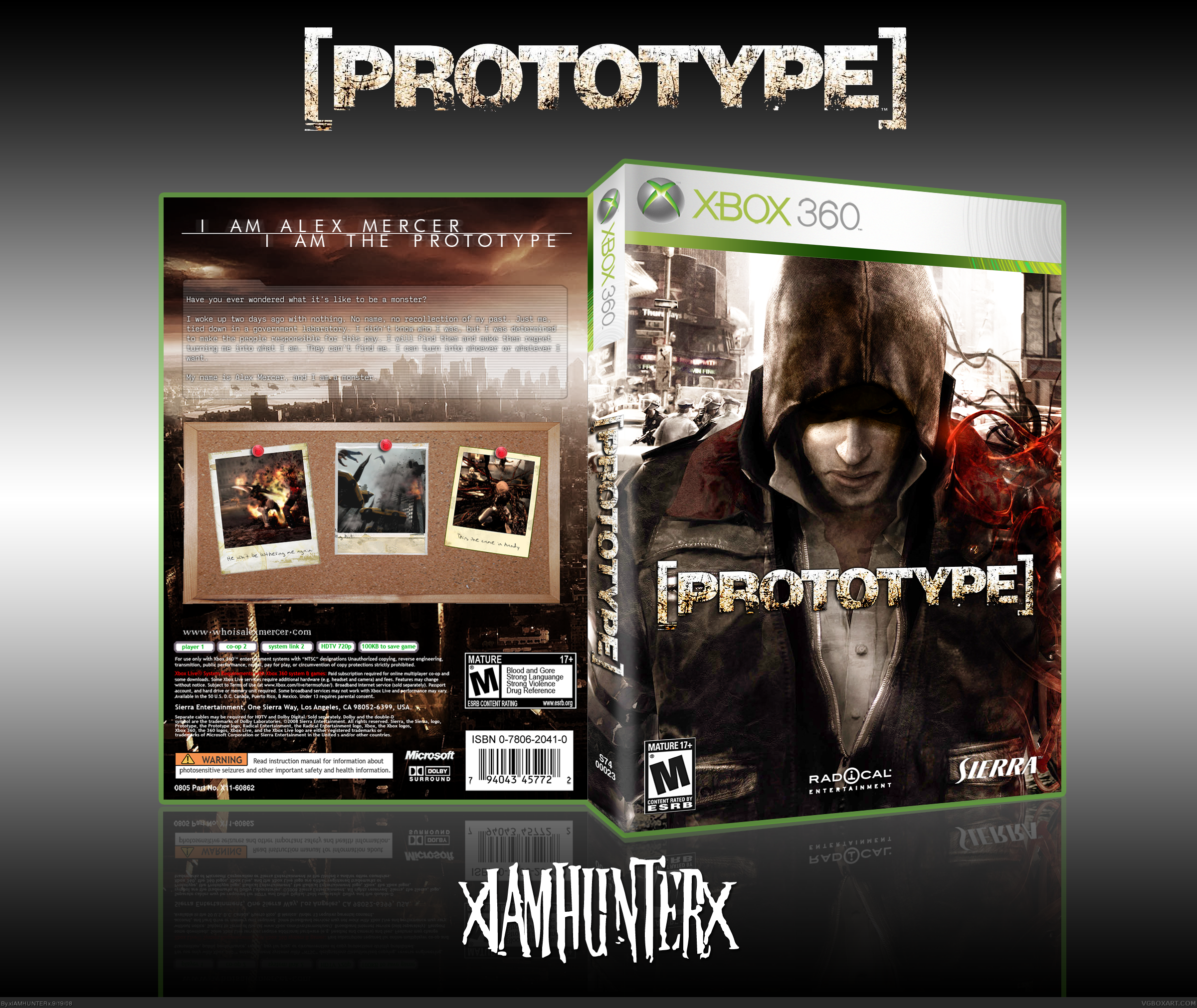
[ Buy Prototype at Amazon ] » 2008 Hall of Fame Winner! By xIAMHUNTERx 43 on September 19th, 2008 Download Printable [ Box updated on September 20th, 2008 ] [ original ] Prototype Box Cover Comments Comment on xIAMHUNTERx's Prototype Box Art / Cover. Cancel Reply xIAMHUNTERx 43 [ 1 decade ago ] "We're all puppets... I'm just a puppet who can see the strings." [ Reply ] shadysaiyan 42 [ 1 decade ago ] The front is nice, the back layout just doesn't make any sense relating to the game and stands out in the wrong way. again though, the front is nice! [ Reply ] numerobetically 42 [ 1 decade ago ] :D Do you EVER check your PM's? lol @ Karma I'm not liking the board but the top of the back and the front are excellent. Edited at 1 decade ago [ Reply ] yummybrains 30 [ 1 decade ago ] It's better than my convo on msn. ;) [ Reply ] yummybrains 30 [ 1 decade ago ] Deleted Edited at 1 decade ago [ Reply ] Karma 33 [ 1 decade ago ] Great, but once again the 3D isn't working for me, and the billboard idea on the back seems sorta tacked on (no pun intended) Edited at 1 decade ago [ Reply ] Altair 29 [ 1 decade ago ] Nice use of the new wallpaper. I'd get rid of the board though. [ Reply ] master_general 43 [ 1 decade ago ] i like it [ Reply ] jevangod 50 [ 1 decade ago ] Not bad. The front is kind of bright though especially for a killing game. The back is ok. 3.8/5 [ Reply ] Skyrunner 33 [ 1 decade ago ] Amazin. [ Reply ] GlowBlue 43 [ 1 decade ago ] Not to beat a dead horse, but I'm not feeling the cork board either. Kinda throws off the otherwise consistent theme. Still, the rest of the box is amazing looking and definitely worthy of a FAV! Great job as always! [ Reply ] Pan 48 [ 1 decade ago ] I agree with everyone, great box, bad idea with the board though. [ Reply ] xIAMHUNTERx 43 [ 1 decade ago ] I never really thought it was that bad, but you guys are right. It's really ugly. >__O Update'd. [ Reply ] Pan 48 [ 1 decade ago ] Ah, much better now. [ Reply ] xIAMHUNTERx 43 [ 1 decade ago ] d^_^ [ Reply ] Drakxxx 46 [ 1 decade ago ] Nice man. Nice. [ Reply ] jevangod 50 [ 1 decade ago ] The update is alright but too much empty space on the back. [ Reply ] Ervo 48 [ 1 decade ago ] Whoa. Looks damn good. [ Reply ] xIAMHUNTERx 43 [ 1 decade ago ] #17, Um, where? [ Reply ] jevangod 50 [ 1 decade ago ] #19, Like you could move the screen shots up some and put something under them. I mean you nailed the minimalism theme (on the back anyway), but the front failed to do. Edited at 1 decade ago [ Reply ] Star89er 34 [ 1 decade ago ] Nice update. 'Grats on the Hall BTW. [ Reply ] xIAMHUNTERx 43 [ 1 decade ago ] Ohhhh I'm bad. D= [ Reply ] Blarg 1 [ 1 decade ago ] im wet [ Reply ] tleeart 45 [ 1 decade ago ] #23, Ewww This is hella awesome. Can't say anything about it, it's flawless. [ Reply ] Azleigh 1 [ 1 decade ago ] this game looks like its going to be a good one!. +fav #23,#24 lol... [ Reply ] GrahamZ 40 [ 1 decade ago ] your kidding right? link were brothers :D Edited at 1 decade ago [ Reply ] hanci54 1 [ 1 decade ago ] very thx [ Reply ]
 Prototype Box Cover Comments
"We're all puppets... I'm just a puppet who can see the strings."
[ Reply ]
The front is nice, the back layout just doesn't make any sense relating to the game and stands out in the wrong way. again though, the front is nice!
[ Reply ]
:D
Do you EVER check your PM's?
lol @ Karma
I'm not liking the board but the top of the back and the front are excellent.
Edited at 1 decade ago
[ Reply ]
It's better than my convo on msn.
;)
[ Reply ]
Deleted
Edited at 1 decade ago
[ Reply ]
Great, but once again the 3D isn't working for me, and the billboard idea on the back seems sorta tacked on (no pun intended)
Edited at 1 decade ago
[ Reply ]
Nice use of the new wallpaper. I'd get rid of the board though.
[ Reply ]
i like it
[ Reply ]
Not bad. The front is kind of bright though especially for a killing game. The back is ok. 3.8/5
[ Reply ]
Amazin.
[ Reply ]
Not to beat a dead horse, but I'm not feeling the cork board either. Kinda throws off the otherwise consistent theme. Still, the rest of the box is amazing looking and definitely worthy of a FAV! Great job as always!
[ Reply ]
I agree with everyone, great box, bad idea with the board though.
[ Reply ]
I never really thought it was that bad, but you guys are right. It's really ugly. >__O
Update'd.
[ Reply ]
Ah, much better now.
[ Reply ]
d^_^
[ Reply ]
Nice man. Nice.
[ Reply ]
The update is alright but too much empty space on the back.
[ Reply ]
Whoa. Looks damn good.
[ Reply ]
#17, Um, where?
[ Reply ]
#19, Like you could move the screen shots up some and put something under them.
I mean you nailed the minimalism theme (on the back anyway), but the front failed to do.
Edited at 1 decade ago
[ Reply ]
Nice update.
'Grats on the Hall BTW.
[ Reply ]
Ohhhh I'm bad. D=
[ Reply ]
im wet
[ Reply ]
#23, Ewww
This is hella awesome. Can't say anything about it, it's flawless.
[ Reply ]
this game looks like its going to be a good one!. +fav #23,#24 lol...
[ Reply ]
your kidding right?
link
were brothers :D
Edited at 1 decade ago
[ Reply ]
very thx
[ Reply ]