When I first saw this I felt something didn't feel right and I still do. I don't like how it uses loads of explosions because it's a deep movie with loads of arty promotion material.
Rachel feels so out of place because she's so jolly compared to everyone. Ruins the mood of the box a bit. Very good effort, can't say I like it as much as other people.
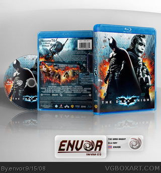
I agree with E_G. I just do not like the colorless aspect of the front. It was such a character-driven movie, that taking away the life from the characters and making the only color on the box be death, seems wrong in a way. That, and I have never liked blending screenshots together as you have on the front, and the odd border really kills it for me. I can't say it's my favorite.
I think that while your box is very nice, i feel a little annoyed with so many of these boxes being submitted, i men i saw the movie and found it to be one the the best movies ever, but i dont go make a box for it when there 500 other ones and they all have the same pictures >_< but anyway. I also agree with E_G, i think you should replace Maggie with the Lead cop guy, his name always slips my mind, sure hes not all that dark and corrupt but in a way hes a sidekick to batman imo. ANd if im not mistaken, thats Sens temp, just Blu-ray'd and blown up (because it looks a little blurry) so i think you should give credit for that, i'd rate this box a 8.5/10 if i had too. just because the front character thing and i dont reall like the screenshot format, i would have prefered the sceenshots be in that batman shape thing, but also inside the batman shape, the screenshots in the windows of that big wayne building. Nice job though
 The Dark Knight Box Cover Comments
The Dark Knight! :)
[ Reply ]
OMG Envor! ;D
[ Reply ]
Great box!
[ Reply ]
I'm not a huge fan of the tagline text, but other than that, this is just, WOW.
[ Reply ]
Epic. Love the front. Love the back even more. Wonder how long before this makes the Hall :D
[ Reply ]
Presses the special envor Fav button again! :) Excellent cover again mate :)
[ Reply ]
When I first saw this I felt something didn't feel right and I still do. I don't like how it uses loads of explosions because it's a deep movie with loads of arty promotion material.
Rachel feels so out of place because she's so jolly compared to everyone. Ruins the mood of the box a bit. Very good effort, can't say I like it as much as other people.
[ Reply ]
I agree with E_G. I just do not like the colorless aspect of the front. It was such a character-driven movie, that taking away the life from the characters and making the only color on the box be death, seems wrong in a way. That, and I have never liked blending screenshots together as you have on the front, and the odd border really kills it for me. I can't say it's my favorite.
[ Reply ]
It might look better without the tagline. Apart from that I like it a lot!
[ Reply ]
love this!
[ Reply ]
The first original use of the new art IMO
[ Reply ]
One of the best Dark Knight boxes here. Maybe even the best O.O
+ Fav
[ Reply ]
I think with all the editing you lost quality.
[ Reply ]
I think that while your box is very nice, i feel a little annoyed with so many of these boxes being submitted, i men i saw the movie and found it to be one the the best movies ever, but i dont go make a box for it when there 500 other ones and they all have the same pictures >_< but anyway. I also agree with E_G, i think you should replace Maggie with the Lead cop guy, his name always slips my mind, sure hes not all that dark and corrupt but in a way hes a sidekick to batman imo. ANd if im not mistaken, thats Sens temp, just Blu-ray'd and blown up (because it looks a little blurry) so i think you should give credit for that, i'd rate this box a 8.5/10 if i had too. just because the front character thing and i dont reall like the screenshot format, i would have prefered the sceenshots be in that batman shape thing, but also inside the batman shape, the screenshots in the windows of that big wayne building. Nice job though
</longest comment ever>
[ Reply ]
WOW great cover... fav
keep it up m8 ;)
[ Reply ]
dddd
[ Reply ]
Woah...
[ Reply ]
Very nice
[ Reply ]
Printable please :(
[ Reply ]