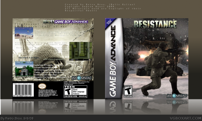
It was very hard to get text that was clearly visible and didn't look weird. The Screens are from Super Army Wars(GBA), Metal Gear (NES) and Gun Force for the SNES.
I hope you enjoy, thanks!
BTW, it was meant to look cheap, if you look you will see some small grammer errors and such, but I assureyou they are all intentional!
well, it's not horrible, but it's not amazing. the font is too small, and it looks way too generic, you should pick a different font. plus, the screenshots look really bland, you should add borders to them. also, on the back of the box, in the top right hand corner, it says RESISTGAME BOY ADVANCE, which throws it all off.
It looks amazingly cheap, so you did your job well. : )
In all seriousness though, there should be a tiny border around the actual art, otherwise it looks too cleanly cut, The front is alright, but a little more work could have gone into it. The back is iffy, the text is kind of illegible and the ResistGBA thing isn't too well executed. Good box but average execution.
Well thanks to all who commented creatively, I'm gonna have a go at Spore for the PC next, then when people like that, I'll try and do a good one for the Galactic Edition.
 Resistance Box Cover Comments
It was very hard to get text that was clearly visible and didn't look weird. The Screens are from Super Army Wars(GBA), Metal Gear (NES) and Gun Force for the SNES.
I hope you enjoy, thanks!
BTW, it was meant to look cheap, if you look you will see some small grammer errors and such, but I assureyou they are all intentional!
Edited at 1 decade ago
[ Reply ]
not bad actually 4/5
[ Reply ]
Thanks for Faving! =)
[ Reply ]
well, it's not horrible, but it's not amazing. the font is too small, and it looks way too generic, you should pick a different font. plus, the screenshots look really bland, you should add borders to them. also, on the back of the box, in the top right hand corner, it says RESISTGAME BOY ADVANCE, which throws it all off.
2/5, average
Edited at 1 decade ago
[ Reply ]
It looks amazingly cheap, so you did your job well. : )
In all seriousness though, there should be a tiny border around the actual art, otherwise it looks too cleanly cut, The front is alright, but a little more work could have gone into it. The back is iffy, the text is kind of illegible and the ResistGBA thing isn't too well executed. Good box but average execution.
Be different man. GENETICALLY DIFFERENT.
[ Reply ]
Well thanks to all who commented creatively, I'm gonna have a go at Spore for the PC next, then when people like that, I'll try and do a good one for the Galactic Edition.
[ Reply ]
I like it, good job.
[ Reply ]
#6, Sorry. I meant if.
[ Reply ]