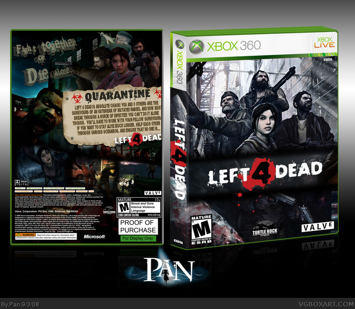
If anyone could give me an idea to make the tagline look better, I'd appreciate it. I want to fix that before I upload the printable(even though there's no need to print it, I still like uploading them).
Thanks for commenting people who did. More comments would be nice though.
#8, Sorry you don't like my temp, I like using it so I don't use the same temps as everyone else on the site. I upload printable copies of all my boxes too though. :3
 Left 4 Dead Box Cover Comments
Nice but the front cover looks a bit fat but overall its amazing
[ Reply ]
Wanted to make a Left 4 Dead box before there were to many looking the same. I don't really like the tagline and think I'm going to change it.
It's "for display only" since the game isn't out and the information for it is most likely wrong.
#1, I make all my boxes the exact same size, but they all seem to fit differently in my temp.
Edited at 1 decade ago
[ Reply ]
Great job.
[ Reply ]
On a scale of one to ten, this is so awesome.
[ Reply ]
If anyone could give me an idea to make the tagline look better, I'd appreciate it. I want to fix that before I upload the printable(even though there's no need to print it, I still like uploading them).
Thanks for commenting people who did. More comments would be nice though.
[ Reply ]
:D
[ Reply ]
#4, So, it's a 7 right?
=P
Yea, this box is vereh nice ^^___^^
[ Reply ]
I love your boxes. I just don't like the temps you use. The perspectives are a bit weird.
[ Reply ]
this is totally sweetness FAVE
[ Reply ]
Looks terrific. I love the front.
In regards to the tag line, probably just a flat font would look better.
Something with a sloppy, horror vibe to it.
[ Reply ]
#8, Sorry you don't like my temp, I like using it so I don't use the same temps as everyone else on the site. I upload printable copies of all my boxes too though. :3
[ Reply ]
Guys, seriously. Another Pan masterpiece is going unnoticed, and I won't stand for it!
[ Reply ]
This is awesome! Your template is great, just make the box on the right a bit less deep and it'll be spot on.
[ Reply ]