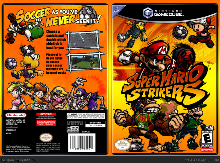
Well, I was thiking of a box to make, when I was scrolling through an art site, and I really liked the art for this. And also when I was looking at Venom's box, I really liked the feel to it.
So, I decided to make my own :D
Hope you guys like. I know ive been making a lot of cube boxes lately, and Mario boxes, but i decided to so bleh.
Credit to ADFD for temp, and copperhead for borders. Please critique ;)
It's a nice box, but honestly, I fin it funny how you criticize Dave's box for having randomly laced characters, yet yours has it as well. The scratchy texture on the front could flow better, and I think Birdo as a transparent character could be incorporated better. Overall, not bad, but it could be loads better. 3/5
 Super Mario Strikers Box Cover Comments
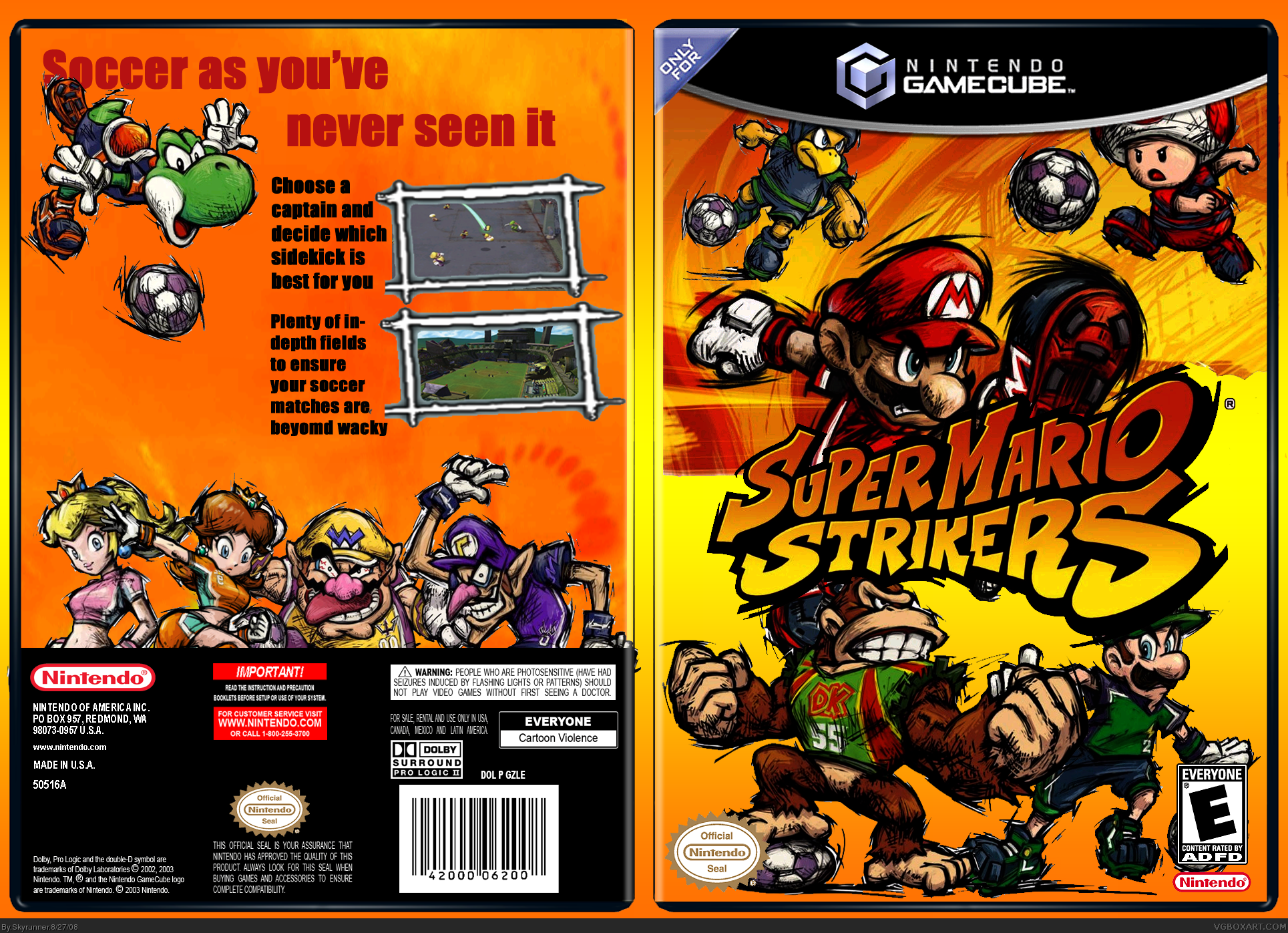
Well, I was thiking of a box to make, when I was scrolling through an art site, and I really liked the art for this. And also when I was looking at Venom's box, I really liked the feel to it.
So, I decided to make my own :D
Hope you guys like. I know ive been making a lot of cube boxes lately, and Mario boxes, but i decided to so bleh.
Credit to ADFD for temp, and copperhead for borders. Please critique ;)
[ Reply ]
The front is pretty good :D the back is nice aswell but i'd suggest making the screens better and fill up that space underneath yoshi.,
[ Reply ]
#2 Should i add another render under yoshi? And how should i make the screens bigger?
Ok version 2 added. Filled up the space underneath yoshi with koopa :)
Edited at 1 decade ago
[ Reply ]
i actually think this is pretty cool. fav.
[ Reply ]
#3 that really makes sense now. Yoshi wants to kick Koopa's head :P
[ Reply ]
sweet
[ Reply ]
Thanks guys, any one else?
#8 Sorry E_G
Edited at 1 decade ago
[ Reply ]
#7, I would recommend that you and others do not ask for extra attention.
[ Reply ]
you got a typo. on the back it says that the matches are "beyomd wacky." lol. nice box though.
[ Reply ]
pretty the back seems kinda empty
[ Reply ]
#9 and 10 thanks.
[ Reply ]
I love the front, but the back is plain. And now, for my trademark critique:
FADE SA'MORE PICS IN DA BAKROUND KTHXBAI!!!!
[ Reply ]
OK TNX 4 DE FAV BUT WHY DO YA LIKE FADED PIX ALL DA TIME???
[ Reply ]
CAUSE I LIK TA YELL AT 'DEM PEEPS LOLOLOLOLOL YA....
LOOK KOOL NAO KK???
Edited at 1 decade ago
[ Reply ]
#14 Ok i'll update tonight Im not on my computer with photoshop.
[ Reply ]
It's looking good my friend.
the composition is nice, and the orange really looks nice.
You might want to see if you can trim up some of the renders just a tad more, as I saw some white here and there due to the sketchy style of them.
Also, maybe hit the "Soccer as you've never seen it" with some effects
to make it pop.
Keep on this one, it's almost there!
[ Reply ]
#16 Thanks. Will work on in a couple minutes and have posted up by tonight!
[ Reply ]
Updated to version 3 :)
Drakxxx im not really good with logos but I tried to spice it up as best i could :/
And I cut the white spots, but left some there intentioanally to make it fit the style of the game.
And JBone there wasn't a lot of places to fade characters, without them looking bad there, so i faded birdo on the front.
[ Reply ]
still says "beyomd wacky" lol.
[ Reply ]
#19 Oh yeah forgot oops.
[ Reply ]
I'll see what I can put together for you on the back, and PM it to you.
[ Reply ]
#21 Thanks :)
[ Reply ]
Change the background color so it doesn't look like the front doesn't have an image its just see threw.
[ Reply ]
UPDATED! Major credit to Drakxxx for the logo on the back.
[ Reply ]
its good i like it
the actual box is better though
3.5/5
[ Reply ]
#25 Thanks
[ Reply ]
Looking good my friend!
[ Reply ]
#27 Thank you and thanks for the fav :)
[ Reply ]
Now you're just bumping...
It's a nice box, but honestly, I fin it funny how you criticize Dave's box for having randomly laced characters, yet yours has it as well. The scratchy texture on the front could flow better, and I think Birdo as a transparent character could be incorporated better. Overall, not bad, but it could be loads better. 3/5
[ Reply ]
Ok now that tagline is SICK. Too bad you didn't make it...
[ Reply ]
still says "beyomd wacky." lol.
[ Reply ]
#29 Thanks for the criticism. And sorry if i keep bumping.
#30 If I find a logo-making program, I'll redo it! Lol
#31 crap I forgot again.
[ Reply ]
you have some nice boxes! :D especially this one
[ Reply ]