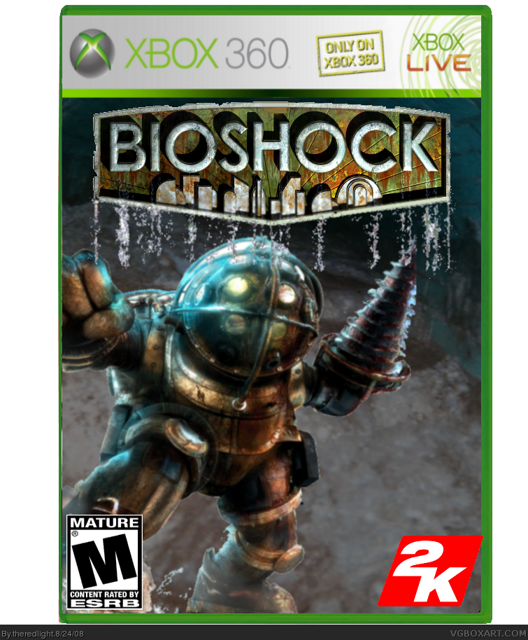
The cutout around the bioshock logo is pretty choppy in full view. The 2K logo is a bit big, as AnimeKunx7 said, and it clips over edge of the case. Overall I think you need to add some color or texture to make this stand out from the 900,000 Bioshock boxes on the site. Good start, but needs some work still.
 BioShock Box Cover Comments
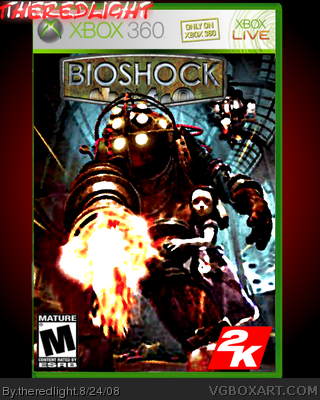
here's my bioshock box please comment and tell me what you think
any comments?
Edited at 1 decade ago
[ Reply ]
cool
[ Reply ]
#2 Please tell me your not the OTHER DMAN...
[ Reply ]
M rating abit wide and big.. so as 2K logo.. front cover is abit plain
2.5/5
[ Reply ]
The cutout around the bioshock logo is pretty choppy in full view. The 2K logo is a bit big, as AnimeKunx7 said, and it clips over edge of the case. Overall I think you need to add some color or texture to make this stand out from the 900,000 Bioshock boxes on the site. Good start, but needs some work still.
[ Reply ]
#4, i didn't notice the 2k logo so now i fix it
[ Reply ]
I like it 3.5/5
[ Reply ]
#7, thanks and i made it look more like a painting that why it look blurry, and i ahve never played bioshock so this was hard ot think of what to do
Edited at 1 decade ago
[ Reply ]
Its alright 3/5
[ Reply ]