[ Box updated on August 19th, 2008 ] [ original ]
 Kingdom Hearts 2: Special Edition Box Cover Comments
Comment on theredlight's Kingdom Hearts 2: Special Edition Box Art / Cover.
[ Box updated on August 19th, 2008 ] [ original ]
Comment on theredlight's Kingdom Hearts 2: Special Edition Box Art / Cover.
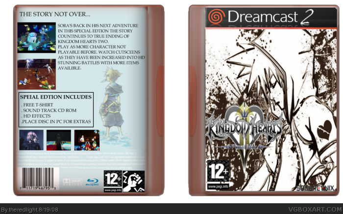
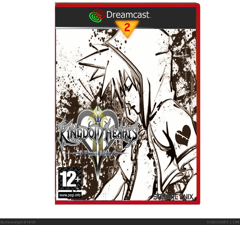
images from photo bucket,i made the temp on Vr.one
Vr.two temp is from electric frost
i'll make a back soon
Edited at 1 decade ago
[ Reply ]
i know where not suppose to beg for comments but could i have some crictism please on how to make this better if i can in the fourms i edit this a little tell me what you think
Update: i added a back
Edited at 1 decade ago
[ Reply ]
Honestly I think it looks fine the way it is, and would not change a thing.
[ Reply ]
The back looks too generic but I like the front.
[ Reply ]
#4, hhow should i fix that or should i keep it the way it is
[ Reply ]
#Do not change it pm me the front render please i'd love to use it for a new box for me and this is a fantastic boxart 4/5 and a definatly buy from me!
[ Reply ]
#5, You could add more pictures, maybe a real background and choose a less generic font. =)
[ Reply ]
#7, it's the actual font of the game that why i used it, better?
Edited at 1 decade ago
[ Reply ]
It looks nice and all, but on the front, I have the idea the logo's width and height ratio isn't correct as it seems to tall in comparison to the width. Good job though!
[ Reply ]
why is it dreamcast, do they even make games for those anymore
[ Reply ]