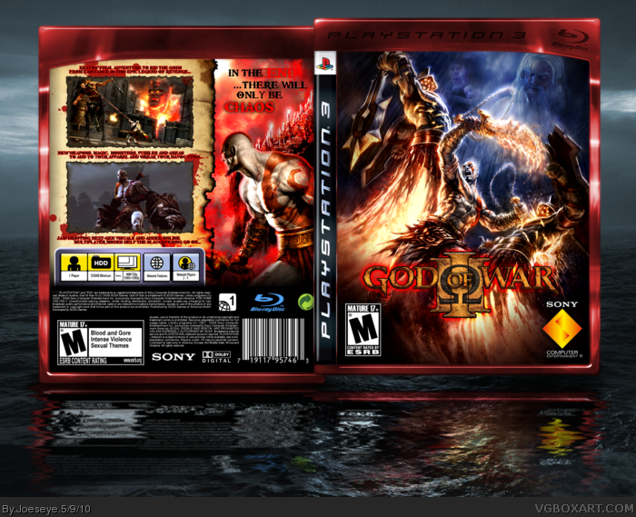
Even though you used Chains of Olympus art for the front, I think it looks brilliant (the front, i mean). Back's alright, i don't really like the colours. But 5/5 for the front
The front is great! I quite enjoy the color contrast. The back...it's in need of help. I would actually use God of War II screens as space fillers instead of just those boring renders from the trailer. But I agree with #8 about the desaturated Kratos and I don't like the red background.
 God of War III Box Cover Comments
Even though you used Chains of Olympus art for the front, I think it looks brilliant (the front, i mean). Back's alright, i don't really like the colours. But 5/5 for the front
[ Reply ]
Not the best I've seen from you, but still very cool. +FAV
[ Reply ]
the front looks awesome!! but the back looks pretty bad. change the back and i'll fave it.
[ Reply ]
#7, well first you shouldn't of desaturated Kratos also the picture boarder is too light for a very dark photo, also the blood is unnecessary
[ Reply ]
The front is great! I quite enjoy the color contrast. The back...it's in need of help. I would actually use God of War II screens as space fillers instead of just those boring renders from the trailer. But I agree with #8 about the desaturated Kratos and I don't like the red background.
I'm still going to fav this. 3.5/5
[ Reply ]
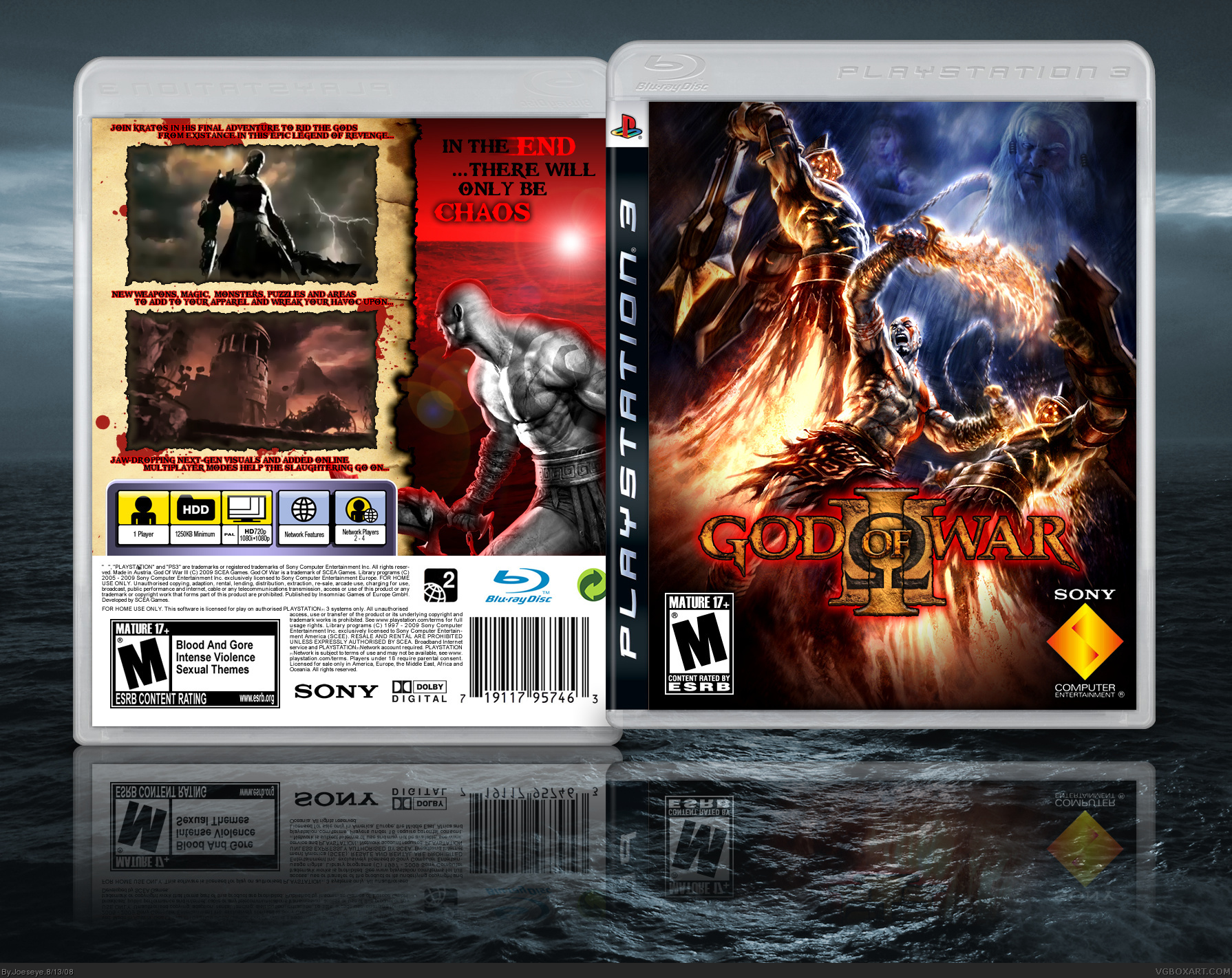
Here my version:
link
Greetings!
[ Reply ]