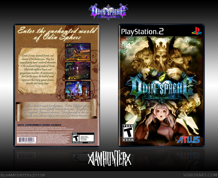
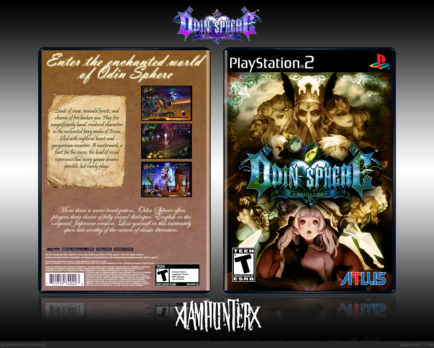
Worked on this for seriously about two months and I'm really happy with the result. Normally I would have serious qualms about using one piece of art for the front (the art used on the official no less, as I found out a week or two into this project), but the composition was too perfect to pass up.
Really nice, however, the back is a bit weak compared to the front, and it would look better if you had a better flow between both parts. Still, not bad looking at all ;)
 Odin Sphere Box Cover Comments
UGHHHH.
Worked on this for seriously about two months and I'm really happy with the result. Normally I would have serious qualms about using one piece of art for the front (the art used on the official no less, as I found out a week or two into this project), but the composition was too perfect to pass up.
Credit to Dan for the temp.
[ Reply ]
das purtie! while the back isn't top notch, the front surely makes up for it, +fav
[ Reply ]
Wow!
[ Reply ]
This is great.
[ Reply ]
Really nice, however, the back is a bit weak compared to the front, and it would look better if you had a better flow between both parts. Still, not bad looking at all ;)
[ Reply ]
Front- =o
Back- *fart noise* its to plain.
[ Reply ]
Wow, I love it when I work for two months on a box and it gets less attention than a dead rat.
[ Reply ]
Backk need more stuff, too plain. Front is awesome.
[ Reply ]
The front is amazing, so ill fav for that, but the back is a bit plain
[ Reply ]
is this for the lulz
[ Reply ]
This is really good, I would like to see the back have more on it though.
[ Reply ]
I think you could have had some sort of discreet design in the back's background, but I'll fave for the front alone. Very eye-catching.
[ Reply ]
The front is good. The back........bland. Sorry.
Edited at 1 decade ago
[ Reply ]
i have to agree with everyone else on this one, great front, bland back. Still worth a fav though.
[ Reply ]
Wow, I honestly haven't thought about this box in ages.
Turns out I still have the .psd... I guess I could give an update a whirl.
[ Reply ]
Yeah, the back looks very plain and the text used on the back seems hard to read.
[ Reply ]
Updated, blah.
[ Reply ]