i'd better throw in some constructive criticism...
The logo is kinda bad, try pen-tooling some lines or something, or maybe adding some groovy circles as in the back.
Also, try overlaying or using soft light to make it blend more, the blue stands out too much ;).
Btw, make the subtitle a tad bigger ;).
Wow!!!!!!!!!!!! I see you got a new colour from her tan lol and its awesome and you should but special edition but the bonus 3 songs are on that so it's still awesome Fav!
 Rihanna - Good Girl Gone Bad Cover Comments
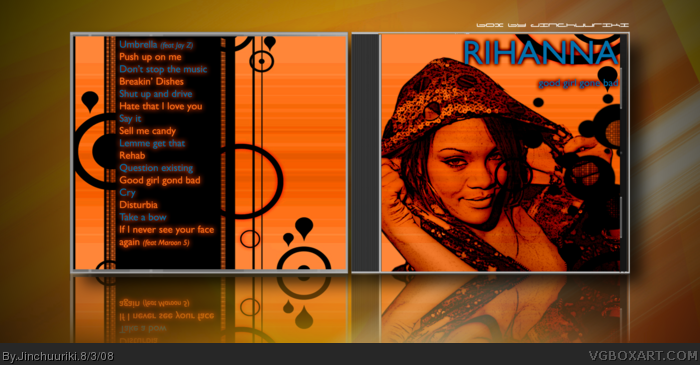
My third box and my first music box.. I believe it went pretty well on this one.. please comment to improve
J.
[ Reply ]
Damn! I like this box! You're improving great Jinchuuriki! You'll be quite some boxartist soon.. I can tell.. Faved XD
[ Reply ]
That's good dude!
[ Reply ]
#2, doe da niet man, da's gewoon zwak.
Kinda like the box, but the front's just a randomly-overlayed picture.
Back layout seems solid, allthough i would've filled up the right part a bit more.
Keep it up.
and,please, no faving with alt accounts,bart.
[ Reply ]
#5, k.
sorry for accusing you ;)
i'd better throw in some constructive criticism...
The logo is kinda bad, try pen-tooling some lines or something, or maybe adding some groovy circles as in the back.
Also, try overlaying or using soft light to make it blend more, the blue stands out too much ;).
Btw, make the subtitle a tad bigger ;).
Good luck!
[ Reply ]
#6, Don't worry, I can understand your thinking on this one..
Thank you really much for your tips.. I kinda like the blue cause it stands out.
[ Reply ]
Wow!!!!!!!!!!!! I see you got a new colour from her tan lol and its awesome and you should but special edition but the bonus 3 songs are on that so it's still awesome Fav!
[ Reply ]