Well, it looks alright. But the front is too bright, and the back is rather plain. But at the very least I like the concept you have going. Not bad for your first. Looking forward to more from you. BTW, I know you've been here a couple days, but welcome to the site.:)
#3, Thanks for your comment! I see what your talking about with the cover being too bright, I made it brighter because I thought the colors looked dull before I made the back, I realize it's quite blinding in comparison now.
I think I can find some ideas for the back, it is just a simple gradient; and thank you for welcoming me.
i think you could've gone with a better temp, and the back is sort of bland, plain. other than that, all in all, it's a pretty good box. great start and welcome to the site!
 Star Ocean 4: The Last Hope Box Cover Comments
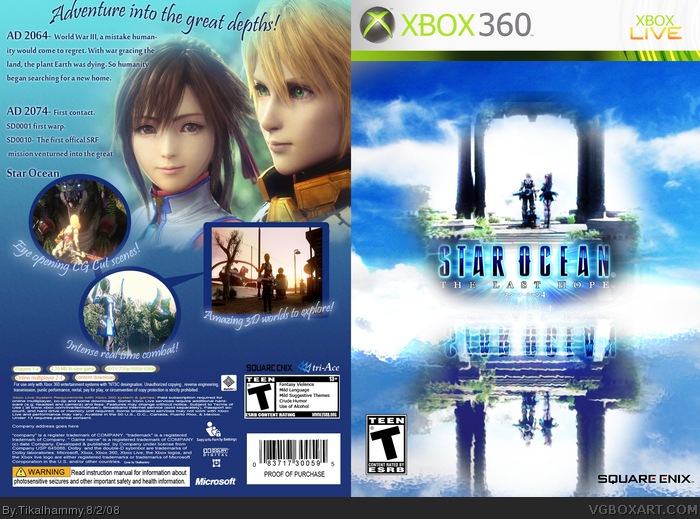
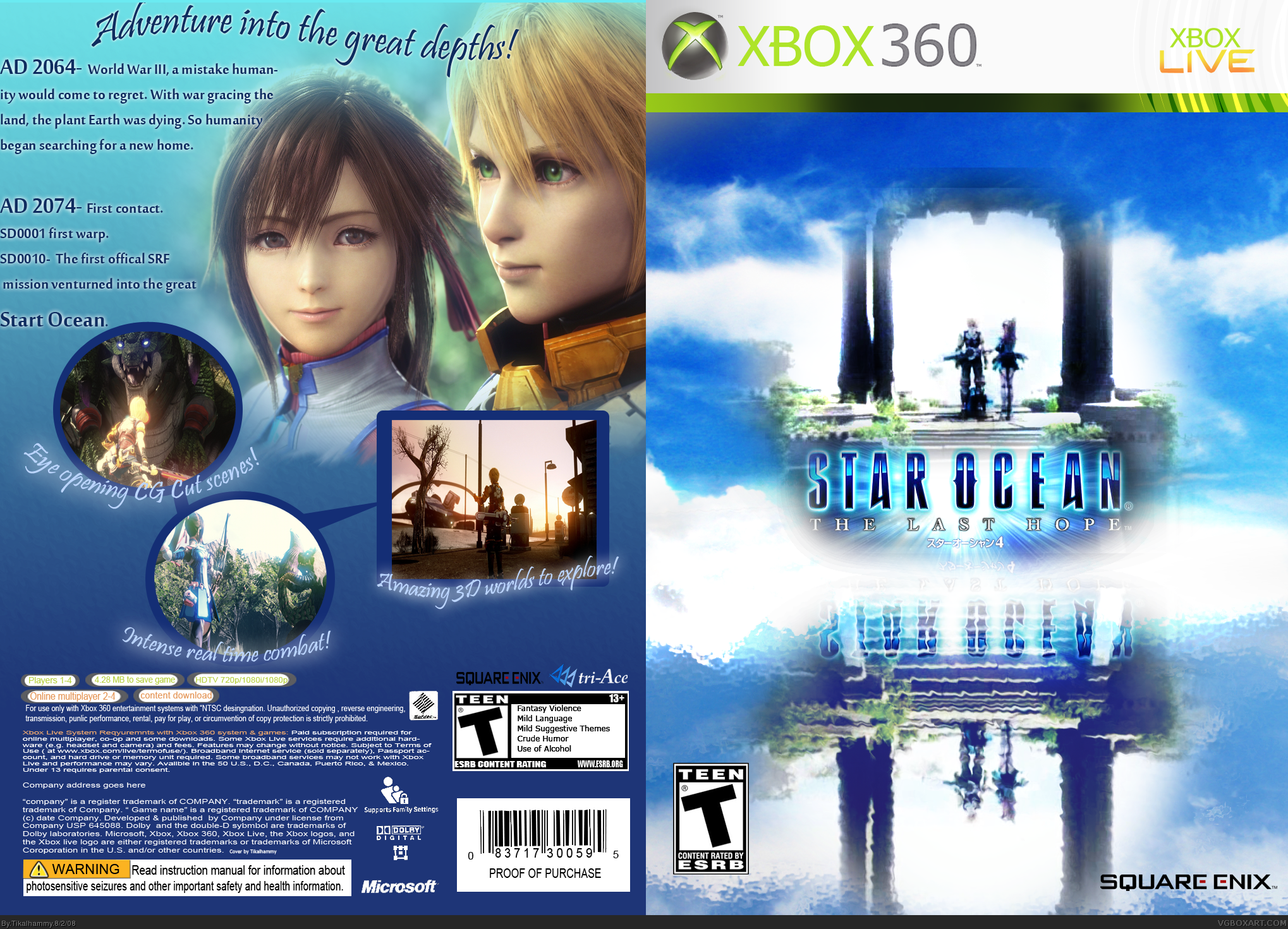
This is my first Box art. I thought I would do Star Ocean 4 because I can't wait for it!
The description is re worded from Wikipedia, and the screen shots are from TeamXbox.com and Fileplanet.com.
[ Reply ]
Thats not bad. At all.
[ Reply ]
Well, it looks alright. But the front is too bright, and the back is rather plain. But at the very least I like the concept you have going. Not bad for your first. Looking forward to more from you. BTW, I know you've been here a couple days, but welcome to the site.:)
Edited at 1 decade ago
[ Reply ]
#2, Thank you!
#3, Thanks for your comment! I see what your talking about with the cover being too bright, I made it brighter because I thought the colors looked dull before I made the back, I realize it's quite blinding in comparison now.
I think I can find some ideas for the back, it is just a simple gradient; and thank you for welcoming me.
[ Reply ]
i think you could've gone with a better temp, and the back is sort of bland, plain. other than that, all in all, it's a pretty good box. great start and welcome to the site!
[ Reply ]