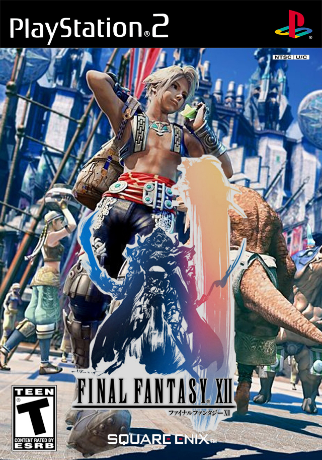
Colorful and very its enjoyable to looks at. 9-9.5/10. Very nice.
Also, I'm beginning to get interested in making VG box arts. But, I know NOTHING, absolutely NOTHING about photoshopping. Tips/advice would be appreciated.
#5 I made the detailed logo bright to stand out on the darker background, it’s a simple trick whilst being subtle and theres naught wrong with that, you say it ‘sux’.
Grow up.

 Final Fantasy XII Box Cover Comments
Colorful and very its enjoyable to looks at. 9-9.5/10. Very nice.
Also, I'm beginning to get interested in making VG box arts. But, I know NOTHING, absolutely NOTHING about photoshopping. Tips/advice would be appreciated.
[ Reply ]
Woah, I made a bunch of grammar mistakes there....
[ Reply ]
You may want to consider fixing up the FFXII logo. Other than that, i like how colorful it is. Nice job.
[ Reply ]
I updated it now with the time?
Heres the real one by the way which I like a lot.
link
Better now?
[ Reply ]
:\ not really.. the logo sux.. and compared too the background its too bright
[ Reply ]
#5 I made the detailed logo bright to stand out on the darker background, it’s a simple trick whilst being subtle and theres naught wrong with that, you say it ‘sux’.
Grow up.
[ Reply ]