[ Box updated on December 7th, 2008 ] [ original ]
 Sonic The Hedgehog: Shadow's Revenge Box Cover Comments
Comment on Sonicrulez's Sonic The Hedgehog: Shadow's Revenge Box Art / Cover.
[ Box updated on December 7th, 2008 ] [ original ]
Comment on Sonicrulez's Sonic The Hedgehog: Shadow's Revenge Box Art / Cover.
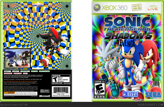
okay this is my first box so its not that good
[ Reply ]
well the font's hard to read and it's a bit coppy but fix those up and it should be good. get a better sega logo
[ Reply ]
alright ill try to do that
[ Reply ]
i say thats one good box art
10/5
Edited at 1 decade ago
[ Reply ]
thanks #4
[ Reply ]
any comments???
[ Reply ]
#6, don't beg for comment they will look if they want, and comment if tehy want, but fix up those things #2 said
[ Reply ]
i cant that would take forever
[ Reply ]
#8, just remake the box don't be lazy(no offence)
[ Reply ]
Wow this sucks, haha im just joking, but its not very good.
[ Reply ]
Sonicrules, Try a bit harder. I know my black backgrounds are plain and all, and I use MSPaint. What program are you using? I mean, nice idea (see my Shadow Chronicles one), but make it better. Do you mind If I make one?
[ Reply ]
#11, paint.net gimp photoshop
use those there forsured to make better boxes
get paint.net first it easier
then gimp or photoshop
[ Reply ]
#12 i use gimp and i will redo it. #11 I don't mind that you make one.
Geez people im just a beginer!
Edited at 1 decade ago
[ Reply ]
#13, we know your just starting out where giving you tips for the future even thought your new don't wien about "ah it my first box"
"ah im new"
[ Reply ]
dude you are mean
[ Reply ]
a bit too choppy
[ Reply ]
yeah but i fixed it a little bit
[ Reply ]
The summary on the back is nonsensical and blends in with the background, making it extremely hard to read. Try putting in some more effort.
[ Reply ]
#18, you are the only one who talks about summaries
[ Reply ]
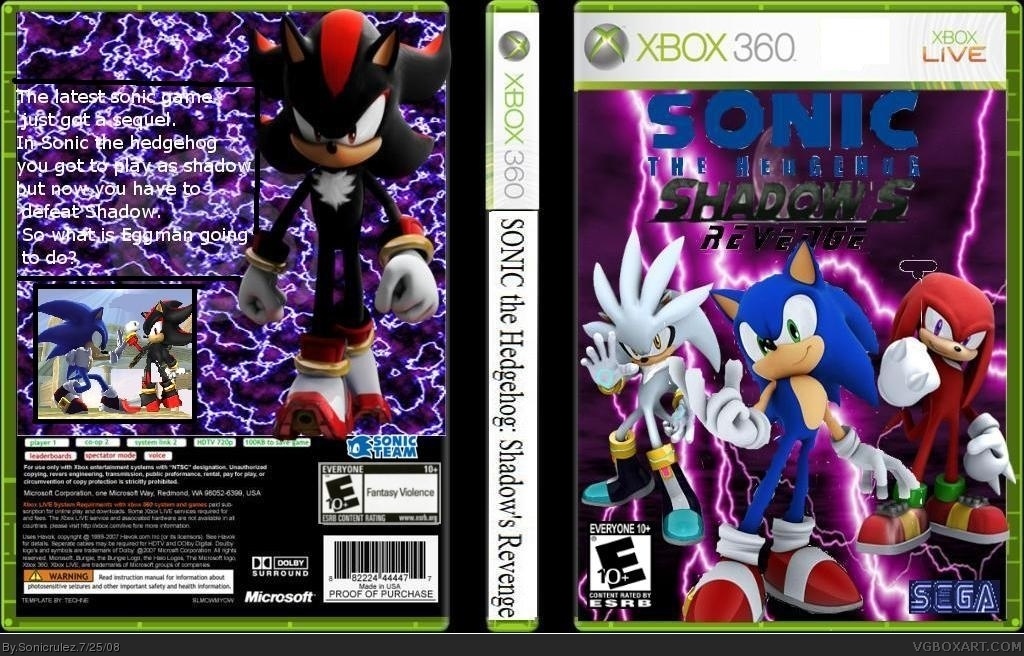
Okay I remade my first box completely. Hope you guys like this better.
i personally think it's better
[ Reply ]
sorry to post again but i needed to point out that if there is anything i could improve please tell me!!
[ Reply ]