I don't really like the color scheme, the torn paper effect doesn't really fit the style, and overall it's really plain. Not your best, but still a nice effort.
3, Yes I know. Just because you gave the advice doesn't mean I need to take it. For example, the entire point of the box was the green color scheme and changing that would require me to make a completely different box.
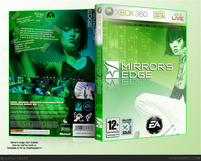
brilliant box, but only flaw i see is i think the tattoo under faiths eye, is on different sides from the back of the box and the front of the box, but you prbably flipped her so it would fit the box right...
Whoa, whoa, whoa! Huge mistake dude, the chick has a tattoo near her eye and you put her twice on the box, and one is inverted horizontal and the sign is on a different eye man, don't do that again; but I like the different approach, with the color, fav!
I absolutely love it! I can't believe I didn't spot this before! Brillant colour scheme, very clinical and crisp! The front is amazing, and so much more original in layout to most of the other Mrror's Edge boxes. Fave, definitely!
 Mirror's Edge Box Cover Comments
Hope you like it, I worked hard on this one and really like it :)
FULL VIEW and PRINTABLE PLEASE
Edited at 1 decade ago
[ Reply ]
I don't really like the color scheme, the torn paper effect doesn't really fit the style, and overall it's really plain. Not your best, but still a nice effort.
[ Reply ]
you didn't take any of my advice, it still looks the same :\
[ Reply ]
3, Yes I know. Just because you gave the advice doesn't mean I need to take it. For example, the entire point of the box was the green color scheme and changing that would require me to make a completely different box.
[ Reply ]
I really like it. =D
[ Reply ]
#5, same here. It stands out from the rest.
[ Reply ]
Agreed it stands out because of the color scheme. It's one of the better Mirror's Edge boxes on the site. +fav
And 5 bucks to the person who can guess who I am :p
#8 here's your 5 bucks XD
Edited at 1 decade ago
[ Reply ]
#7, Some n00b no one remembers.
[ Reply ]
Interesting. I love it, but I'm not giving it a fav because it doesn't fit the game that well (green scheme, taped on back, etc.).
[ Reply ]
If you love it, you should fave it... *confused*
[ Reply ]
Like Karma, I'm not really fond of the green color scheme here.
But it's unique, well designed, and I like it whenever a box surprises me. + fav
[ Reply ]
Not really feeling the green scheme, but it's nicely designed.
[ Reply ]
lol at "game of the year"
reminds me of The Matrix for some reason.
not bad, 4/5
[ Reply ]
brilliant box, but only flaw i see is i think the tattoo under faiths eye, is on different sides from the back of the box and the front of the box, but you prbably flipped her so it would fit the box right...
any way fave from me
[ Reply ]
Thanks for the comments, and yeah, I had flipped her.
[ Reply ]
#14, Nope, it makes sense. On the back, she's looking at her reflection.
[ Reply ]
Whoa, whoa, whoa! Huge mistake dude, the chick has a tattoo near her eye and you put her twice on the box, and one is inverted horizontal and the sign is on a different eye man, don't do that again; but I like the different approach, with the color, fav!
Edited at 1 decade ago
[ Reply ]
17 - It's a reflection.
[ Reply ]
I absolutely love it! I can't believe I didn't spot this before! Brillant colour scheme, very clinical and crisp! The front is amazing, and so much more original in layout to most of the other Mrror's Edge boxes. Fave, definitely!
[ Reply ]
job!
[ Reply ]