I really like making SNES box art! So expect more SNES box art soon! Please comment!
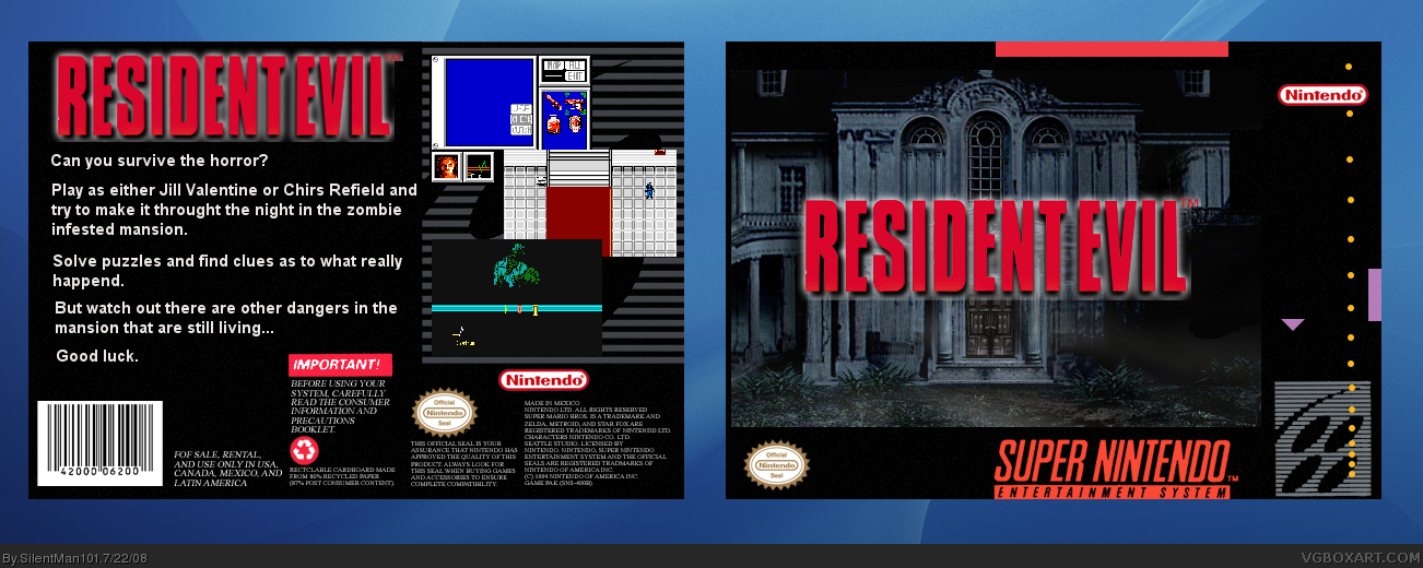
#2, Yeah I know it kinda is but I did not want to put official art because the art it self looked ahead of the SNES's time so I figured that just having the Mansion gave it a eerie, empty feeling. Anyways the front is kinda like this link
I like it. It looks just how an SNES box should. They WERE plain. Still, to please this crowd you probably should consider adding something else to the cover besides the house.
Since you were going for an authentic look I'd have to say you pulled it off. The front looks just like it would have been as a SNES game. On the back the description text seems too big compared to real boxes and the screen shots look of lesser quality than SNES though I can't complain since Resident Evil SNES never existed.
 Resident Evil Box Cover Comments
I really like making SNES box art! So expect more SNES box art soon! Please comment!
#2, Yeah I know it kinda is but I did not want to put official art because the art it self looked ahead of the SNES's time so I figured that just having the Mansion gave it a eerie, empty feeling. Anyways the front is kinda like this link
Edited at 1 decade ago
[ Reply ]
The front is a little plain, but I like it.
[ Reply ]
Not to seem pushy. But anyone? And i know I have two spelling errors.
Edited at 1 decade ago
[ Reply ]
The front seems like just one image
[ Reply ]
nice one, dude please send me that logo, fav!
[ Reply ]
#4, It is. But it looks cool for a SNES cover lol
and I updated it to get rid of one of the spelling errors.
Edited at 1 decade ago
[ Reply ]
I like it. It looks just how an SNES box should. They WERE plain. Still, to please this crowd you probably should consider adding something else to the cover besides the house.
[ Reply ]
#7, Well Im not gonna. SNES boxes were plain and thats how I want mine to be. Just like the old times.
[ Reply ]
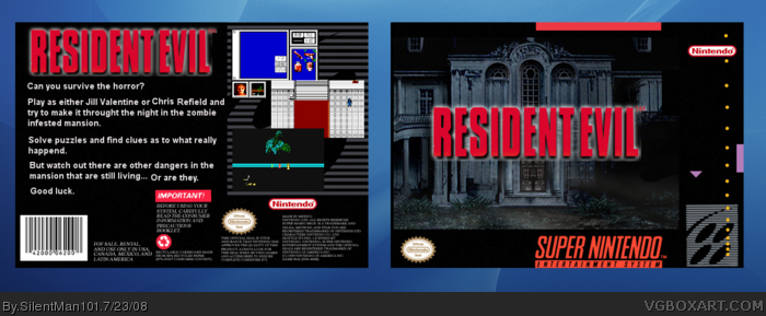
on the back the dangers that are still living add to that '...or are they?' make it seem more mysterious
#10 not to nit-pick but you missed the question mark on the end still looks great though and I love the good look, just like when you load
Edited at 1 decade ago
[ Reply ]
#9, Ok did that.
[ Reply ]
Since you were going for an authentic look I'd have to say you pulled it off. The front looks just like it would have been as a SNES game. On the back the description text seems too big compared to real boxes and the screen shots look of lesser quality than SNES though I can't complain since Resident Evil SNES never existed.
[ Reply ]