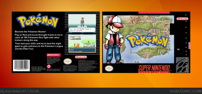
I really think this IS my best box so far. Oh sorry about the screens being so blurry , I had to resize them. Also please comment! Im very proud of this box!
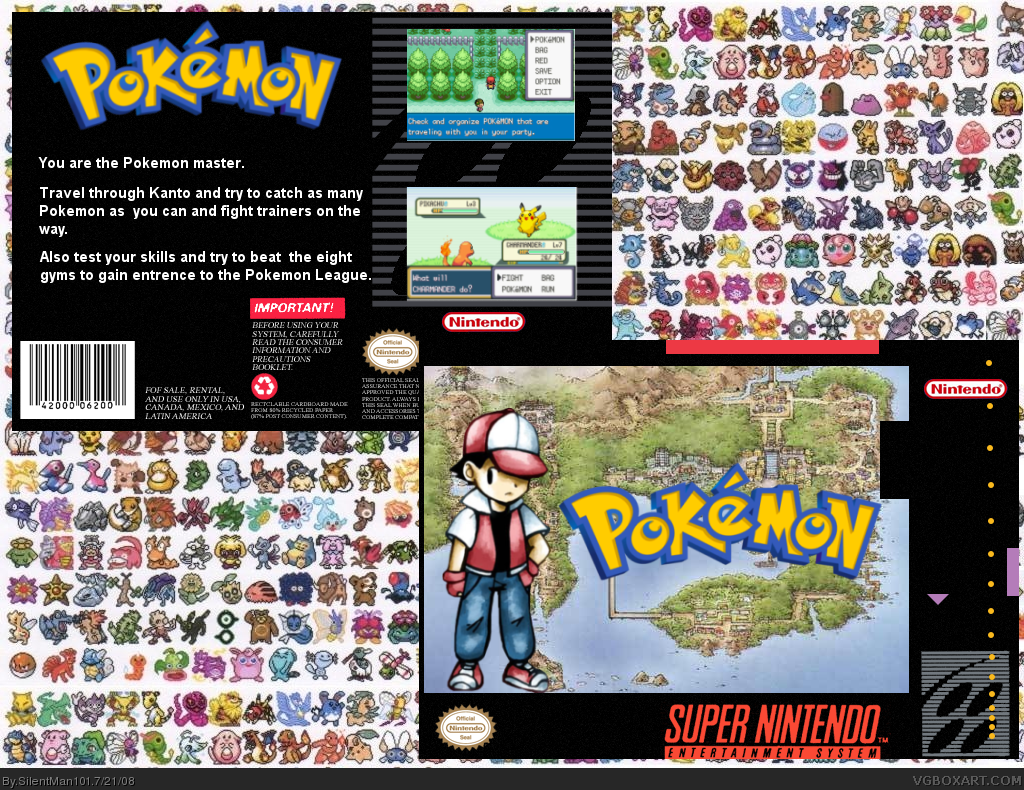
I think the pokemon tile background is overshadowing the actual box art here. I like the concept and the front looks great, but the back could use a bit of work.
It's good, both the front and back, but it could be improved.
FRONT: I get the concept, but the guy is standing on nothing. I would suggest maybe making him a bit bigger and move him down more until you can't see his feet maybe? This way it doesn't look like he's floating
BACK: Looking good, only suggestion would be to make the text size smaller and add ome more to it. And maybe make it a bit more grey instead of pure white.
And I have to agree with Ray, the bg is a little distracting.
#6, Well I was thinking of that but I figured that the SNES had better graphics then the original Pokemon and better graphics then Pokemon Gold, Silver, and Crystal. So I figured the screen-shots taken from FireRed would be more appropriate.
I like the box. Back cover would be more true to the common packaging if it contained four games screens instead of two. Captions under neath would be a great addition too. U should make spline, so ppl could print it as a actual cover. Your Nintendo logo on front looks bit choppy.
Overall nice box.
 Pokemon Box Cover Comments
I really think this IS my best box so far. Oh sorry about the screens being so blurry , I had to resize them. Also please comment! Im very proud of this box!
Edited at 1 decade ago
[ Reply ]
I think the pokemon tile background is overshadowing the actual box art here. I like the concept and the front looks great, but the back could use a bit of work.
Overall - 3/5 (good enough for a fav :D)
[ Reply ]
#2, Well what on the back should I fix? And thanks for the fav!
[ Reply ]
It's good, both the front and back, but it could be improved.
FRONT: I get the concept, but the guy is standing on nothing. I would suggest maybe making him a bit bigger and move him down more until you can't see his feet maybe? This way it doesn't look like he's floating
BACK: Looking good, only suggestion would be to make the text size smaller and add ome more to it. And maybe make it a bit more grey instead of pure white.
And I have to agree with Ray, the bg is a little distracting.
Good work so far.
[ Reply ]
Ok! Fixed it, it looks LOADS better!
[ Reply ]
#5 use screen-shots from the original pokemon games, the snes couldnt handle those graphics, still great though.
[ Reply ]
#6, Well I was thinking of that but I figured that the SNES had better graphics then the original Pokemon and better graphics then Pokemon Gold, Silver, and Crystal. So I figured the screen-shots taken from FireRed would be more appropriate.
#8, Thank You!
Edited at 1 decade ago
[ Reply ]
Nice box!
[ Reply ]
i like this box
a perfect SNES box! +fav
[ Reply ]
#9, Thank You!
#11, Ok maybe I will!
Edited at 1 decade ago
[ Reply ]
Great and Awesome Box. 4.5/5
I think you should try Gold, Silver, Crystal graphics. At least try them and see how they look! :)
[ Reply ]
not bad. pretty good
[ Reply ]
#12, Thank you very much Sonic ^.^
[ Reply ]
I have only one negative comment, please don't use revolutionary graphics as the ones from GBA games, you make it unreal by doing that!
[ Reply ]
I like the box. Back cover would be more true to the common packaging if it contained four games screens instead of two. Captions under neath would be a great addition too. U should make spline, so ppl could print it as a actual cover. Your Nintendo logo on front looks bit choppy.
Overall nice box.
[ Reply ]