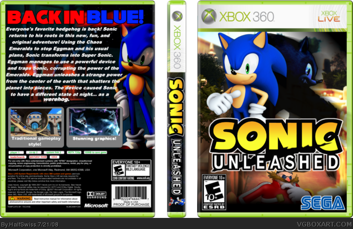
I think it's possibly my best yet. Please comment and full view!
CREDIT:
Temp - Techne
Werehog render - JBone
Sonic & Werehog render at bottom - Rawr Joey
Screenshot border - Ninty
Should of used the official logo.
Also different ESRBs on back and front
He is still called Eggman in the game, not Robotnik!
The screenshot borders look bad (no offence Ninty)
would be better with only one of sonic and werehog on the cover, not two of each. the back is just bad. the text is horrible, and then all the stuff cerium said.
#7, I'm just gonna stick with Rokudaimes.
Btw, could you PM me your emerald screenshot borders please since I don 't have good borders? I can't find any border to match the game.
#5, Because we don't stalk every single last detail for every single new game they come up with, you aren't fans? Give me a damn break.
I like it, but as Cerium said about the ESRB and such. The Sonic part on the spine looks a bit too big. And I generally just don't like the font used on the back. Otherwise, I like it. 3.5/5
Alright make the text on the back lighter so it's easier on the eyes and scale the text down a notch so it doesn't look so high. The render of sonic on the spine seems out of place.
Well... the Eggman looks bad and the renders don't blend with the background. I don't like the background, either.
The text on the back is too big, and the font choice is ugly. The red doesn't look good, either. The text is too close to the screens and the screenshot borders are ugly. That Sonic is also overrused, I don't like the background and I highly doubt there would be a quote like that on the back.
I still don't like it. You didn't change the front at all, and the text on the back is extremely boring. The text also seems crammed in there and the screenshot borders are really boring.
#24, because you could create your own screenshot border, and scroll through your fonts for one that works instead of using the first one you see.
I like most of the front. Sonic and WereSonic look great in it but why didn't you use the official logo? This one looks simple and not as cool, IMO. Also, Robotnik looks kind of out of place in the front.
The back, for some reason, didn't really look too good. I don't know why, tho. It just... well, it looks too, too simple and bland (no offense). The screenshot borders look bad. No offense.
I think it's arranged rather well overall, and besides the description being a bit wordy and the font being a bit to bold, I don't have any real problems with the font assortment either.
I can definitely tell a lot of time, energy and thought was put into the composition. That's what it's all about, and it shows.
I like the front, totally awesome, but the spine could do some work...
Make the Sonic logo smaller, and remove Sonic from the spine.
The back, even through updates needs some work... The font choice for the description isn't as good...
This is your best yet... for the front, but the back, not as sure...
 Sonic Unleashed Box Cover Comments
I think it's possibly my best yet. Please comment and full view!
CREDIT:
Temp - Techne
Werehog render - JBone
Sonic & Werehog render at bottom - Rawr Joey
Screenshot border - Ninty
[ Reply ]
Should of used the official logo.
Also different ESRBs on back and front
He is still called Eggman in the game, not Robotnik!
The screenshot borders look bad (no offence Ninty)
Overll, a nice effort =) 3/5
Edited at 1 decade ago
[ Reply ]
would be better with only one of sonic and werehog on the cover, not two of each. the back is just bad. the text is horrible, and then all the stuff cerium said.
you can definately fix it up though. :)
[ Reply ]
#2, that is the official loho. And I thought they called him Robotnk in this one?
#3, ... so many times I have tried... I finally thought I had made a good back with good text, after so many tries.
=( Thought this was my best... guess not.
[ Reply ]
#4 No its not! Geez you call yourself a Sonic fan? ha ha!
This is the official logo, link , they are similar but different :p
And no its still Eggman.
Edited at 1 decade ago
[ Reply ]
#5, they renamed the game PicOodle: Image Not Found? =P
Whatever, Eggman, Robotnik, not a big deal...
[ Reply ]
#6 LOL try again! Its because of the stupid comma at the end >.<
[ Reply ]
#7, I'm just gonna stick with Rokudaimes.
Btw, could you PM me your emerald screenshot borders please since I don 't have good borders? I can't find any border to match the game.
I'll get working on the text and such.
[ Reply ]
#5, Because we don't stalk every single last detail for every single new game they come up with, you aren't fans? Give me a damn break.
I like it, but as Cerium said about the ESRB and such. The Sonic part on the spine looks a bit too big. And I generally just don't like the font used on the back. Otherwise, I like it. 3.5/5
[ Reply ]
#9 Calm down it was a joke >.< I noticed you been getting a bit too stressy lately.
Why so serious? (lol) I suggest cool it down a bit, for your sake.
[ Reply ]
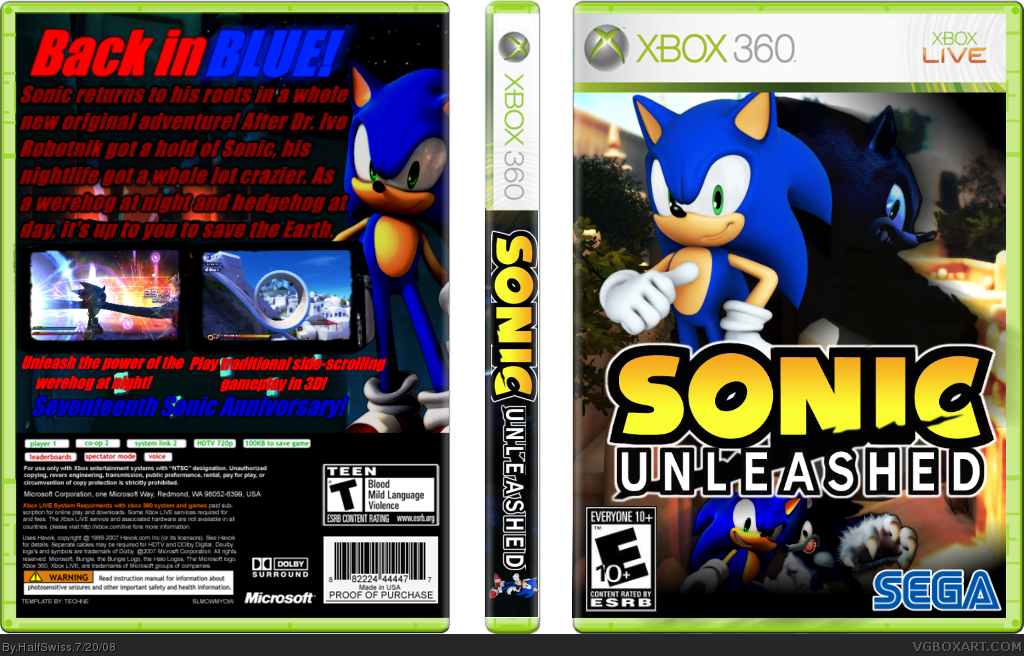
BIG UPDATE! Credit to numderobetically for the screens.
[ Reply ]
Thats the old Eggman from Sonic '06! The new Eggman doesn't look anything like that.
[ Reply ]
#12, I know, but I couldn't find a render with good graphics besides that.
[ Reply ]
#10, Eh, sorry, personal issues I'm just really pissed off about pretty much is making me angry at everything.
#13, If you find a picture of the new Eggman, I can render it for you.
[ Reply ]
Nevermind, I got a picture from Mario & Sonic.
How is it now?
[ Reply ]
Anyone else? Please? I don't want to bump, but I worked hard on this, and I want more than three diffrent people to comment...
[ Reply ]
Alright make the text on the back lighter so it's easier on the eyes and scale the text down a notch so it doesn't look so high. The render of sonic on the spine seems out of place.
[ Reply ]
Good job. You took the advice I gave you and really put a lot of effort into making a good back.
Other than that, It looks good. Maybe on the back you could have faded Sonic so that his feet arent being cut off from the template.
+Fav.
[ Reply ]
Well... the Eggman looks bad and the renders don't blend with the background. I don't like the background, either.
The text on the back is too big, and the font choice is ugly. The red doesn't look good, either. The text is too close to the screens and the screenshot borders are ugly. That Sonic is also overrused, I don't like the background and I highly doubt there would be a quote like that on the back.
[ Reply ]
text on back is wierd. change it to something more generic and i'll fav.
[ Reply ]
Alright, updated. That better for ya guys?
[ Reply ]
#21, that's much better fav+
[ Reply ]
I still don't like it. You didn't change the front at all, and the text on the back is extremely boring. The text also seems crammed in there and the screenshot borders are really boring.
#24, because you could create your own screenshot border, and scroll through your fonts for one that works instead of using the first one you see.
Edited at 1 decade ago
[ Reply ]
#23, then why not suggest me a good screenshot border or font that you want me to use?
[ Reply ]
Damn. You beat the shit out of me with your front cover. Very well done.
[ Reply ]
7.5/10.
I like most of the front. Sonic and WereSonic look great in it but why didn't you use the official logo? This one looks simple and not as cool, IMO. Also, Robotnik looks kind of out of place in the front.
The back, for some reason, didn't really look too good. I don't know why, tho. It just... well, it looks too, too simple and bland (no offense). The screenshot borders look bad. No offense.
This was overall good. You have potential.
Edited at 1 decade ago
[ Reply ]
I think it's arranged rather well overall, and besides the description being a bit wordy and the font being a bit to bold, I don't have any real problems with the font assortment either.
I can definitely tell a lot of time, energy and thought was put into the composition. That's what it's all about, and it shows.
Good job sir!
[ Reply ]
I like the front, totally awesome, but the spine could do some work...
Make the Sonic logo smaller, and remove Sonic from the spine.
The back, even through updates needs some work... The font choice for the description isn't as good...
This is your best yet... for the front, but the back, not as sure...
[ Reply ]
Heh, you know what's also funny about your cover? It was submitted on the same day I submitted mine.
[ Reply ]