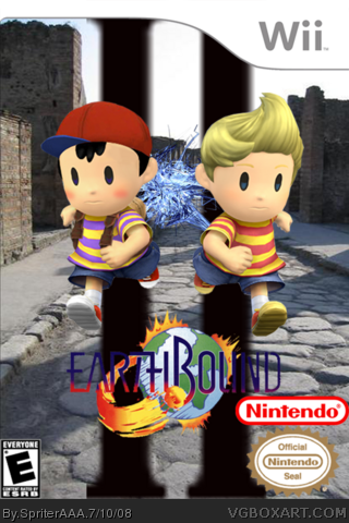
[ Buy Earthbound 2 at Amazon ] By SpriterAAA 1 on July 10th, 2008 No Printable Available Earthbound 2 Box Cover Comments Comment on SpriterAAA's Earthbound 2 Box Art / Cover. Cancel Reply SpriterAAA 1 [ 1 decade ago ] Renders by: InU-R (lucas) KoopaDasher (Lucas) Bash (Jagged Electricity) So, do ya like? [ Reply ] SpriterAAA 1 [ 1 decade ago ] Yeah. It is Jpeg. Sorry [ Reply ] The Missing Link 13 [ 1 decade ago ] Wow! Ness looks awesome! [ Reply ] dennyhamlinfan 1 [ 1 decade ago ] Awesome box [ Reply ] SilentMan101 44 [ 1 decade ago ] It seems a bit boring. But I like it [ Reply ] wasa-bi 7 [ 1 decade ago ] Title is pretty hard to read [ Reply ] Sonink 1 [ 1 decade ago ] bit good [ Reply ] Crossover Kirby 1 [ 1 decade ago ] The Nintendo logo should be on the bottom and the Seal of Quality should be smaller, but other than that, this is not a bad box art! 4/5 [ Reply ] rpgfreak 14 [ 1 decade ago ] It's okay... It seems not EarthBoundish enough. The Roman Numeral thing doesn't fit the setting of EarthBound. [ Reply ] YoshiStar 46 [ 1 decade ago ] This seriously has a lot of potential in my eyes!! If you made the background more green and more Mother-ish and changed the logo and made it a bit more 3dish and modern, I would love this. [ Reply ] jerzykulik99 7 [ 1 decade ago ] i like it [ Reply ] mrm64 1 [ 1 decade ago ] This HAS to be real. Nintendo should consider it. [ Reply ] joeyo72 1 [ 1 decade ago ] Good box, but I dont like the big roman numeral 2 in the back. It looks a bit fuzzy and it makes the title a bit hard to read. [ Reply ]
 Earthbound 2 Box Cover Comments
Renders by: InU-R (lucas) KoopaDasher (Lucas) Bash (Jagged Electricity)
So, do ya like?
[ Reply ]
Yeah. It is Jpeg. Sorry
[ Reply ]
Wow! Ness looks awesome!
[ Reply ]
Awesome box
[ Reply ]
It seems a bit boring. But I like it
[ Reply ]
Title is pretty hard to read
[ Reply ]
bit good
[ Reply ]
The Nintendo logo should be on the bottom and the Seal of Quality should be smaller, but other than that, this is not a bad box art! 4/5
[ Reply ]
It's okay... It seems not EarthBoundish enough. The Roman Numeral thing doesn't fit the setting of EarthBound.
[ Reply ]
This seriously has a lot of potential in my eyes!! If you made the background more green and more Mother-ish and changed the logo and made it a bit more 3dish and modern, I would love this.
[ Reply ]
i like it
[ Reply ]
This HAS to be real. Nintendo should consider it.
[ Reply ]
Good box, but I dont like the big roman numeral 2 in the back. It looks a bit fuzzy and it makes the title a bit hard to read.
[ Reply ]