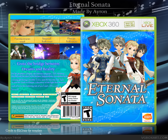
Nice front shame about the face.. ermm... I mean back ;) The top row of screenshots look weird -- they seem cropped badly --- ie. 1st one seems to zoomed into her face too much.. 2nd one has pic of the person's back but head cut off, and the 3rd image looks stretched. Not keen on the font between the screenshots and yellow. Rest of box is cool however ;)
 Eternal Sonata Box Cover Comments
Finally, another cartoony box by me >.>"
On behalf of dersnap's advice of making more cartoony boxes--- here's an eternal sonata box for you guys.
Alot of effort went into this, and i severely hope you'll enjoy it ^.^"
Credit=on da image.
Enjoyahh.
[ Reply ]
The front's original, I'll give you that. But I'm just not feeling the back. The screenshots just don't seem right to me and neither does the text.
[ Reply ]
#2,' the back is a sort-of rip-off off of the original [ try saying that. ]
Ty.
[ Reply ]
The front is really awesome. but like Dersnap said, there is something im not quite feeling about the back.
Anyway, fav =)
[ Reply ]
Cool!
[ Reply ]
I like it!
[ Reply ]
Something in the back bothers me, but the front looks great.
[ Reply ]
#7, ...what does? xD
Thanks,though ^^
[ Reply ]
#8 some of the screenshots are stretched
other than that, its a great box!
[ Reply ]
I love it, but to me it dosnt seem of your calibur... I think your much better than this.... The front however is fantastic
Edited at 1 decade ago
[ Reply ]
Nice front shame about the face.. ermm... I mean back ;) The top row of screenshots look weird -- they seem cropped badly --- ie. 1st one seems to zoomed into her face too much.. 2nd one has pic of the person's back but head cut off, and the 3rd image looks stretched. Not keen on the font between the screenshots and yellow. Rest of box is cool however ;)
[ Reply ]
Front pwns.
[ Reply ]
#11, i know. backs aren't my strongest point [/inuendo]
Thanks everyone ^^
[ Reply ]
The front makes me fav it. But the screenshots on the back look a little stretched.
[ Reply ]
The back just doesn't look right...=(
But anyway, good job!
[ Reply ]