#7 Please dont bump!!
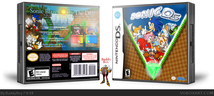
The box looks good but nothing great.
In my opinion, the presentation of the box makes it look alot better than what it really is.
The front looks okay but the character arrangement is a bit messy, Knuckles, Rouge, Vector and Eggman look too small compared to the other characters.
The back is better but the text is hard to read, the renders on the left side look bad and it seems like you just randomly placed a Shadow there to fill up space?
So like I said, the presentation/template looks great but the box, not so much.
But if im rating it overall, it would be a 3.4/5
EDIT: Also noticed some slight grammar errors on the back XD
 Sonic DS Box Cover Comments
hereit is, my sonic ds!
origial idea is spawned from the e3 demo game thing from i while back,http://ds.ign.com/objects/682/682909.html
Edited at 1 decade ago
[ Reply ]
It's really good.
[ Reply ]
Great.
But the font on the back is hard to read, but other then that its great.
4/5
[ Reply ]
Very, very nice!
[ Reply ]
#3, yeah, i was thinkin that but, there wasn't anything i could do :/
[ Reply ]
front is good but the back is not.
[ Reply ]
no moe comments ? :|
[ Reply ]
#7 Please dont bump!!
The box looks good but nothing great.
In my opinion, the presentation of the box makes it look alot better than what it really is.
The front looks okay but the character arrangement is a bit messy, Knuckles, Rouge, Vector and Eggman look too small compared to the other characters.
The back is better but the text is hard to read, the renders on the left side look bad and it seems like you just randomly placed a Shadow there to fill up space?
So like I said, the presentation/template looks great but the box, not so much.
But if im rating it overall, it would be a 3.4/5
EDIT: Also noticed some slight grammar errors on the back XD
Edited at 1 decade ago
[ Reply ]
The mild language and violence would get it E+10.
[ Reply ]
#9, maybe
[ Reply ]