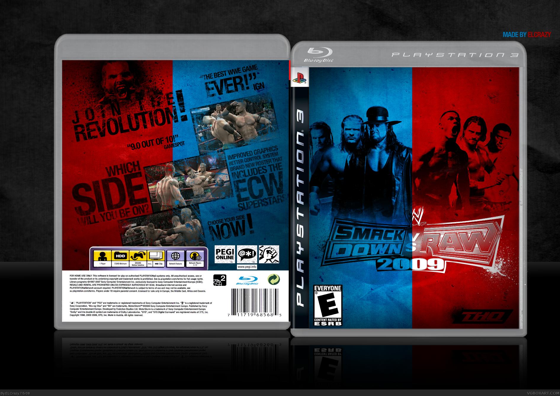
Nice box.. good idea for design... although too much space for my liking. Preferred the original colour logo. I was gonna make a WWE 2009 printable.. but I saw the official cover with Triple H/Shaun Michaels, and for a change, it's actually good- lol.
 WWE SmackDown! vs RAW 2008 Box Cover Comments
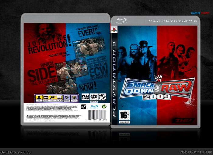
I had so much fun making this box. I loved how it came out
Thanks to shady for the awesome temp and Sens for the logo.
Enjoy! (:
[ Reply ]
Get on MSN. Nao.
There's some bleeding on the right side of the front.
Edited at 1 decade ago
[ Reply ]
And I had so much fun faving this box (well, not really). :P
Nice job, ELCrazy!
[ Reply ]
wrong esrb :P
pretty sweet box.
[ Reply ]
Fixed the mistakes =P
[ Reply ]
Sens just needs to make his now...
=P (not really a "=P" moment, I just wanted to keep up the streak, haha)
[ Reply ]
:p
[ Reply ]
Really great box! One of the best wrestling boxes on the site maybe? considering theres loads of them =P
[ Reply ]
Nice box.. good idea for design... although too much space for my liking. Preferred the original colour logo. I was gonna make a WWE 2009 printable.. but I saw the official cover with Triple H/Shaun Michaels, and for a change, it's actually good- lol.
[ Reply ]
the colors are really cool. good job.
[ Reply ]
I guess I posted at the worst possible time. :(
Thanks all for the comments and faves!
[ Reply ]
#11, Me n you both.
Looks awesome, Very clean. +Fav
[ Reply ]
I've thought of making a wrestling box too, but i'm not sure should I. Great as always.
[ Reply ]
Thanks guys! (:
[ Reply ]
wow this looks great, the only thing that sucks is that it says svr08 as title :/ but this is awsome.
[ Reply ]
I can't believe this went ignored...it's one of your bests.
[ Reply ]
Mine!
[ Reply ]
Am I the only one who figured out this? Database title says WWE SmackDown! VS. RAW 2008 while the box is for SD vs RAW 2009...
I like the overall grungy design, ELCrazy, it certainly fits into the scene of the wrestling vision. Fave
[ Reply ]
#18, Oh yeah, haha. Thanks for the fav! (:
[ Reply ]
Gahhh, just saw this...I really like it, seriously well done. The crinkled paper effect on the concrete looks superb. +fav
[ Reply ]
how come the title is 08 but the box says 09? good box though
[ Reply ]
finally in the hall!
congrats man
Edited at 1 decade ago
[ Reply ]
hmmm the front well is decent not that good though. and the back is pretty much the same. good typography though... :D
[ Reply ]