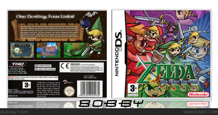
#3, not exactly. It's good, but the large characters on the front don't look good, and the front and back don't match. The background on the back is boring and the Toon Link on it is extremely choppy. I don't like the font choices on the back either.
This is pretty good for a 2nd box. The front is good.. although the title logo could do with a small drop shadow since the "The Legend of" part is hard to read against the background. Back is good, but could have done with a subtle multi-colour background like front, and make the scroll less straight horizontally.
However - the worst SIN is the temp.. remember, even if you are using a temp, you CAN change it.. having THQ on back and other unrelated logos looks bad.
However, good job. Maybe you can do a quick edit ;)
 The Legend of Zelda: Four Swords Adventures Box Cover Comments
My second box. What do you think
Credit to Ninty for template.
[ Reply ]
Noice. Although a background on the back'd be nice, this still gets my fav.
[ Reply ]
This is Hall material
[ Reply ]
#3, not exactly. It's good, but the large characters on the front don't look good, and the front and back don't match. The background on the back is boring and the Toon Link on it is extremely choppy. I don't like the font choices on the back either.
[ Reply ]
This is pretty good for a 2nd box. The front is good.. although the title logo could do with a small drop shadow since the "The Legend of" part is hard to read against the background. Back is good, but could have done with a subtle multi-colour background like front, and make the scroll less straight horizontally.
However - the worst SIN is the temp.. remember, even if you are using a temp, you CAN change it.. having THQ on back and other unrelated logos looks bad.
However, good job. Maybe you can do a quick edit ;)
[ Reply ]
Thanks for the feedback. I'll update soon
[ Reply ]
#4, You might be taking back your words pretty quickly :P
[ Reply ]
Second Box? WOW!
Very nice! :D Hall of Fame quality!
Edited at 1 decade ago
[ Reply ]
#7, even if it gets HoF I'm not taking back my words.
[ Reply ]
can you tell me what font did you used on the tagline?
[ Reply ]
#4 I do aggree with you on the front and cover not matching up, but if anything, change the back. I absolutely love the front design.
[ Reply ]
Great for a 2nd! +fav
[ Reply ]
Holy crap! Awesome second. +fav
[ Reply ]
The template is bad and I wouldn't make your name stand out so much. Other than that its pretty cool.
[ Reply ]
#10, AmericanUNCD, or the wind waker font.
[ Reply ]
omg, marker faved u!!!!! nice box bytheway
[ Reply ]