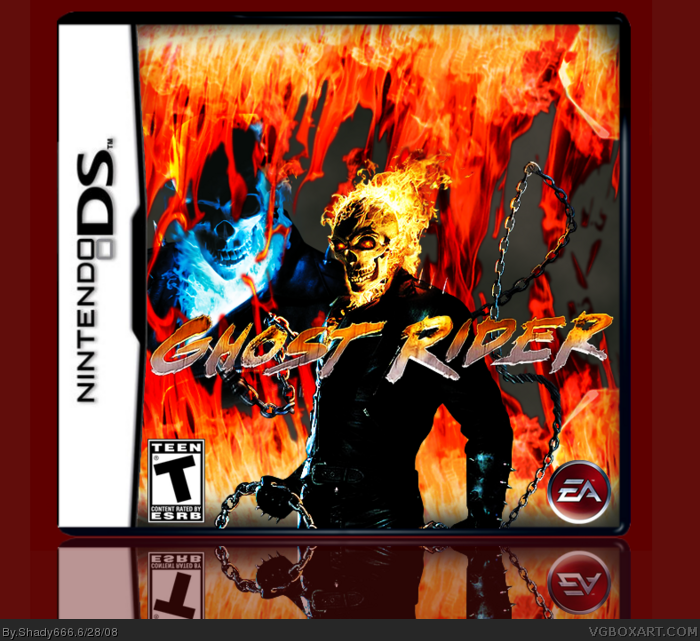
This is my first boxart here. Technically its my second, but I think this ones better than my first, So I uploaded this one instead. Question, Can someone tell me how to get a reflection? Its rotate 90 Degrees I believe, But I'm not sure.
#4 the box is pretty good for a first. The t esrb is too big, and I', not really liking the empty gray spaces showni in a few spots, but it's pretty good, especially for a first! 4/5
Cool idea, here's some more advanced tips to help you as an artist rather than a graphic designer (since you obviously know what you're doing):
*Light blue and red/orange clash, better combination's are (if possible): Red/Orange + Black, Red + Dark Blue, Red/Orange + Dark Blue, and much more, those were just off the top of my head.
*The fire is flipped vertically. People WILL notice this, especially other designers and artists. What I do to replace this is chop both of them (top flame and bottom flame) up and blend them back together differently (with feather edges)(if you have no idea what I just said, it's alright =P)
*The background flames and Ghost Rider's flame are different hues. Ghost Rider's is orange-er, the bg's is red-er. At all times, in a situation like this, you want to find a color that matches the render as CLOSE as possible, and then you can mess around with the brightness, contrast, etc. to fix it up.
*You NEED something behind the flames/blue ghost rider. Right now it looks unfinished, like a screenshot you took, add something nice behind to fix it up.
Anyway, there's my long ass comment, all off the top of my head, I hope that helps you as an artist in the future :)_
 Ghost Rider Box Cover Comments
This is my first boxart here. Technically its my second, but I think this ones better than my first, So I uploaded this one instead. Question, Can someone tell me how to get a reflection? Its rotate 90 Degrees I believe, But I'm not sure.
[ Reply ]
--Double Post--
Edited at 1 decade ago
[ Reply ]
#1, for a reflection you have to flip it Verticaly then lower th opacity ;)
[ Reply ]
#3, Hey thanks, Hows the box?
[ Reply ]
#4 the box is pretty good for a first. The t esrb is too big, and I', not really liking the empty gray spaces showni in a few spots, but it's pretty good, especially for a first! 4/5
[ Reply ]
#5, Kay thanks.
[ Reply ]
Cool idea, here's some more advanced tips to help you as an artist rather than a graphic designer (since you obviously know what you're doing):
*Light blue and red/orange clash, better combination's are (if possible): Red/Orange + Black, Red + Dark Blue, Red/Orange + Dark Blue, and much more, those were just off the top of my head.
*The fire is flipped vertically. People WILL notice this, especially other designers and artists. What I do to replace this is chop both of them (top flame and bottom flame) up and blend them back together differently (with feather edges)(if you have no idea what I just said, it's alright =P)
*The background flames and Ghost Rider's flame are different hues. Ghost Rider's is orange-er, the bg's is red-er. At all times, in a situation like this, you want to find a color that matches the render as CLOSE as possible, and then you can mess around with the brightness, contrast, etc. to fix it up.
*You NEED something behind the flames/blue ghost rider. Right now it looks unfinished, like a screenshot you took, add something nice behind to fix it up.
Anyway, there's my long ass comment, all off the top of my head, I hope that helps you as an artist in the future :)_
[ Reply ]