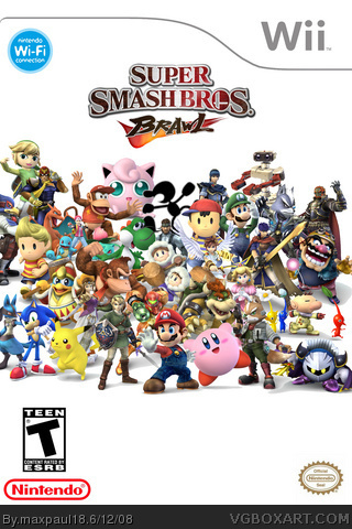
Alright Alright, I'll digg. The box wouldn't be too bad if ya put a good back round in there, even something as simple as a stage from brawl or something just the white makes it look un-profesinal.
Also a lot of new people to the site make boxes like this for brawl so try and use the skill you have to something more creative, all the charicters together on one white backround isnt too original.
hey, it's not that bad. i know it's very plain but organising about 30-40 renders into one box is very difficult and takes absolutely forever. the box itself is only ok, but i commend you for the effort.
make the game logo a little bigger and it needs a background. and why is there a mark on Yoshy's nose? needs Zero Suit Samus, but don't replace the power suit samus.
you know can you make the characters a little bigger, I change my mind. Oh by the way, you can just put the transformations on the back, they have room. And make the back I want to see how you can make it good.
#8 The sizes are fine to you?!
Since when has Jigglypuff been bigger than Samus?
Since when has Pikachu come up to Link's waist?
Since when was a Pikmin bigger than Pokemon Trainer?
You get my point... but besides the VERY poor size issues, for a 5th box, its very commendable. And like Vengeance said, I said can see the effort here. Nice job.
 Super Smash Bros. Brawl Box Cover Comments
This is by far my best box yet!!!!!
I spent more time on this box than on my first four combined.
I hope you enjoy!!!!!
Edited at 1 decade ago
[ Reply ]
yeah, gather a thousand images from ball and put it on a plainbackground with the WRONG ESRB. Dude. C'mon. Seriously.
[ Reply ]
Alright Alright, I'll digg. The box wouldn't be too bad if ya put a good back round in there, even something as simple as a stage from brawl or something just the white makes it look un-profesinal.
Also a lot of new people to the site make boxes like this for brawl so try and use the skill you have to something more creative, all the charicters together on one white backround isnt too original.
Anywho, Keep trying and work on it.
[ Reply ]
anyone could of placed every charcter on a box, theres no background, and the character sizes are all messed up.
[ Reply ]
#2, The Esrb is T....Which is stupid
[ Reply ]
hey, it's not that bad. i know it's very plain but organising about 30-40 renders into one box is very difficult and takes absolutely forever. the box itself is only ok, but i commend you for the effort.
[ Reply ]
You all have to keep in mind that I rendered them all myself
[ Reply ]
make the game logo a little bigger and it needs a background. and why is there a mark on Yoshy's nose? needs Zero Suit Samus, but don't replace the power suit samus.
#2 and #5, It's supposed to be "T" rating.
#4, the size are fine to me.
Edited at 1 decade ago
[ Reply ]
#8 the mark on yoshi's nose is from snake's headband
I decided to keep out sheik and zero suit samus because they are just transformations
[ Reply ]
you know can you make the characters a little bigger, I change my mind. Oh by the way, you can just put the transformations on the back, they have room. And make the back I want to see how you can make it good.
[ Reply ]
#8 The sizes are fine to you?!
Since when has Jigglypuff been bigger than Samus?
Since when has Pikachu come up to Link's waist?
Since when was a Pikmin bigger than Pokemon Trainer?
You get my point... but besides the VERY poor size issues, for a 5th box, its very commendable. And like Vengeance said, I said can see the effort here. Nice job.
[ Reply ]
#11, on my last post, I change my mind about keeping the sizes, make them bigger, it also needs a background.
[ Reply ]
It may not be of the best quality
but I put a lot of work and effort into it
I am making a second versin to satisfy you all
It might take a while
[ Reply ]
#2, it is the right esrb
[ Reply ]