It's a long time since i've made a box in which so many different styles clashed. Well, in my opinion,that is.
I also tried a couple of new tricks here, and i hope you guys really enjoy this box, as it REALLY has alot of effort.
Thanks to EVERYONE who posted in critiques for helping me!
--------------------------------------
printable added for those who are interested. IF you use it,please tell me ^^
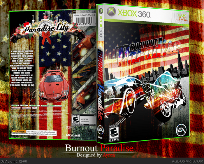
#1, Damn Ayron uploaded this pretty early in the morning. And on the back it would be better if the flag on the back had a rip through it cause the car just went through it.
#14, *bad attempt at a bump, but glad you did otherwise I'd never notice this box*
Awesome dude, this really shows your potential. However, like IceFox's box, too much emphasis is on the bike, and not on the car where, IMO, it should be.
I have two probles with this, the American flags don't work, Criterion is a Non-American Publisher, and he game is avalable in Europe, Asia, and Japan as well as America. Also, the city buildings on the bike should line up with the ones on the car, or else it looks pasted in. Other than that you did a pretty good job!
 Burnout Paradise Box Cover Comments
Yeah. burnout paradise.
It's a long time since i've made a box in which so many different styles clashed. Well, in my opinion,that is.
I also tried a couple of new tricks here, and i hope you guys really enjoy this box, as it REALLY has alot of effort.
Thanks to EVERYONE who posted in critiques for helping me!
--------------------------------------
printable added for those who are interested. IF you use it,please tell me ^^
Edited at 1 decade ago
[ Reply ]
#1, Damn Ayron uploaded this pretty early in the morning. And on the back it would be better if the flag on the back had a rip through it cause the car just went through it.
Edited at 1 decade ago
[ Reply ]
#2, check full view, it has a hole in it.
i know...school :P
[ Reply ]
best paradise box
[ Reply ]
Well done, mate! Your finally back to form! (:
+fav
[ Reply ]
Yay! Like ELCrazy said, you got your mojo back! :D Fav and author fav as well :)
[ Reply ]
Your best box in long time. Faved :)
[ Reply ]
Thanks for the support and feedback,everyone!
[ Reply ]
excelent job, I love it.
the only thing I don't like about it is that the logo is nearly invisible.
fav anyway.
[ Reply ]
Whoa...
[ Reply ]
Logo is kinda hard to see, but good job.
[ Reply ]
#11, Sorry,but i thought it looked >.>"
-edit-
LOL xD
Looked good ;)
Edited at 1 decade ago
[ Reply ]
#12, you thought it looked what??! Spit it out, lad!
[ Reply ]
Whoa...bumped off by 2 rows of NHL boxes..
[ Reply ]
#14, *bad attempt at a bump, but glad you did otherwise I'd never notice this box*
Awesome dude, this really shows your potential. However, like IceFox's box, too much emphasis is on the bike, and not on the car where, IMO, it should be.
[ Reply ]
Nice. This game ROCKS XP!
[ Reply ]
You know what ayron? This has too much style. It's just TOO stylish. I hate it.
:P +fav
[ Reply ]
I have two probles with this, the American flags don't work, Criterion is a Non-American Publisher, and he game is avalable in Europe, Asia, and Japan as well as America. Also, the city buildings on the bike should line up with the ones on the car, or else it looks pasted in. Other than that you did a pretty good job!
[ Reply ]
#1, nice work , looks good nice box art.
Edited at 1 decade ago
[ Reply ]