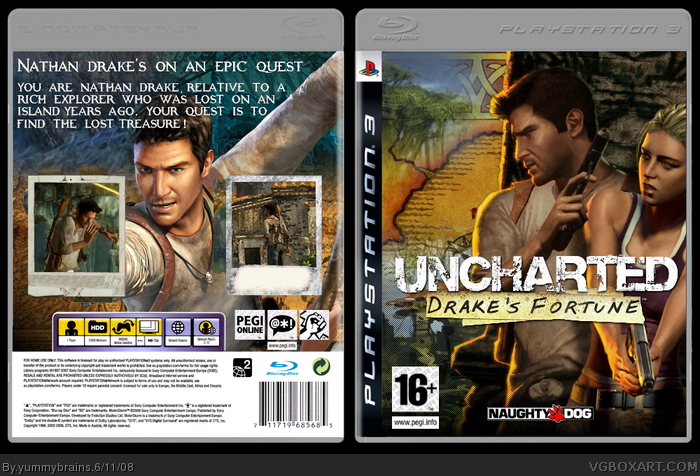
Hmm...about the box. The text is boring with no effects and it's a bad choice of text. The colors don't blend well and the overall design isn't anything we haven't seen before. The screenshots look bad, they're just standing straight up and look very boring. And you forgot the SCE logo.
The front's really nice, nice blending and editing but the back...not so much. The pictures seem like they should be tilted a lil so there like strewn everywhere. Is that the GoW font? xD
Front is amazingly good...
Back... not as much.
The back isn't necessirlily bad, just the font was a bad choice because it doesn't seem to work to me, then there's just like screenshots and it looks plain because there's nothing explaining about the screenshots. But not bad. 3.3/5
#2, That's how I feel. I've said this before but I don't like how people are using that version of WG1's template because it's been made too dark.
The front is ok, the Uncharted logo is not the best quality and the scanlines are a bit out of place. On the back, the text is too big and one of the screenshots in coming out of the frame. It would be nice if some text was on the bottom of the screenshot frames.
 Uncharted: Drake's Fortune Box Cover Comments
My Box versus Milky in the Milky comp.
Credit to Elcrazy/ wickedgamer1 for the temp and credit to Frenchboy for the screenboarders!
Edited at 1 decade ago
[ Reply ]
#1, ELCrazy/WickedGamer1 made it. ;]
Hmm...about the box. The text is boring with no effects and it's a bad choice of text. The colors don't blend well and the overall design isn't anything we haven't seen before. The screenshots look bad, they're just standing straight up and look very boring. And you forgot the SCE logo.
Overall, not too bad but not very good, either.
Edited at 1 decade ago
[ Reply ]
Thanks, what about the box though?
[ Reply ]
the front is good
[ Reply ]
Thanks!
(:
[ Reply ]
please give credit for the render
[ Reply ]
#6, Ah yes, Credit to yourself for rendering the front pic.
[ Reply ]
The front's really nice, nice blending and editing but the back...not so much. The pictures seem like they should be tilted a lil so there like strewn everywhere. Is that the GoW font? xD
[ Reply ]
#8, Thanks for the fav. OMGZZ!
That's narnia font btw.
[ Reply ]
Front is amazingly good...
Back... not as much.
The back isn't necessirlily bad, just the font was a bad choice because it doesn't seem to work to me, then there's just like screenshots and it looks plain because there's nothing explaining about the screenshots. But not bad. 3.3/5
[ Reply ]
#2, That's how I feel. I've said this before but I don't like how people are using that version of WG1's template because it's been made too dark.
The front is ok, the Uncharted logo is not the best quality and the scanlines are a bit out of place. On the back, the text is too big and one of the screenshots in coming out of the frame. It would be nice if some text was on the bottom of the screenshot frames.
[ Reply ]
#11, Dang...Those were some amatuer mistakes I made.
I should be more careful next time.
[ Reply ]