Alright, I like it but I really think you should either go into more detail about the game, utilizing ign.com and other sites like it, of course. If you don't feel like you can, then I'd suggest using bullet points for features, which would give your back more depth.
EDIT. No wait, it's there. Also #5 the game descriptions are on the screen shots. I was going to put stuff from game websites/mags but couldn't really find room for it.
#8, How's the front looking like the real deal a bad thing? Looks official right? This is the official you're probably thinking of: link
I actually did a lot of blending together the front, about 20 layers, the guy, his snakes, the beast with the 6 and the moon and background are all different images.
Thanks for your comment too. And I don't think I've done better ones because this one is full 300 DPI, most my others unfourtunantly aren't.
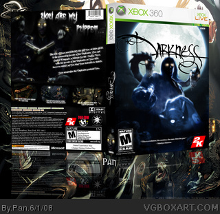
 The Darkness Box Cover Comments
Finished, look at it in full view please, since it went all tiny like for some reason. Also check out the printable version.
And comment, please! :3
[ Reply ]
Pretty nice, except the background is a tad blurry.
[ Reply ]
Great box. Just one thing though, the "The" is missing from the title. +fav
[ Reply ]
#2, The background behind the box? Eh, that doesn't matter much to me. At least the box isn't. Thanks for the fav.
[ Reply ]
Alright, I like it but I really think you should either go into more detail about the game, utilizing ign.com and other sites like it, of course. If you don't feel like you can, then I'd suggest using bullet points for features, which would give your back more depth.
[ Reply ]
#3, o shi- I'll have to fix that.
EDIT. No wait, it's there. Also #5 the game descriptions are on the screen shots. I was going to put stuff from game websites/mags but couldn't really find room for it.
Edited at 1 decade ago
[ Reply ]
Loks awesome. Keep up the good work!
[ Reply ]
The good:
- "You are my puppet"
- Logos are well cut and stuff
- You thought of the little details
- Nice style
The bad:
- The front looks too much like the real deal
- A but blurry here and there
Overall, a 8/10. You have done some better ones.
[ Reply ]
#8, How's the front looking like the real deal a bad thing? Looks official right? This is the official you're probably thinking of: link
I actually did a lot of blending together the front, about 20 layers, the guy, his snakes, the beast with the 6 and the moon and background are all different images.
Thanks for your comment too. And I don't think I've done better ones because this one is full 300 DPI, most my others unfourtunantly aren't.
[ Reply ]
I fixed the typo "wield" on the printable version.
[ Reply ]
Hmmm...looks good.
[ Reply ]
Oh alright, if you've already tried it, then it's fine :)
[ Reply ]