I honestly don't like it that much. It seems too random and plain, and I hatre how it's all concept art. Also too much brown. And the text is just bleh.
Ok, I updated a few small things:
I added a Rising Sun on the back so that it isn't as "plain" and I deleted some stuff that was bleeding from the back to the front.
It's OK, but the text is too freakin' crowded man! I don't want to read all that crap! Go get some bookworms! GAWD!! JEJEJEJEJEJEJEJEJEJEJEJEJEJEJEJEJEJEJEJEJEJEJEJEJEJEJEJEJEJEHUA!!!!!!!!!
='P
JK! Hey! The letters go in order from the alphabet! J, K! *geeks out*
#16, I knew it! I always thought those two were eerily similar... they have (well, used to) very similar posting styles (i.e. instead of saying "lol" they would say "Lol." and they like the same stuff, etc...
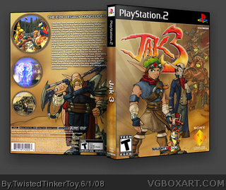
 Jak 3 Box Cover Comments
*breathes*
[ Reply ]
This is truly HoF worthy.
[ Reply ]
wow. that. is. amazing.
how long did it take you?
you have my first fav =)
[ Reply ]
gee that's a lot of text don't you think...
[ Reply ]
#4, I guess I could delete some of it. >_>
I almost forgot, credit to Dersnap for the template.
[ Reply ]
its good but theres alot of text on it.
Edited at 1 decade ago
[ Reply ]
#4, Yeah srsly...
I honestly don't like it that much. It seems too random and plain, and I hatre how it's all concept art. Also too much brown. And the text is just bleh.
>__O
[ Reply ]
Like i said, it's great :)
[ Reply ]
Got rid of some of the text.
#7, I figured someone would complain. I was going for a really simple design. Something like I wouldn't normally do.
EDIT: Added printable.
WARNING: Too small to actually print. This version is for text-reading purposes only. Box looks better in 3D.
Edited at 1 decade ago
[ Reply ]
#7, well to be fair it's not all concept art, but i get what you mean.
[ Reply ]
Ok, I updated a few small things:
I added a Rising Sun on the back so that it isn't as "plain" and I deleted some stuff that was bleeding from the back to the front.
[ Reply ]
You should have paragraphed the text, but other than that, it's good!
[ Reply ]
#12, I don't like to paragraph text. I think it looks bad.
[ Reply ]
It's OK, but the text is too freakin' crowded man! I don't want to read all that crap! Go get some bookworms! GAWD!! JEJEJEJEJEJEJEJEJEJEJEJEJEJEJEJEJEJEJEJEJEJEJEJEJEJEJEJEJEJEHUA!!!!!!!!!
='P
JK! Hey! The letters go in order from the alphabet! J, K! *geeks out*
[ Reply ]
#14, why are you acting like a retard lately? srsly...
[ Reply ]
I'm pretty certain that he's an alternate account of Chibi Cloud, well he was...
[ Reply ]
#16, I knew it! I always thought those two were eerily similar... they have (well, used to) very similar posting styles (i.e. instead of saying "lol" they would say "Lol." and they like the same stuff, etc...
[ Reply ]
#16, finally. I somehow knew he was an alt. They both have that same bad attitude.
Edited at 1 decade ago
[ Reply ]
to say the truth, i still wouldn't wanna read all that text, like, i kno you already took some off, but i wouldn't like to read that much
but hey, that's just my opinion, great box otherwise! I love how you used the cartoon versions, rather than the 3D versions!
4.9/5 +fav!!
[ Reply ]
How do you do it and what do you do it on- 4.999999999999999999999999999/5
[ Reply ]