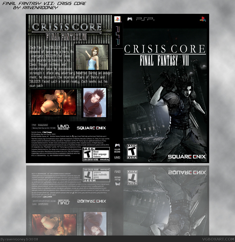
the back's nice but the cover needs a little bit more stylizing, try using the curves command in photohshop to get optimal results, also it could be pretty cool if u had the original picture but desaturated it but left one of the channels on so it would be like you could only see the blue while everything else would be in black and white.
 Crisis Core Final Fantasy VII Box Cover Comments
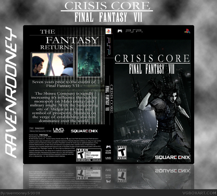
I'm getting this game this afternoon, so I decided to make my own little box art for it. How do you like it?
[ Reply ]
It's alright. Maybe add screenshot borders and the text is a little hard to read, maybe put some stroke.. 3/5
[ Reply ]
3,5/5 Not Bad, but I don't Like the first Picture on the COver
[ Reply ]
Updated again, with the back completely redone.
[ Reply ]
the back's nice but the cover needs a little bit more stylizing, try using the curves command in photohshop to get optimal results, also it could be pretty cool if u had the original picture but desaturated it but left one of the channels on so it would be like you could only see the blue while everything else would be in black and white.
[ Reply ]
I'm completely agree with Solidex !
You should Rooney do change like that way :)
[ Reply ]