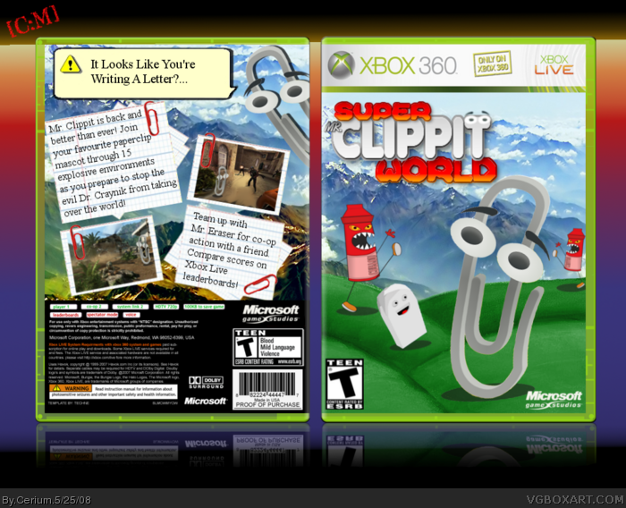
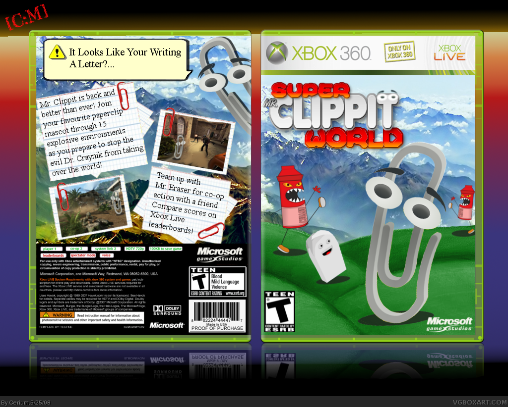
So first of all, let me explain my inspiration for this box....
I was thinking that Nintendo has Mario, Sony has Ratchet and Clank, even Sega has Sonic but Microsoft dont seem to have any cute mascot to represent them! I mean sure theres Master Chief but he has about as much personality as a pear! So I was thinking, which cute character could be used as Microsoft's mascot??? Enter.... CLIPPIT!! (or Mr. Clippit as he is known in this game.)
This box took me so much effort and an immense amount of work was put into it. Around 10 hours spread over three days (obviously I took breaks between, I wasn't working 10 hours nonstop lol) and I hope you all like the finished product.
If your wondering why this is Humor, its because its meant to be a joke and obviously this game would never get made. The title is meant to be a pun on "Super Mario World."
And please dont moan about the text on the back being too plain, its just basic Times New Roman to pay tribute to Microsoft Word where Clippit started!
Credit to Techne for template
MARKER for rendering an image for me and general advice
FiReHaWkZ for image
#2 Get over it man, your box was gonna get bumped off the front page sooner or later. You've always had a grudge against me ever since I criticised your Game and Watch box. Please stop this -.-
#5, hey look. you were like in the beging say "Great Box Your Improving!"
than suddenly you were like "DUDE Put some More Effort In Your Boxes!"
and thats why im starting to hate you...
#6 Well you was improving, but then your boxes got pretty mixed and it was like some good, some bad. Im sorry if speaking my mind upsets you. Im not gonna lie and say a box is good just to please you. Maybe I could of been less harsh with my comments but I do not wish to discuss this any further on my box. If you want to carry this on, take it to PM.
Looks good, but it's not funny. The shadows should be transparent, too. I'll favorite it, though, because it looks pretty good, despite some minor flaws, and I'd like to prove that I'm not still made at you. ;)
#8 Thank you TTT, i'm glad we've patched up our differences. I did actually make the shadows transparent a little bit but obviously not high enough. I'll try to edit it =]
When I first saw this box I didnt wanted to take a better look becouse it felt like some idiot just was bored, but when it got in to the Hall I had to take a better look and notices it was Cerium who made it and it was actually good.
Fav
EDIT
I acctually dont have Clippit, I got a lady called bettan, ot the dog Voff
(I shanged it in the option so I wouldnt need Clippit :P)
Or mayby I got him back, it was years ago sinse I used MS Word (He's from there, right?)
Well it's awesome and fantastic Mr.Clippit would be proud of you i would buy this came out,and the best thing is the screenshots,if you need just pm me....
5/5 + Fav!
Funny!!! I Hate Mr.Clippit. Making this is just plain AWSOME, rated T for Teen Makes it more humors! it is a good box- but it might need some extra detail on the back. Good try, is this your oldest or newest box?
-Box reviewer
 Super Mr. Clippit World Box Cover Comments
So first of all, let me explain my inspiration for this box....
I was thinking that Nintendo has Mario, Sony has Ratchet and Clank, even Sega has Sonic but Microsoft dont seem to have any cute mascot to represent them! I mean sure theres Master Chief but he has about as much personality as a pear! So I was thinking, which cute character could be used as Microsoft's mascot??? Enter.... CLIPPIT!! (or Mr. Clippit as he is known in this game.)
This box took me so much effort and an immense amount of work was put into it. Around 10 hours spread over three days (obviously I took breaks between, I wasn't working 10 hours nonstop lol) and I hope you all like the finished product.
If your wondering why this is Humor, its because its meant to be a joke and obviously this game would never get made. The title is meant to be a pun on "Super Mario World."
And please dont moan about the text on the back being too plain, its just basic Times New Roman to pay tribute to Microsoft Word where Clippit started!
Credit to Techne for template
MARKER for rendering an image for me and general advice
FiReHaWkZ for image
[ Reply ]
Thanks for bumping box off the front page.....
and it isent that great sorry
[ Reply ]
I laughed at the tagline and the second screenshot with information
Nice one Cerium.
[ Reply ]
Lol... I don't know why, but that's hilarious. And greatly done. +Fav
[ Reply ]
#2 Get over it man, your box was gonna get bumped off the front page sooner or later. You've always had a grudge against me ever since I criticised your Game and Watch box. Please stop this -.-
EDIT: Thanks for comments and favs everyone ^_^
Edited at 1 decade ago
[ Reply ]
#5, hey look. you were like in the beging say "Great Box Your Improving!"
than suddenly you were like "DUDE Put some More Effort In Your Boxes!"
and thats why im starting to hate you...
[ Reply ]
#6 Well you was improving, but then your boxes got pretty mixed and it was like some good, some bad. Im sorry if speaking my mind upsets you. Im not gonna lie and say a box is good just to please you. Maybe I could of been less harsh with my comments but I do not wish to discuss this any further on my box. If you want to carry this on, take it to PM.
Edited at 1 decade ago
[ Reply ]
Looks good, but it's not funny. The shadows should be transparent, too. I'll favorite it, though, because it looks pretty good, despite some minor flaws, and I'd like to prove that I'm not still made at you. ;)
Edited at 1 decade ago
[ Reply ]
#8 Thank you TTT, i'm glad we've patched up our differences. I did actually make the shadows transparent a little bit but obviously not high enough. I'll try to edit it =]
[ Reply ]
#9, oh, another thing, the characters are a tad choppy, as well as the logo. Also, it should say "You're" instead of "Your" on the back tagline.
[ Reply ]
Man that's cool. It's not too funny it's kinda Dry Humor but still i like it
depite the minor flaws TTT pointed out.
Edited at 1 decade ago
[ Reply ]
#10 Grrr and i'm usually so good with grammar ^_^
Updated with text error fixed and shadows made more transparent.
Thanks for pointing those out ;)
Edited at 1 decade ago
[ Reply ]
lol, I like it a lot; 5/5 +fav
[ Reply ]
Boo Ya. Like it, Cerium. ^^
[ Reply ]
Ahhgg, i didn't fav and i meant to. My bad Cerium.
[/multitasker]
[ Reply ]
'Tis epic, my buddy...
[ Reply ]
Sweet joke. But I sadly don't have clipit.
[ Reply ]
LMAO that is hilarious.
[ Reply ]
#17 Go download Word 2001 RIGHT NOW!! ^_^
Thanks for the favs and kind comments everyone :)
[ Reply ]
Haha nice +fav
[ Reply ]
It's all awesome
[ Reply ]
DIE CLIPPIT, DIE!!!
*ahem*
[ Reply ]
#20, #21 thanks =]
#22 I take it you dont like Clippit? =O
[ Reply ]
Roflcopter!
[ Reply ]
Nice as you probably know - lol
[ Reply ]
96 points Cerium. I used mah noggin =]
[ Reply ]
#26 Thanks for saving me the work of counting them myself =]
Nearly there ^_^
Thanks for favs people!
[ Reply ]
When I first saw this box I didnt wanted to take a better look becouse it felt like some idiot just was bored, but when it got in to the Hall I had to take a better look and notices it was Cerium who made it and it was actually good.
Fav
EDIT
I acctually dont have Clippit, I got a lady called bettan, ot the dog Voff
(I shanged it in the option so I wouldnt need Clippit :P)
Or mayby I got him back, it was years ago sinse I used MS Word (He's from there, right?)
Edited at 1 decade ago
[ Reply ]
#28 Yep he is from MS word but was removed from the 2007 version *sniff* :(
and YAY!! A third successive HoF!! Thanks a bunch to everyone who faved :)
[ Reply ]
Gratz man!
[ Reply ]
#30 Thank you! I'm gonna have my work cut out to make it 4 in a row :)
[ Reply ]
I didn't even comment x]
As i said on pm---really good xD! keep it up mate, and away we go to fourth consecutive HoF!
[ Reply ]
Good job! It looks very pretty in the colours, and I will have to fave! (H)
[ Reply ]
dude, this rox... added as fav
[ Reply ]
I thought humor boxes didn't have backs.
[ Reply ]
#35 Who told you that? O_o
[ Reply ]
The T on clippit looks real dodgy! fav+
[ Reply ]
#37 Lol?!
Maybe you just have a dirty mind ;)
Thanks for the fav.
[ Reply ]
LOL! I hate clippit, but this is Hysterical.
[ Reply ]
This is awsome! Although, I find mr. Clippit annoying, this is still cool.
[ Reply ]
One of the better humor-boxarts that I have seen :D
[ Reply ]
i hate that Damn paper clip
[ Reply ]
I have one word for this box.
/facepalm.
[ Reply ]
#43 Im guessing you dont like the box then?
[ Reply ]
Wow as annoying as Mr.Clippit is i would buy this game (as an xbla title) well anyways great job, favorited image and you.
[ Reply ]
Well it's awesome and fantastic Mr.Clippit would be proud of you i would buy this came out,and the best thing is the screenshots,if you need just pm me....
5/5 + Fav!
[ Reply ]
ahahahahah this. is. gold.
[ Reply ]
Wow. I'm getting a 360 for christmas. That is wonderful work Cerium. Ah, by the way, can you give me the xbox template? Thanks.
[ Reply ]
Wow! A video game starring Microsoft Word's mascot?? This is so cool! And let's not forget all the impressive graphics here!
[ Reply ]
why would mr.clippit have blood and violence in it's game? lol
[ Reply ]
Funny!!! I Hate Mr.Clippit. Making this is just plain AWSOME, rated T for Teen Makes it more humors! it is a good box- but it might need some extra detail on the back. Good try, is this your oldest or newest box?
-Box reviewer
[ Reply ]
hahahahahaha thats funny +fav
[ Reply ]
clippit is a word buddy from M. word
[ Reply ]
PFFFF thats so kool nice box
[ Reply ]
so thats where he go's when i close his advice window
[ Reply ]
OMG. This is so awesome, cute, and funny!
[ Reply ]