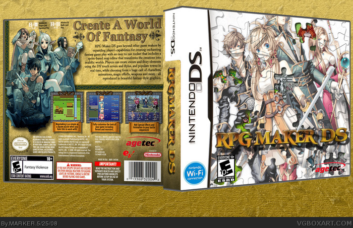
Okay, since numerobetically posted her's... here's my RPG Maker DS box for the Midas Touch comp against none other than numerobetically ;)
The front still has part VGMaster's original image in the background (as you can clearly see the red dragon on the top ;)), as I wanted a jigsaw look since you are putting together a game. The box is part based on the XP version and the Playstation version, since Agetec has the official license to the console version, hence the change in compamy logo and rating.
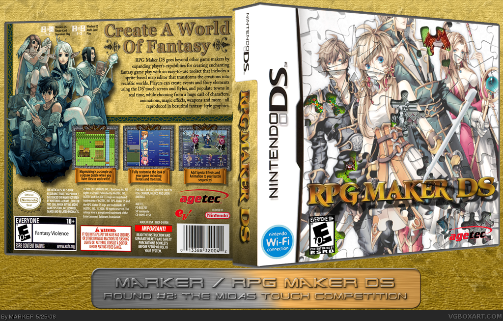
Uploaded wrong one. V1 was for the forum as it's smaller. V2, is bigger like my other boxes.
#5, Thanks... although there's a reason for the front to look like that because the emphasis is not on the jigsaw puzzle itself hence why the pieces are lighten a lot and the logo/stylus and the background (VGMaster's original image) is so sharp, because it's a REMAKE of VGMaster's box.
The "piece a puzzle" concept on the front is cool, but I don't think it quite works to the effect you were going for. It tends to distract me more than intrigue me. The background layer (with the pixel characters) only adds to the whole confusing factor, which I doubt is the point of this box- I didn't notice the stylus until a minute or two. I don't particularly like how the top front character's face is cut off and the overall top puzzle layer quality is just very poor in full view.
The back, however, is exactly the opposite of the front. Crisp, organized, with a sweet scheme and amazing design. I wish you continued the brown scheme to the front.
Well, you already know how tough of a critic I can get especially when it comes to competitions. So no surprises there, right? ;)
#12, lol - sorry - sig... as I mentioned, I wasn't gonna post this in main as it's a competition box, but as Nikki did, I basically just flattened my PSD file and uploaded it. If you check out V1, you'll see the forum version with the Midas sig on it ;)
#11, Well.. I would agree with you IF this was a proper RPG game. But I stick by my design for the front since this is NOT a game at all as it a game creator, there's no actual game on the cartridge, so the picture on the jigsaw doesn't matter. If all the characters heads were cut off it wouldn't matter as none of them exist as it's you who's going to create the game. It's not like it's Final Fantasy and Cloud's head is chopped off. The jigsaw look is there to convey the ease of how easy it is to create a RPG - like putting together a jigsaw - and not what the jigsaw itself looks like. By making it sharp and bright - it'll look like a normal RPG game. Well.. that's my way of thinking anyway ;)
Wow, that is really well done. Is that orignal artwork? The guy to the farleft looks alot like Light on the front cover. I'm loving the puzzle effect. Faving it.
 RPG Maker DS Box Cover Comments
Okay, since numerobetically posted her's... here's my RPG Maker DS box for the Midas Touch comp against none other than numerobetically ;)
The front still has part VGMaster's original image in the background (as you can clearly see the red dragon on the top ;)), as I wanted a jigsaw look since you are putting together a game. The box is part based on the XP version and the Playstation version, since Agetec has the official license to the console version, hence the change in compamy logo and rating.
Uploaded wrong one. V1 was for the forum as it's smaller. V2, is bigger like my other boxes.
Edited at 1 decade ago
[ Reply ]
Very Nice. Your's and numerobetically's comp is going to be a close one.
[ Reply ]
I love it.. It's going to be hard for people because our boxes are soooo different. And different from VGMaster's haha.
Very clever.
Originally I was going to do the puzzle thing too except I'd already done puzzle pieces on my Toki Tori box.
Edited at 1 decade ago
[ Reply ]
Love the idea of the jigsaw pic great job
[ Reply ]
This is amazing, MARKER. Front looks a little blurry, though.
[ Reply ]
#5, Thanks... although there's a reason for the front to look like that because the emphasis is not on the jigsaw puzzle itself hence why the pieces are lighten a lot and the logo/stylus and the background (VGMaster's original image) is so sharp, because it's a REMAKE of VGMaster's box.
[ Reply ]
very cool Marker, looks like your changing things up more recently with your boxes.
[ Reply ]
Front seems a little messy, but it makes up for it on the back :)
I'd vote for numero though XP
[ Reply ]
*gasp* You didn't put your sig in the bottom right corner...
I don't know you anymore. :P
[ Reply ]
Nice.
[ Reply ]
#8, Agreed.
The "piece a puzzle" concept on the front is cool, but I don't think it quite works to the effect you were going for. It tends to distract me more than intrigue me. The background layer (with the pixel characters) only adds to the whole confusing factor, which I doubt is the point of this box- I didn't notice the stylus until a minute or two. I don't particularly like how the top front character's face is cut off and the overall top puzzle layer quality is just very poor in full view.
The back, however, is exactly the opposite of the front. Crisp, organized, with a sweet scheme and amazing design. I wish you continued the brown scheme to the front.
Well, you already know how tough of a critic I can get especially when it comes to competitions. So no surprises there, right? ;)
[ Reply ]
Where's your sig?
NOOO!!!
[ Reply ]
Awesome!
[ Reply ]
#12, lol - sorry - sig... as I mentioned, I wasn't gonna post this in main as it's a competition box, but as Nikki did, I basically just flattened my PSD file and uploaded it. If you check out V1, you'll see the forum version with the Midas sig on it ;)
#11, Well.. I would agree with you IF this was a proper RPG game. But I stick by my design for the front since this is NOT a game at all as it a game creator, there's no actual game on the cartridge, so the picture on the jigsaw doesn't matter. If all the characters heads were cut off it wouldn't matter as none of them exist as it's you who's going to create the game. It's not like it's Final Fantasy and Cloud's head is chopped off. The jigsaw look is there to convey the ease of how easy it is to create a RPG - like putting together a jigsaw - and not what the jigsaw itself looks like. By making it sharp and bright - it'll look like a normal RPG game. Well.. that's my way of thinking anyway ;)
[ Reply ]
Wow, that is really well done. Is that orignal artwork? The guy to the farleft looks alot like Light on the front cover. I'm loving the puzzle effect. Faving it.
[ Reply ]
You did take the poster and made it a puzzle with a effect. Effortless. Front is VX art, back XP art.
Edited at 1 decade ago
[ Reply ]