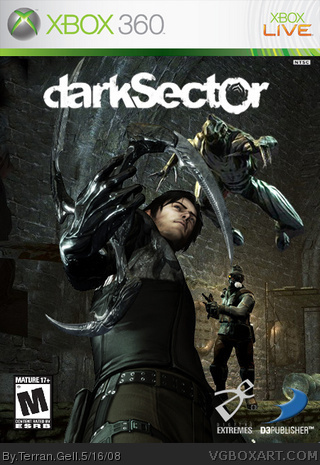
[ Box updated on May 16th, 2008 ] [ original ]
 Dark Sector Box Cover Comments
Comment on Terran Gell's Dark Sector Box Art / Cover.

[ Box updated on May 16th, 2008 ] [ original ]
Comment on Terran Gell's Dark Sector Box Art / Cover.
Been meaning to post this for a while. As always, helpful criticism is welcome.
[ Reply ]
I love it.
but there are two things I think are wrong.
there is no back and the logo is not centered.
[ Reply ]
#2, Love it?
I think he shoud have done better and put
more effort in it.
3/5
Edited at 1 decade ago
[ Reply ]
#3, f*ck off and go the f*ck away.
[ Reply ]
#4, Uncalled for, he's entitled to his opinion.
As for the box it's nice but the logo could be bigger and centered, and you might want to use something other than a screenshot for a background
Edited at 1 decade ago
[ Reply ]
Updated. The only reason it was off center was because it obstructs the blade. I thought I could get away with putting it off to the side a bit (apparently not). As for the background, I looked everywhere and this is the best I could find.
And for the record, "do better" is not helpful in any way.
[ Reply ]
I actually like what you were going for. A pretty original concept. However, if you're using Photoshop, try experimenting with brushes, textures etc. to enhance the box.
[ Reply ]