yeah,but still
i wish people would notice the other boxes that go through
not just vet boxes, and first boxes, and the obvious spam boxes
i am always mad at that, seeing good boxes pushed off...
#12, Your right, spam boxes get the most attention, and then, if its not a box by a vet, nobody looks at it. I think this is well made and creative, should get more attention.
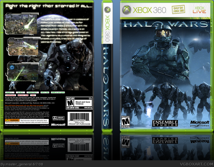
 Halo Wars Box Cover Comments
EVEYTHING by me except template which is too Techne
anyway, i wanted to catch a good feel of the game,Dark and Eerie
this took me awhile and i'm proud of it:D
[ Reply ]
A-w-e-s-o-m-e
[ Reply ]
idk about the back. but the fronts awosome.
Edited at 1 decade ago
[ Reply ]
Thanks for some great comments and favs
[ Reply ]
#4, lol, this should get more attention
fav.
EDIT: whoa! your only rank 3?
Edited at 1 decade ago
[ Reply ]
yeah
my boxes do get pushed off
and i wish i was at least 4
[ Reply ]
#6, Me to =/
[ Reply ]
I usually hate Halo War boxes but i hate to say it ... love it
Edited at 1 decade ago
[ Reply ]
thanks blarg
[ Reply ]
Pushed off again, sigh
[ Reply ]
Don't worry i still faved u
[ Reply ]
yeah,but still
i wish people would notice the other boxes that go through
not just vet boxes, and first boxes, and the obvious spam boxes
i am always mad at that, seeing good boxes pushed off...
i am not talking about mine...
Edited at 1 decade ago
[ Reply ]
#12, Your right, spam boxes get the most attention, and then, if its not a box by a vet, nobody looks at it. I think this is well made and creative, should get more attention.
Mah 2 cents.
[ Reply ]
ok.. here's my $0.02
1-- the spine logo is flipped-- if you see it from the side, it's hard to read.
2-- The front is nothing special.-- just [2]? wallpapers blended. looks nice though, but originality is a big point in my book.
3-- Tagline is a tad too small, and read-- make it bigger, so it fills up more.
4-- add a background to the back,black looks so plain.
5--screenshots have different sizes, i don't know if you meant it to be like that- but i dpn't like it.
my 2 cents.
[ Reply ]
ummm that was 5
lol
[ Reply ]
Must... Steal...
[ Reply ]
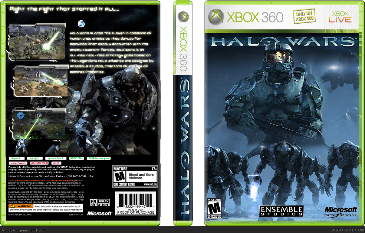
Update 4/6
So i messed with the back and spine
Full View
Edited at 1 decade ago
[ Reply ]