[ Buy Yoshi Topsy-... at Amazon ] By Ayron 47 on May 6th, 2008 No Printable Available Yoshi Topsy-Turvy Box Cover Comments Comment on Ayron's Yoshi Topsy-Turvy Box Art / Cover. Cancel Reply Ayron 47 [ 1 decade ago ] Yes, i know.. it's and odd time to post, but please-- this box is just so bright.. ahhh =] Credit to ADFD for template ^^' May i present to you, with its first appearace on Vgboxart: Yoshi Topsy Turvy! Edited at 1 decade ago [ Reply ] E_G 39 [ 1 decade ago ] Great job. I personally like the 3D perspective, it goes with the idea of tilting which is what the game is literally about. The only thing I don't like is the description font, it's too fat. I suggest you give that a good and small outline so it has more depth as well. [ Reply ] GuitarMan 28 [ 1 decade ago ] Box looks great. i go agree with E_G about the font. [ Reply ] Redhedd 13 [ 1 decade ago ] Love it, something I haven't seen. [ Reply ] Ayron 47 [ 1 decade ago ] #2, i'll update later in the evening ;) [ Reply ] Veronica 41 [ 1 decade ago ] Looks great, I don't like the amount of yellow on the front, just it make's it seem plain, but I love the feel of it. ^^ [ Reply ] kirby22 14 [ 1 decade ago ] not my favorite of yours... Pros: Very colorful Very creative Made well Cons: sort of boring and dull some spots seem empty But other than that it's good in the hood +fav [ Reply ] Ayron 47 [ 1 decade ago ] #7, Lol-- it's meant to be kind of plain, as i didn't feel it was a busy game. [ Reply ] yummybrains 30 [ 1 decade ago ] #2, *Agrees* Also, I think overall the box is a little plain. :\ [ Reply ] Wario22 11 [ 1 decade ago ] Its great 4/5 +fav [ Reply ]
 Yoshi Topsy-Turvy Box Cover Comments
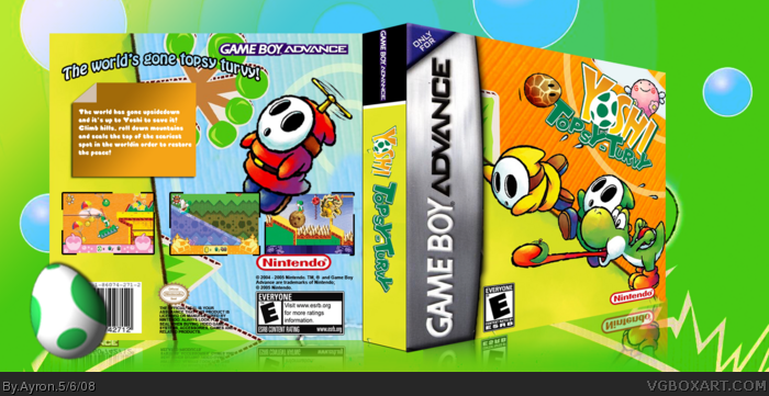
Yes, i know.. it's and odd time to post, but please-- this box is just so bright.. ahhh =]
Credit to ADFD for template ^^'
May i present to you, with its first appearace on Vgboxart:
Yoshi Topsy Turvy!
Edited at 1 decade ago
[ Reply ]
Great job. I personally like the 3D perspective, it goes with the idea of tilting which is what the game is literally about.
The only thing I don't like is the description font, it's too fat. I suggest you give that a good and small outline so it has more depth as well.
[ Reply ]
Box looks great. i go agree with E_G about the font.
[ Reply ]
Love it, something I haven't seen.
[ Reply ]
#2, i'll update later in the evening ;)
[ Reply ]
Looks great, I don't like the amount of yellow on the front, just it make's it seem plain, but I love the feel of it. ^^
[ Reply ]
not my favorite of yours...
Pros:
Very colorful
Very creative
Made well
Cons:
sort of boring and dull
some spots seem empty
But other than that it's good in the hood +fav
[ Reply ]
#7, Lol-- it's meant to be kind of plain, as i didn't feel it was a busy game.
[ Reply ]
#2, *Agrees*
Also, I think overall the box is a little plain.
:\
[ Reply ]
Its great 4/5
+fav
[ Reply ]