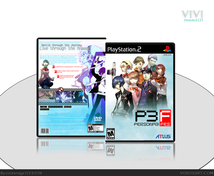
Man, you really like PE3 boxes, don't you? Anyways, I can't say I like it, sorry. Too plain for my liking,the monochromatic scheme doesn't work that well, and the image on the back of the MC has a clashing art style compared to the rest of the characters. 3.5/5
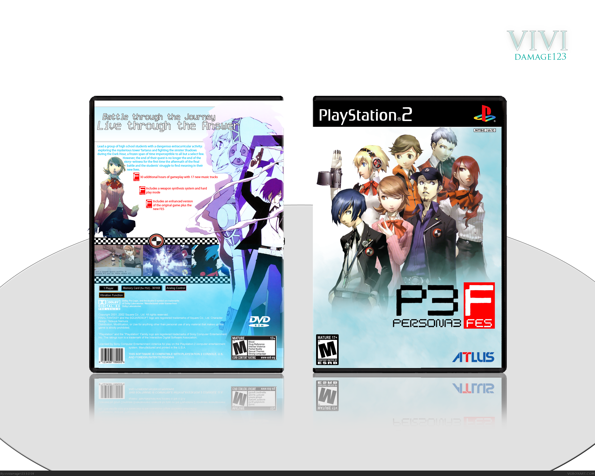
Hey everyone yes I know it's MY 3rd Persona BOx, I LOVE DOING THEM, great material and fun to work with. Anyway's I noticed alll FES BOXES are veryyy dark so I decided to do a bright box simliar to the menues and stuff in the game so I hope you enjoy...
Credit to NumberoBetically, a forum for the logo(forgot the name), Images from Creativeuncut, Yukari render from Planetrenders
First of all, I'm pretty disappointed by the amount of comments/favs this has received, it's like people have just ignored it. Honestly there's barely anything to fault here about the box design, after viewing full size the resolution, typography and overall composition are top-notch.
There's too much space outside the box but faved for sure and the plainness of the box is fine.
I totally agree. It does happen though, that boxes get unnoticed sometimes (unfortunately). But I do like it, a lot actually. I usually don't like the blend of CG and regular artstyle, but in this one you pulled it off stunningly. The only nitpick I have is the fact that the main character and junpei stand out in the front. The tone of all the other characters are the same and they all match, but theirs doesn't. It's just simple brightness and contrast I think that you need to do. But good job ;)
WOW!!!! Thanks EG for the amazing comment, really appreciate it, and I wanted this box to get more attention because I feel this was one of my better ones. Anyone thanks for the 3 FAVS!! Let's get more :)
 Persona 3 FES Box Cover Comments
Man, you really like PE3 boxes, don't you? Anyways, I can't say I like it, sorry. Too plain for my liking,the monochromatic scheme doesn't work that well, and the image on the back of the MC has a clashing art style compared to the rest of the characters. 3.5/5
[ Reply ]
Hey everyone yes I know it's MY 3rd Persona BOx, I LOVE DOING THEM, great material and fun to work with. Anyway's I noticed alll FES BOXES are veryyy dark so I decided to do a bright box simliar to the menues and stuff in the game so I hope you enjoy...
Credit to NumberoBetically, a forum for the logo(forgot the name), Images from Creativeuncut, Yukari render from Planetrenders
ENJOY!
[ Reply ]
#1, I have to say I agree with. But the back is nice. :]
Edited at 1 decade ago
[ Reply ]
First of all, I'm pretty disappointed by the amount of comments/favs this has received, it's like people have just ignored it. Honestly there's barely anything to fault here about the box design, after viewing full size the resolution, typography and overall composition are top-notch.
There's too much space outside the box but faved for sure and the plainness of the box is fine.
Edited at 1 decade ago
[ Reply ]
I totally agree. It does happen though, that boxes get unnoticed sometimes (unfortunately). But I do like it, a lot actually. I usually don't like the blend of CG and regular artstyle, but in this one you pulled it off stunningly. The only nitpick I have is the fact that the main character and junpei stand out in the front. The tone of all the other characters are the same and they all match, but theirs doesn't. It's just simple brightness and contrast I think that you need to do. But good job ;)
[ Reply ]
Fantastic.
Oh hey that's my temp! Yaaayyy!
Edited at 1 decade ago
[ Reply ]
WOW!!!! Thanks EG for the amazing comment, really appreciate it, and I wanted this box to get more attention because I feel this was one of my better ones. Anyone thanks for the 3 FAVS!! Let's get more :)
[ Reply ]
I love this box
Edited at 1 decade ago
[ Reply ]
thanks
[ Reply ]
I Object to the outragously early death of this box!
+Fave
[ Reply ]
#10, I know it really wasnt fair but its okay I guess
[ Reply ]
good stuff, deserves more attention.
i like your boxes, but way too much white around them IMO, all of that space really isnt necessary
[ Reply ]
#12, Yeah ive been told about the white space, thanks though! I look up to your stuff
[ Reply ]
Wow, I was just browsing through your page and saw this. I saw that it didn't have hall and then I fainted.
srsly people, what the hell?
ITS BEAUTIFUL! LOOK IN FULL!
Edited at 1 decade ago
[ Reply ]
#14, Haha thanks
[ Reply ]