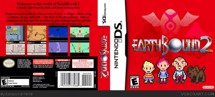
it going off the idea that the Earthbound2 in japan (it was called Mother3) had an overly simplistic box design. Compared to the original box, this isn't simple at all. Also, it would ruin the box to put more stuff on there.
This is actually an edit of a box I made earlier, but I choose not to overwrite the other one as they are technically the same game, but someone might choose to use the name of the original game (Mother3). link
Earthbound is actually Mother2
Earthbound0 is Mother
and Earthbound2 is Mother3.
I think this is perfect! I can actually vision it right now at GameStop. Whats up with simplicity, you say #1? You should ask Nintendo, who is currently ignoring our begging and pleading for a worldwide release of Mother 3 and could "simply" remake it with no lame excuse, or at least put Earthbound on Virtual Console so it would sell again! But overall, this is fantastic! I feel like printing this out and putting it in a DS case so I would "finally have it" lol!
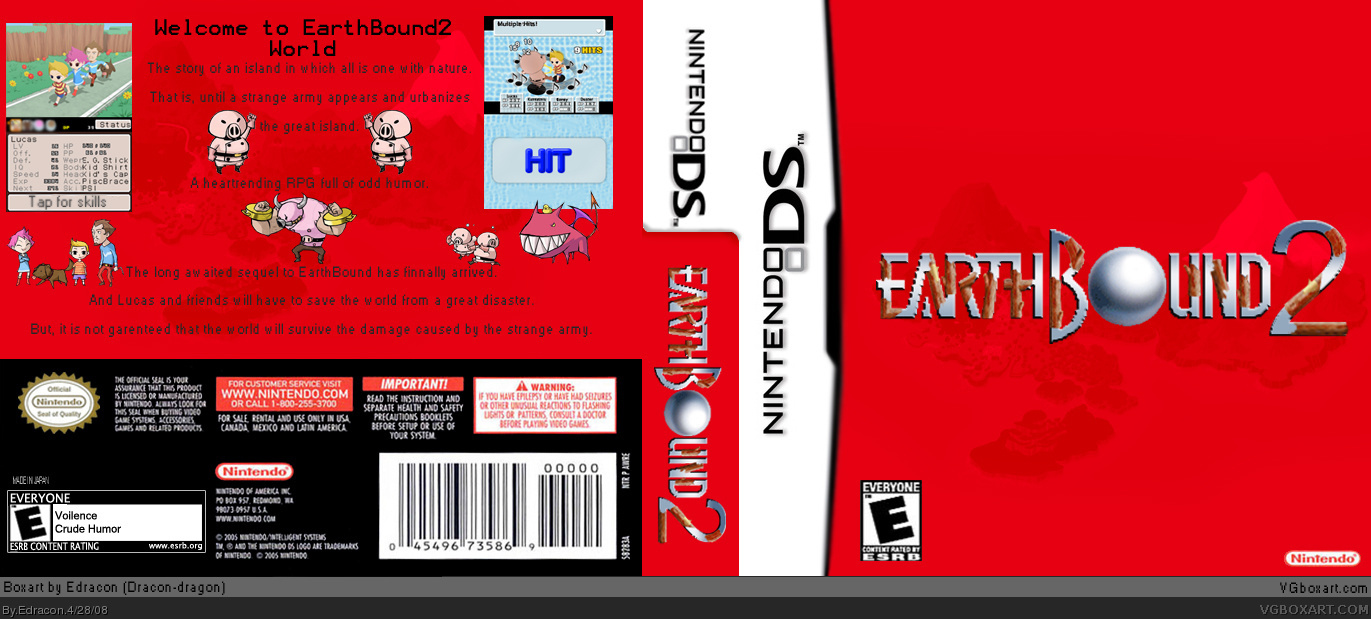
there's a couple of problems going on here,
-the logo looks bad
-i understand that you wanted to keep it simple, but the frontis only a logo with a single image faded into a plain background. Atleast put a little bit more stuff to catch the eye.
- the back's placement of charactors doesn't look good and you should put some screenborders.
I have a better version of the logo, it's slightly cleaner and stuff (the jaggedness is cause by the angle of the letters, not the image itself I CANNOT FIX THAT!). But I'm redoing the box template so that it can be printed out and fit in a real DS case.
Also, I have put other things in the front image.. and it just looked terrible, it turned out keeping to a minimum (like the official MOTHER3 box) works the best in this case.
And why do I need screenborders, I've seen many official and unofficial DS boxes, and if the tob and bottom screen are different enough THERE IS NO SCREEN BORDER TO SEPERATE THEM!
sorry for this double post.. I would just like to strike some of the things I said in #8
I finally got other things on the front to look good.
Im redoing the back completly at this time (I WILL ALSO EDIT THE ONE THAT SAYS MOTHER3)
 Earthbound 2 Box Cover Comments
watsup with the simplicity?
[ Reply ]
it going off the idea that the Earthbound2 in japan (it was called Mother3) had an overly simplistic box design. Compared to the original box, this isn't simple at all. Also, it would ruin the box to put more stuff on there.
This is actually an edit of a box I made earlier, but I choose not to overwrite the other one as they are technically the same game, but someone might choose to use the name of the original game (Mother3). link
Earthbound is actually Mother2
Earthbound0 is Mother
and Earthbound2 is Mother3.
All in all, simple is how it's supposed to be.
Edited at 1 decade ago
[ Reply ]
The cell shaded winderwaker styled artwork is from here link
I edited three pics though.
3d from link
For those who did not read Post #2, it's supposed to be simplistic.
[ Reply ]
I think this is perfect! I can actually vision it right now at GameStop. Whats up with simplicity, you say #1? You should ask Nintendo, who is currently ignoring our begging and pleading for a worldwide release of Mother 3 and could "simply" remake it with no lame excuse, or at least put Earthbound on Virtual Console so it would sell again! But overall, this is fantastic! I feel like printing this out and putting it in a DS case so I would "finally have it" lol!
Edited at 1 decade ago
[ Reply ]
#4 what do you smoke?? Jeez you must be an alternate, this is horrible!
[ Reply ]
Lol I like how you've picked up the feel of the original EarthBound 2 art by Nintendo. Plus, you have layed out the images and text quite well.
[ Reply ]
#4 & #6 lol
there's a couple of problems going on here,
-the logo looks bad
-i understand that you wanted to keep it simple, but the frontis only a logo with a single image faded into a plain background. Atleast put a little bit more stuff to catch the eye.
- the back's placement of charactors doesn't look good and you should put some screenborders.
[ Reply ]
#5 & #7
I have a better version of the logo, it's slightly cleaner and stuff (the jaggedness is cause by the angle of the letters, not the image itself I CANNOT FIX THAT!). But I'm redoing the box template so that it can be printed out and fit in a real DS case.
Also, I have put other things in the front image.. and it just looked terrible, it turned out keeping to a minimum (like the official MOTHER3 box) works the best in this case.
And why do I need screenborders, I've seen many official and unofficial DS boxes, and if the tob and bottom screen are different enough THERE IS NO SCREEN BORDER TO SEPERATE THEM!
Also, I am going to redo the back.
[ Reply ]
sorry for this double post.. I would just like to strike some of the things I said in #8
I finally got other things on the front to look good.
Im redoing the back completly at this time (I WILL ALSO EDIT THE ONE THAT SAYS MOTHER3)
and Ultra64 I admit you are right.
Edited at 1 decade ago
[ Reply ]
Box has been updated, all comments before this one are not for v2 which is what you see here.
[ Reply ]