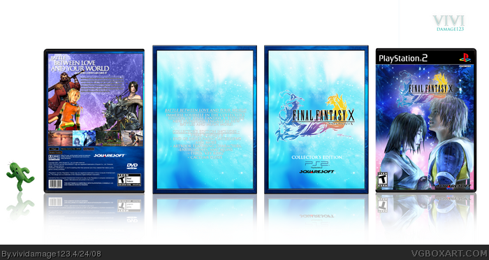
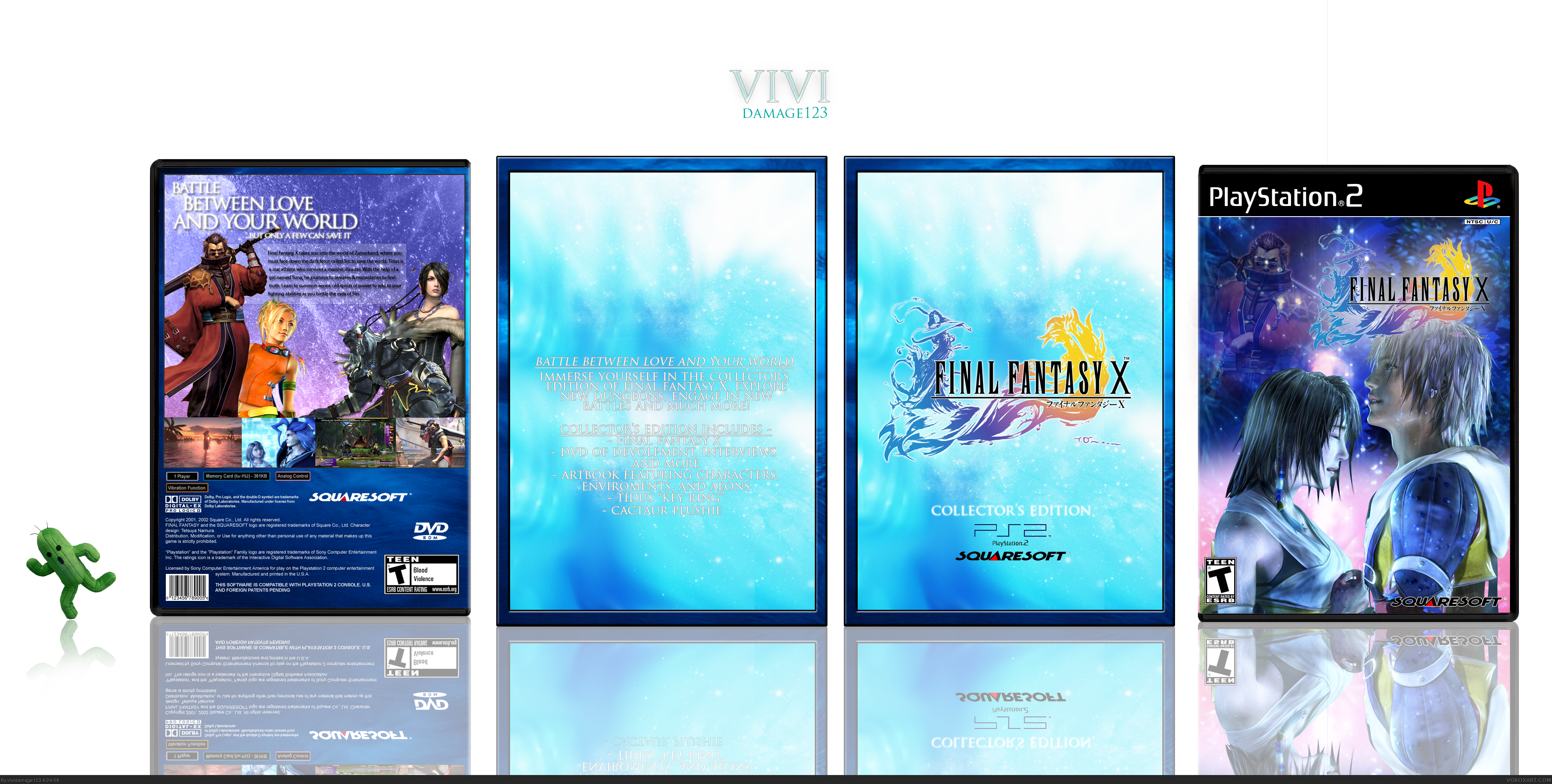
Okay here's my latest box Final Fantasy X! Woooo... Okay so I wanted a more mystical and watery feel to the box so I used alot of blue and some pink and other colors of the such.
Credit to Maybe Tommorow for the Logo (THANKS!)
Credit to Numerobetically for this amazing ps2 template that she made for more! THANKS!
Thats about it, enjoy
PLEASE VIEW IN FULL, resized is nothing compared...
This looks cool. I would have to agree with DMS about Auron on the front.. prefer if he wasn't there (especially as it's the same image as on the back).. thus move the logo central. I would have preferred a light drop shadow on the back text so that it's more readable, and I think the girl in orange (sorry forgot her name) should be in front of Auron since she is bigger. But... great box!
Really good quality and idea but like DMS said, the Auron in the front is random-looking and I'd have prefered the images on the back to blend better together and with the BG! Shouldn't the logo contain the white in it???
Good job none the less. :)
actually the first FF game that i had ever played and the game that really got me into the RPG genre, very very nice box. i think the back kinda feel a little empty though even with those characters there :\
Edit:; also, please no more slip covers, how bout just doing the boxes and leaving it at that :p
 Final Fantasy X Box Cover Comments
So classy. At first the text on the tin looked bad but in full size it's fine.
[ Reply ]
Okay here's my latest box Final Fantasy X! Woooo... Okay so I wanted a more mystical and watery feel to the box so I used alot of blue and some pink and other colors of the such.
Credit to Maybe Tommorow for the Logo (THANKS!)
Credit to Numerobetically for this amazing ps2 template that she made for more! THANKS!
Thats about it, enjoy
PLEASE VIEW IN FULL, resized is nothing compared...
Thanks E G! :)
Edited at 1 decade ago
[ Reply ]
Thats more like it. The faded Auron on the front cover is random, so I suggest removing him since he breaks the enchanting moment.
While you are at it, maybe add some white outer glow to the logo on the front cover too.
Otherwise fantastic box. I don't usually like gimicky slip covers or what not, but this looks terrific and the quality is a big step up for you too.
Edited at 1 decade ago
[ Reply ]
#1, Yeah, same here.
[ Reply ]
This looks cool. I would have to agree with DMS about Auron on the front.. prefer if he wasn't there (especially as it's the same image as on the back).. thus move the logo central. I would have preferred a light drop shadow on the back text so that it's more readable, and I think the girl in orange (sorry forgot her name) should be in front of Auron since she is bigger. But... great box!
[ Reply ]
Anyway where is all the white from the FF logo? Was that intended?
[ Reply ]
Really good quality and idea but like DMS said, the Auron in the front is random-looking and I'd have prefered the images on the back to blend better together and with the BG! Shouldn't the logo contain the white in it???
Good job none the less. :)
[ Reply ]
*Updated* I removed Auron lol, moved Rikku in front and gave the font on the back a stroke. Also made a better reflection...
[ Reply ]
actually the first FF game that i had ever played and the game that really got me into the RPG genre, very very nice box. i think the back kinda feel a little empty though even with those characters there :\
Edit:; also, please no more slip covers, how bout just doing the boxes and leaving it at that :p
Edited at 1 decade ago
[ Reply ]
The back text on the slip over would look better black but it looks very nice.
[ Reply ]
oreaty good
[ Reply ]
Thanks, yeah the slip cover is getting annoying, thanks everyone for the fav's
[ Reply ]
to me it looks like a box more than a slip cover but the open space in the back isnt appealing but I love it
[ Reply ]