Return, return, return.
--------
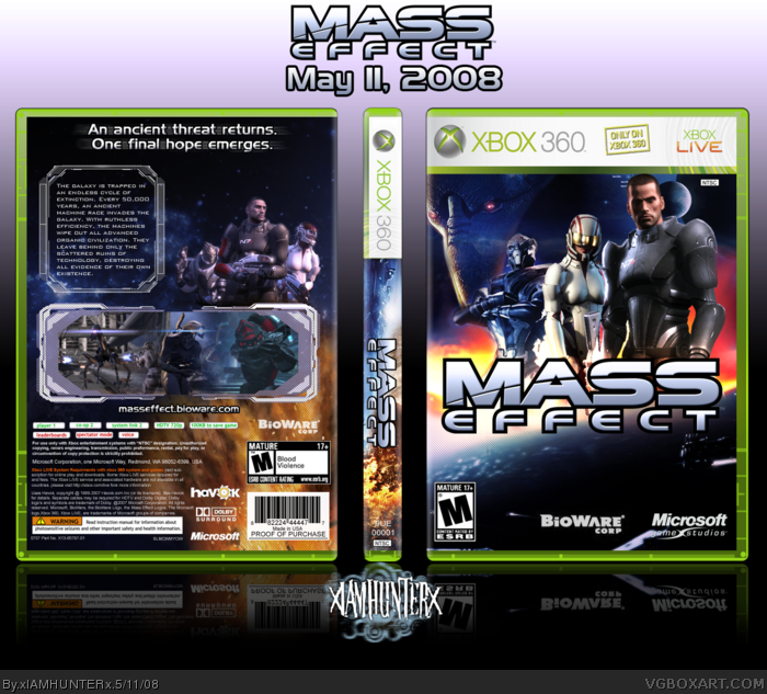
Best box since BioShock (circa February 5th) and - dare I say it - maybe even a little better in terms of design and effort? I actually started this one a few days before I submitted that one, so you should be able to tell that I put a LOT - and I mean a LOT - of effort into this one.
Credit to Ross for the temp as always, and credit to BioWare for being oh so sexy and making this fantastic game.
its alright, nice and all, dont really like what you did with the screenshots and the tech brushes, i think you shouldnt made the screenshots individual, but...i digress :D
This is definitely you best yet, perfect balance and has a great feel to it. Technique wise, it's pretty much flawless- clear and precise placing and organization.
I'm really digging the simplistic approach and also prefer the current subtle placing of the (villain?) on the front left- contrary to what Jason was saying. Keep up the fantastic work. ;)
heh, anyway I was going to say that you should've added the geth army below the logo or maybe a planet or the mako roving on a planet, e.t.c.
Saren as stated above, would've looked better if he wasn't faded.
The back cover looks quite nice, not too fond of that crazy explosion tho. I like when the colors are balanced thoughout the whole box, and you could've used lighter shades of blue or orange some more - perhaps on the typography etc.
I dont really like the front its too empty.
And the temp is very big.
Also the back is pretty empty. Adding some stuff about the gameplay may help. Or putting a few characters in it.
And the logo on the front is pretty big.
But other than that its alright. It has a clean look to it.
I just saw it, chameleon eyes. ;)
Much better. I like the front a lot more, and the back frames are cool. Too bad DMS didn't see the new spine!
2 minor complaints: A sci-fi game needs spaceships. Put one above the group in the back, the space (pun not intended) needs something. Also, Saren's head is cut off by a diagonal line... just fade him into the background.
I'll give you my completely worthless fav. :) Great job.
 Mass Effect Box Cover Comments
Return, return, return.
--------
Best box since BioShock (circa February 5th) and - dare I say it - maybe even a little better in terms of design and effort? I actually started this one a few days before I submitted that one, so you should be able to tell that I put a LOT - and I mean a LOT - of effort into this one.
Credit to Ross for the temp as always, and credit to BioWare for being oh so sexy and making this fantastic game.
Project 86 pwns by the way.
[ Reply ]
That blank space on the front is kinda a killer. Put maybe like a blended/faded pic of the bad guy (I forget his name).
[ Reply ]
-______-
*grabs your head and slams your face against the "blank space"*
HE'S RIGHT THERE!
[ Reply ]
I see him, very nice.
[ Reply ]
HA that was ownage...anyway nice box i think im going to print it out and use it. :D
[ Reply ]
#5, So I guess that means I should make a printable?
Expect one tomorrow about 3:10, guys.
[ Reply ]
#6, Yeah or I could just put in Gimp and crop it out. :-P lol I'll just wait.
[ Reply ]
#3, To bad he is WAY to faded to barely see.
*Grabs your arm and his new baseball bat* Well, you can figure out the rest (And dont say anything gay like <.<)
[ Reply ]
You're blind then, he's right thur.
THAT MOFO RIGHT THERE!
[ Reply ]
I can see him, im just say make him more visible. Geez.
[ Reply ]
That was the ideal opacity setting, trust me. Anything higher and he didn't blend in with the background anymore.
[ Reply ]
I still think hes to faded.
[ Reply ]
#12, You're too faded.
[ Reply ]
#13, Your moms slit is.
[ Reply ]
#14, You've gone too far.
Edited at 1 decade ago
[ Reply ]
#14, xDDDDDDDDDDD
#15, xDDDDDDDDDDDDDDDDDDDDDDDDDDDDDDDDDDDD
Edited at 1 decade ago
[ Reply ]
I blame Ryan for not makin that dude more visible.
[ Reply ]
Play nice children lol. Ok so how about everyone talks about the box from now on? Sounds like a good idea to me. I will start.
The box looks great, the screen shots and the spine are very nice. I love the amount of colors in the spine. Makes me want to paint a picture =P
[ Reply ]
I blame E_G for never commenting on my work.
Bad for self-esteem, you see.
[ Reply ]
its alright, nice and all, dont really like what you did with the screenshots and the tech brushes, i think you shouldnt made the screenshots individual, but...i digress :D
[ Reply ]
I like it, good job. My only problem is that the "top of the back" seems a bit boring
[ Reply ]
Wow...
This is definitely you best yet, perfect balance and has a great feel to it. Technique wise, it's pretty much flawless- clear and precise placing and organization.
I'm really digging the simplistic approach and also prefer the current subtle placing of the (villain?) on the front left- contrary to what Jason was saying. Keep up the fantastic work. ;)
EDIT: #23, errr.....
Edited at 1 decade ago
[ Reply ]
Forget it
Edited at 1 decade ago
[ Reply ]
i saw it first :)
i think. yeah? is that right?
[ Reply ]
#22, #23, #24, Yes.
Word.
Edited at 1 decade ago
[ Reply ]
#25, Haha.
Looks like there was an error on your technique...and it's in the presentation. :P
A bit of an extra canvas to the right. I gotchu. :)
[ Reply ]
#26, What? Where?
*kills self*
[ Reply ]
#27, Don't worry about it, just slide the box to the right a notch or two. [/perfectionist] XD
[ Reply ]
*lazy*
[ Reply ]
Nice. Really nice.
[ Reply ]
Re-Fav
[ Reply ]
Thanks guys. :D
[ Reply ]
I think the characters on the front are too bright, and the enemy is barely noticeable.
[ Reply ]
-___o
Deeeeppp breaths...
[ Reply ]
haha. well, i think its...err. pimp yo.
[ Reply ]
#33, Don't look at just what you think is bad, there are so many great things about this box. Try to be more positive =D
[ Reply ]
Sorry I wasn't able to reply to your pms.
cuz I hav a life lol. ;)
heh, anyway I was going to say that you should've added the geth army below the logo or maybe a planet or the mako roving on a planet, e.t.c.
Saren as stated above, would've looked better if he wasn't faded.
The back cover looks quite nice, not too fond of that crazy explosion tho. I like when the colors are balanced thoughout the whole box, and you could've used lighter shades of blue or orange some more - perhaps on the typography etc.
@#14, lol
[ Reply ]
looks good, i hate the game with a passion though.
[ Reply ]
#36, I'm just giving suggestions... ^.^
Not that he's going to listen to them... :P
Edited at 1 decade ago
[ Reply ]
Well if he changed his box to make everyone happy he might not like the box himself. That is why most people don't bother to change it.
[ Reply ]
#40, well, I mean, making the characters a little darker wouldn't ruin the box at all.
[ Reply ]
Added a printable and made the regular 3D - I think it looks cooler. ^.^
#38, I still don't know why you hate it, it's a brilliant game...
[ Reply ]
Not bad. Except.
I dont really like the front its too empty.
And the temp is very big.
Also the back is pretty empty. Adding some stuff about the gameplay may help. Or putting a few characters in it.
And the logo on the front is pretty big.
But other than that its alright. It has a clean look to it.
[ Reply ]
Anyone know where I can find some geth? >___>
[ Reply ]
Updated in hopes of grabbing the coveted DMS seal of approval.
[ Reply ]
<___>
Did anyone even see this update?
I worked uber hard on it. Like, srsly.
[ Reply ]
I just saw it, chameleon eyes. ;)
Much better. I like the front a lot more, and the back frames are cool. Too bad DMS didn't see the new spine!
2 minor complaints: A sci-fi game needs spaceships. Put one above the group in the back, the space (pun not intended) needs something. Also, Saren's head is cut off by a diagonal line... just fade him into the background.
I'll give you my completely worthless fav. :) Great job.
[ Reply ]
#45, You get my seal of approval.
HoF, betch.
[ Reply ]
Haha, a little late on that one...
[ Reply ]
#49, Never too late my friend, never too late.
Edited at 1 decade ago
[ Reply ]
*Renews fav*
Hope that helps a lil.
[ Reply ]
STFU LK, I hate you.
Yer a bk.
Anyways, cool.
[ Reply ]
*chokes from laughter*
[ Reply ]
Congrats!
[ Reply ]
=O
[ Reply ]
#52, What? link
[ Reply ]
#56, ...Harmeet?
[ Reply ]
You're like Kojima. Do it your own way, don't listen to anyone, it doesn't matter.
Oh, you're banned. That's what happens.
[ Reply ]