#1, in the first version it looked too long. xD
Thanks E_G. :)
So, I spent more time with this than with some boxes and was inspired by the slide from some authors who recently been doing it alot.
I found so many materials for this game which I'll share with you guys in the forum ( I've made some renders and cut the logo).
It was pretty fun working on this and I hope it looks decent.
I remember this game... well I like the over all look, yet there is something about the main white text that bothers me. It just doesnt fit for me. Nice work =]
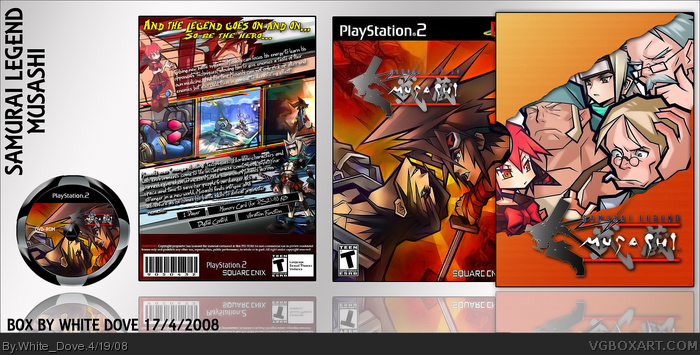
The copyright info is done pretty badly sorry. It is to short and the logos are to big. The whole temp seems mis sized in areas. The top of the front seems to thin. The whole PS2 black thing needs to come down some. The spine logo "PS2" seems to be stretched or something. The art looks cool but the temp and everything ruins it for me.
Looks good, don't let crit. get to you. Your a good artest.
Aww, don't worry guys I like crit, you just showed me now that I should stick into using my own temps like before. And I appreciate the help, thanks. :)
(it still feels like a disappoint ment, though. T.T)
I'll add a new version soon.
Agree with Trev. Actualy, I hate making copyright info too, but logos are realy too big. Hope you will fix it in future.
Everything else is awsome :)
+ Fav
I'm a pretty big sucker for quality presentation (Sometimes, presentation is more of an art than the box design itself.) and the sleeve is something that really attracts me to this. The fact that you created an indentation for gripping the case in the sleeve is a detail that a lot of people would neglect.
It doesn't happen often, but I'm happy to say that I'm favoriting this one.
Looks good.. I was gonna comment in the WIP after you modified the first post, but seeing as you posted it.. might as well comment here.
As mentioned by a few peeps above, I still think the temp is odd.. spine is too thick. If you need a proper size let me know ;)
Artwork and everything is great.
The sleeve is very eye-catching as Slyder mentioned, in fact its the best aspect of the box.
I have only one gripe, which stops me from loving it.
The template - I know you have your own distinct style of making custom temps for every box - but you really messed up with the proportions. Lots of parts, even some of the logos, seem squished and cramped. I suggest clicking the paperclip while re-sizing object in photoshop (if u use that) and then dragging from corners to perserve proportions.
Also, re-size an official front cover and back cover boxshot and put it in the BG of the box - so you get an idea of the proportions of the ESRB logos, dev logos, e.t.c.
I always use this method when working with a new template to keep everything in proportion.
So ATM I only "like" this because because its artistically fantastic, well composed, good typography e.t.c. but it is also technically flawed in the above mentioned department.
I'll correct these flaws and post the update tomorrow. Thanks for the help guys, but I wish if you could have told me all that in the critique forum. xD
Anyway, it's pretty late now, so till tomorrow. Thanks for favs and comments. :)
The box looks great! And though I agree with DMS on the esrb, dev, back info proportions, it's just a matter of technique and doesn't distract that much from the style of the box as a whole. No need for me to wait for the update then. ;)
#29, Really?? Then I am glad I didn't make the logo for this one or I'd have missplaced the name. xD
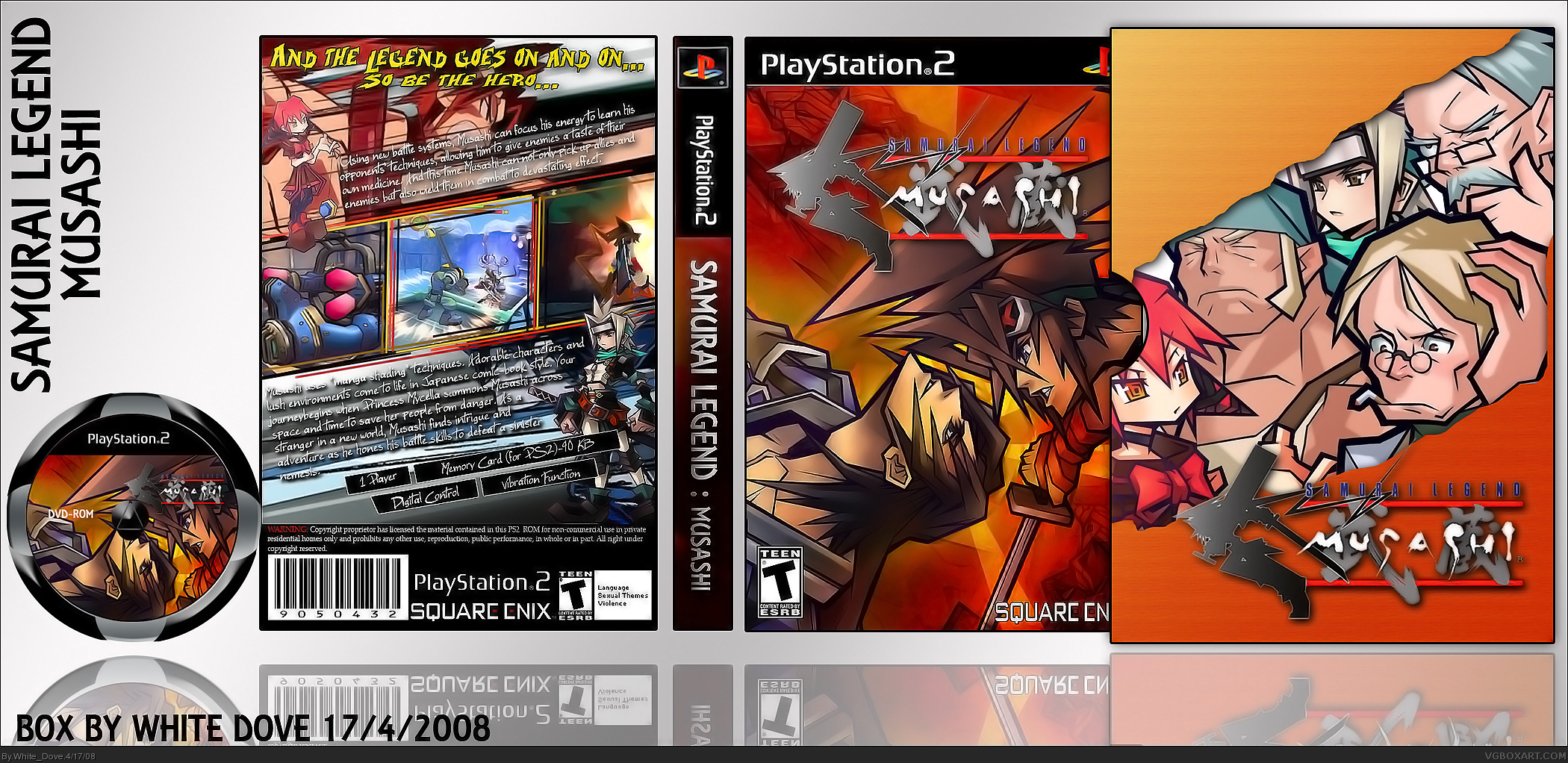
Version 2 added, I removed the spine cause it never looked good no matter what I did to it.
The warning comment on the back I didn't change (I've used it in every box I made and it was never a matter of annoyance to you guys >:()
I resized the PS2 template on the front and resized the logos. Hope it looks better now. :)
 Samurai Legend: Musashi Box Cover Comments
Fantastic yet again. The PS2 bar looks a little too short.
[ Reply ]
#1, in the first version it looked too long. xD
Thanks E_G. :)
So, I spent more time with this than with some boxes and was inspired by the slide from some authors who recently been doing it alot.
I found so many materials for this game which I'll share with you guys in the forum ( I've made some renders and cut the logo).
It was pretty fun working on this and I hope it looks decent.
Comments and favs are welcome as usual.:)
[ Reply ]
Something about that Spine looks very odd. I just cant think what though =/
[ Reply ]
#3, Yeah, the spine was wierd somehow. How about the BOX? I thik it is bigger than the spine. :p
[ Reply ]
Sorry double post, my server is horrible today.
Edited at 1 decade ago
[ Reply ]
The spine and back legal info is odd, but the rest is fantastic.
[ Reply ]
I remember this game... well I like the over all look, yet there is something about the main white text that bothers me. It just doesnt fit for me. Nice work =]
[ Reply ]
Eh, well I tried. Thought this was a good box, though. :/
[ Reply ]
The copyright info is done pretty badly sorry. It is to short and the logos are to big. The whole temp seems mis sized in areas. The top of the front seems to thin. The whole PS2 black thing needs to come down some. The spine logo "PS2" seems to be stretched or something. The art looks cool but the temp and everything ruins it for me.
Looks good, don't let crit. get to you. Your a good artest.
[ Reply ]
#8, Don't get me wrong it is a nice box don't worry =]
#9, Yeah trev is right, the crit is here to help and you are good
Edited at 1 decade ago
[ Reply ]
Aww, don't worry guys I like crit, you just showed me now that I should stick into using my own temps like before. And I appreciate the help, thanks. :)
(it still feels like a disappoint ment, though. T.T)
I'll add a new version soon.
[ Reply ]
#11, Glad to help, and looking forward to an update =]
Edited at 1 decade ago
[ Reply ]
Agree with Trev. Actualy, I hate making copyright info too, but logos are realy too big. Hope you will fix it in future.
Everything else is awsome :)
+ Fav
[ Reply ]
I love it, great job
[ Reply ]
I love it, great job
[ Reply ]
I'm a pretty big sucker for quality presentation (Sometimes, presentation is more of an art than the box design itself.) and the sleeve is something that really attracts me to this. The fact that you created an indentation for gripping the case in the sleeve is a detail that a lot of people would neglect.
It doesn't happen often, but I'm happy to say that I'm favoriting this one.
[ Reply ]
i like this its great
[ Reply ]
Thanks guys! ^^
[ Reply ]
Looks good.. I was gonna comment in the WIP after you modified the first post, but seeing as you posted it.. might as well comment here.
As mentioned by a few peeps above, I still think the temp is odd.. spine is too thick. If you need a proper size let me know ;)
Artwork and everything is great.
[ Reply ]
d(o.O)b
[ Reply ]
The sleeve is very eye-catching as Slyder mentioned, in fact its the best aspect of the box.
I have only one gripe, which stops me from loving it.
The template - I know you have your own distinct style of making custom temps for every box - but you really messed up with the proportions. Lots of parts, even some of the logos, seem squished and cramped. I suggest clicking the paperclip while re-sizing object in photoshop (if u use that) and then dragging from corners to perserve proportions.
Also, re-size an official front cover and back cover boxshot and put it in the BG of the box - so you get an idea of the proportions of the ESRB logos, dev logos, e.t.c.
I always use this method when working with a new template to keep everything in proportion.
So ATM I only "like" this because because its artistically fantastic, well composed, good typography e.t.c. but it is also technically flawed in the above mentioned department.
Edited at 1 decade ago
[ Reply ]
I'll correct these flaws and post the update tomorrow. Thanks for the help guys, but I wish if you could have told me all that in the critique forum. xD
Anyway, it's pretty late now, so till tomorrow. Thanks for favs and comments. :)
[ Reply ]
Wowers! This is really cool!
[ Reply ]
Have I started a slip case epidemic? There's a lot lately :) This is very nice btw.
[ Reply ]
#24, Actually I was inspired by yours and then after I made mine, 3 came right after. I might have started it as well... lol!
[ Reply ]
#24, Haha, yeah.
The box looks great! And though I agree with DMS on the esrb, dev, back info proportions, it's just a matter of technique and doesn't distract that much from the style of the box as a whole. No need for me to wait for the update then. ;)
+fav
[ Reply ]
yes, well... fave.
[ Reply ]
is this the month of slip cases or something??? anyway, very nice Dove
[ Reply ]
I've done a box of this game too :D But it was Musashi: Samurai Legend :D
[ Reply ]
#29, Really?? Then I am glad I didn't make the logo for this one or I'd have missplaced the name. xD
Version 2 added, I removed the spine cause it never looked good no matter what I did to it.
The warning comment on the back I didn't change (I've used it in every box I made and it was never a matter of annoyance to you guys >:()
I resized the PS2 template on the front and resized the logos. Hope it looks better now. :)
And thanks for HOF... :D
[ Reply ]