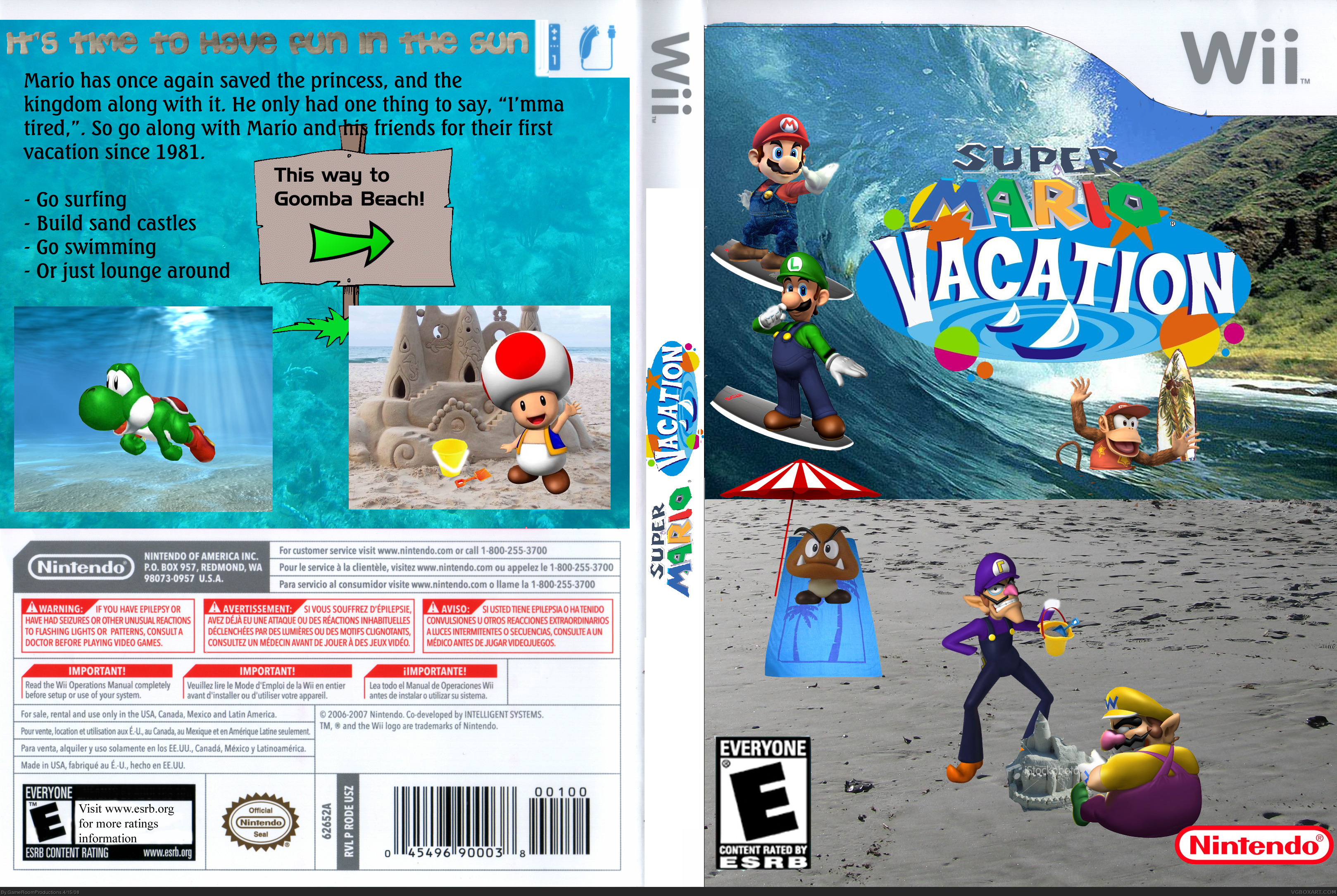
Wow, Gameroom, you really have improved! And i must say, it really does look like yoshi is swimming. the spit on the front is wierd and awkward, but still nice. And great logo! And great editing!
Its a good box!... 3/5...i mean could this really be a game ...wut would the plot be...onestly... try include things like Gooper Bloober or Gelatos and fishes...wait a minute ...diddy kong ? ahh well good box make me kinda happy ...#9 yes he has improved! i thought this was a satire when i saw it but good box well done!
 Super Mario Vacation Box Cover Comments
Hey...uh...yeah...this is my new box
[ Reply ]
Its not great but...... it sure is interesting O_o
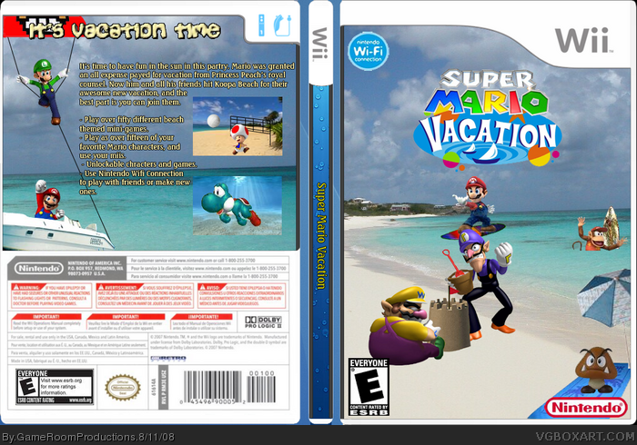
The back says "for their first vacation since 1981" but wasn't Super Mario Sunshine sorta like a vacation?
[ Reply ]
yeah and ow that i think about it i think mario party seven was too. w/e
[ Reply ]
haha i actually like this in a wierd sorta way... i gotta fav it for the wierdness, and that goomba under the sun umbreall cracks me up XDDDD
it just appeals to me somehow >_____< fav+
[ Reply ]
You know, now that I think about it, I actually do like this box!
Theres just something about it that appeals to me.
This box makes me happy ^_^
Should be in satire though surely?
[ Reply ]
i never knew wario and waluigi could float in water...
[ Reply ]
#5, exactly what i was thinking... odd isnt it, its kinda uplifting.
[ Reply ]
#7 Yes, it is funny we both near enough posted and faved this box at the same time!
#6 They aren't on water?
[ Reply ]
Wow, Gameroom, you really have improved! And i must say, it really does look like yoshi is swimming. the spit on the front is wierd and awkward, but still nice. And great logo! And great editing!
+fav
Edited at 1 decade ago
[ Reply ]
Make yoshi a bluer color to fit him with the water background. nice job by the way.
And Mario was on vacation on Super Mario World, Sunshine, and party 7.
[ Reply ]
Its a good box!... 3/5...i mean could this really be a game ...wut would the plot be...onestly... try include things like Gooper Bloober or Gelatos and fishes...wait a minute ...diddy kong ? ahh well good box make me kinda happy ...#9 yes he has improved! i thought this was a satire when i saw it but good box well done!
Edited at 1 decade ago
[ Reply ]
it dont look verry good, but i really like it.
fav.
b.t.w. the title on the spine is turnet at the wrong way.
[ Reply ]
Fixed spine logo and yoshi color
[ Reply ]
I like the logo.
Kinda messy though.
Edited at 1 decade ago
[ Reply ]
#14, thanks
[ Reply ]
jesus. look at this monstrosity. its not even worthy for a fave. its just too cheap looking.
[ Reply ]
The sand castle has stock-photo written right across it. :P
[ Reply ]
#17 To be fair, its not really noticable unless your on full view :P
[ Reply ]
May I ask one question to all of you? Why is CheezyPoofz acting like this to me? What did I do to him?
[ Reply ]
That.......is...................GREAT!!!!!!!!!! =)
honestly, i'd buy this(if i had a Wii)
Edited at 1 decade ago
[ Reply ]
updated and i believe improved
[ Reply ]
what with mario hand on the cover?
[ Reply ]
love the update!
[ Reply ]
#23, thanks man
[ Reply ]
#24, no problom dude
just dont like mario's fingers on the front
Edited at 1 decade ago
[ Reply ]
. . . Just makes me want to swim. . . .
[ Reply ]
this is awesome! cool logo!
[ Reply ]
#27, 2 years old box, huh?
[ Reply ]
Funny.....
[ Reply ]