Sorry I had to add this again, my other wasn't updateing propperly, so could someone PM Reed to delete my other one and if someone could PM me a better 'purple version' logo if they can make a better one please do so, thanks, any thoughts?
if somone could get me an image of charmander, sqirtle and baulbasaur (like ive got on this one could they PM it to me that would be great credit to be given
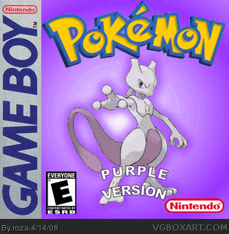
well this is nice but i wuld not hv had mewtwo on the frontbecause hes not a regular legendary pokemon in the sense that youcan get him in all tha gba ones
The front is decent, but the back could use some improvements.
-I don't get what the point is of putting the menu screen as a screenshot. A main menu simply isn't worthy of that since it doesn't showcase the gameplay. Also, the Pokemon logo shouldn't overlap it. Relatedly, the screenshot of the character in his room is rather dull, unlike the one under it which manages to show the gameplay of the overworld and its people.
-There is a sizable section of empty space between the logo and the three Starters.
-The text has a generic font, and the description itself could be improved. Since it's based on the older Pokemon games, touting its "2D graphics" doesn't really make sense since most games were 2D back then (meaning 2D graphics weren't particularly technologically impressive or original).
-Usually companies don't brag about their system being "the best" of its kind, even if it's regarded as true by most. ;p Additionally, going from that sentence and then back to the plot of the rival competing for the title of Champion is awkward.
-Saying that there are eight Gym Leaders which hand out eight gym badges is redundant; you can simply put something like, "...defeat the eight gym leaders to earn badges!"
+I like the idea of there being a "Purple" version, though "Violet" might be a better word for a title since it sounds more appealing.
I think you should keep the "Purple" theme in mind and update it in the future. :)
#23, You really should pay more attention to post dates. It's been over two years since this was uploaded, and the artist has grown significantly since then. Critiquing this is like critiquing a drawing an adult did as a child.

 Pokemon: Purple Version Box Cover Comments
Sorry I had to add this again, my other wasn't updateing propperly, so could someone PM Reed to delete my other one and if someone could PM me a better 'purple version' logo if they can make a better one please do so, thanks, any thoughts?
Edited at 1 decade ago
[ Reply ]
i like it
[ Reply ]
sorry
Edited at 1 decade ago
[ Reply ]
sorry for the triple post
Edited at 1 decade ago
[ Reply ]
its alright
any other thoughts?
[ Reply ]
Its good
[ Reply ]
box updated, added aback and spine, so how how does it look now?
[ Reply ]
anythoughts at all?
[ Reply ]
How did you get the text to bend like that?
[ Reply ]
what text, oh, used power point, and cut & pasted it to fireworks
Edited at 1 decade ago
[ Reply ]
would anyone say this is HoF worthy?
[ Reply ]
#1, i've done the purple version logo, and sorry, it isn't HoF worthy.
[ Reply ]
updated, 'purple version' by HyperShadow2008 *credit*
[ Reply ]
if somone could get me an image of charmander, sqirtle and baulbasaur (like ive got on this one could they PM it to me that would be great credit to be given
[ Reply ]
Wow!Its pretty cool and i love the logo of it and it look's like a pokemon game boy logo i will fav!
[ Reply ]
up dated, added a main menu screen shot (top right) enjoy!
[ Reply ]
8/10 little ruff around nintendo official box sign and wobbly "P" and "V" in purple virsion apart from the nice job
[ Reply ]
ok ill try and fix that
Edited at 1 decade ago
[ Reply ]
now its fav worthy
[ Reply ]
This box art is nice the back of the box has pictures that make it look official.
[ Reply ]
well this is nice but i wuld not hv had mewtwo on the frontbecause hes not a regular legendary pokemon in the sense that youcan get him in all tha gba ones
[ Reply ]
nice box +fav
[ Reply ]
The front is decent, but the back could use some improvements.
-I don't get what the point is of putting the menu screen as a screenshot. A main menu simply isn't worthy of that since it doesn't showcase the gameplay. Also, the Pokemon logo shouldn't overlap it. Relatedly, the screenshot of the character in his room is rather dull, unlike the one under it which manages to show the gameplay of the overworld and its people.
-There is a sizable section of empty space between the logo and the three Starters.
-The text has a generic font, and the description itself could be improved. Since it's based on the older Pokemon games, touting its "2D graphics" doesn't really make sense since most games were 2D back then (meaning 2D graphics weren't particularly technologically impressive or original).
-Usually companies don't brag about their system being "the best" of its kind, even if it's regarded as true by most. ;p Additionally, going from that sentence and then back to the plot of the rival competing for the title of Champion is awkward.
-Saying that there are eight Gym Leaders which hand out eight gym badges is redundant; you can simply put something like, "...defeat the eight gym leaders to earn badges!"
+I like the idea of there being a "Purple" version, though "Violet" might be a better word for a title since it sounds more appealing.
I think you should keep the "Purple" theme in mind and update it in the future. :)
[ Reply ]
#23, You really should pay more attention to post dates. It's been over two years since this was uploaded, and the artist has grown significantly since then. Critiquing this is like critiquing a drawing an adult did as a child.
[ Reply ]
I Love It!
[ Reply ]
Sorry
Edited at 1 decade ago
[ Reply ]
Sorry Man
Edited at 1 decade ago
[ Reply ]
Sorry Quadruple Post
Edited at 1 decade ago
[ Reply ]