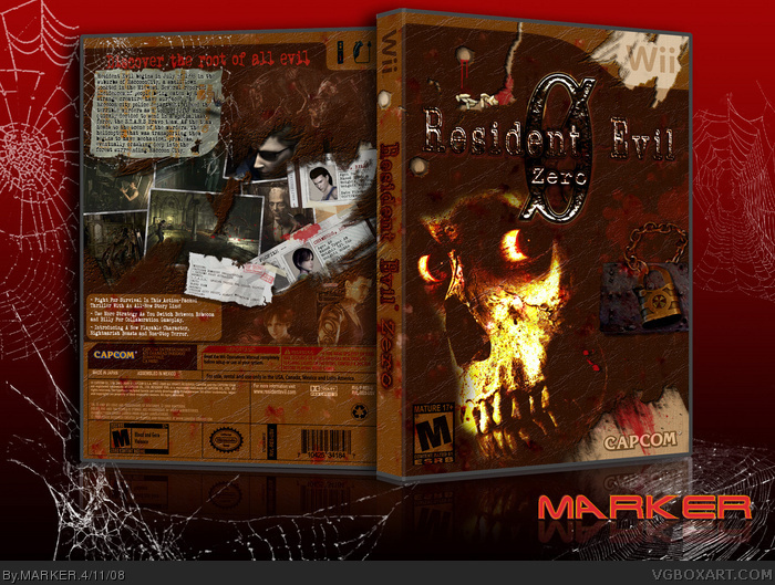
I know the game is not suppose to be coming out to western shores... but what the heck... I started making the printable cover anyway.. probably change to Japanese Biohazard. Also, didn't add the "Wii Edition" bit as I didn't know if it would feature.
Anyway.. this is based on my Oblivion cover with a full texture theme.. a sort of 'book of the dead' look -- and I wanted it more horror/scary-like rather than the normal 2 characters just standing around on the front which were boring.
As usual, best (?) in full view... and I might upload the 300dpi printable so you can look UP CLOSE! ;)
**UPDATE V2** + V2 300dpi Printable**
Changed logo back to my original logo which was ripped from the original gamecube cover. It was really dark and you could barely see it apart from the highlights. I've tweaked it a bit. V1 had a red version of the logo underneath to highlight it. Does it look better?
#4, Cobwebs are brushes ;) Grab them here as well as loads of other great brushes: link
#11, Changed box to grey movie dvd case for less clashing. ;) Texture is actually a LEATHER filter.
#12, I used the Evil Dead image as mentioned in my first comment, as the artwork/rendered images for the game was too dull and I wanted a more scary/horror-like box, and Evil dead pic suited it I think. Plus it bleanded in well since the original was mostly a white colour.
#13, Go to the forums. Top right!
#15, OOps. Changed to normal 'non-digital'. My original logo had white on it on the Pro Logic II bit that stood out like a beacon. I reloaded the another EPS logo of it, and must have clicked the wrong one in. Sorry. Fixed! ;) Well spotted!
OH.. this took bloody ages to do as Photoshop was slowing down because of the texture of the box I think. My PSD files is over 103MEG!! BTW... did anyone noticed I used a McDonald's Cheeburger wrapper for the back of the description text? LOL
I have to say that as a box in general this is amazing. Very well done indeed, however, as a Resident Evil box, I really dislike it. The Evil Dead image is very far away from proper RE imagery, it just doesn't look right. Had you gotten a zombie image it might've been more acceptable.
Quality is amazing, it just doesn't fit the title, I'm afraid.
I really like the effects and the Cheeburger warper. xD I just don't like the grey plastic of the box, it clashs with the brown of the cover.
Wonderful back, by the way, I always wanted to do that style... never was successful... ehm, I'll fav 'cause it has awesome work.
...but I don`t get why people tend to change fixed elements, like the white "wii"-border, or the esrb-logo. specially if they don`t change the games logo, to make it fit the other elements O.o
 Resident Evil Zero: Wii Edition Box Cover Comments
Gives me goosbumps. great
[ Reply ]
I know the game is not suppose to be coming out to western shores... but what the heck... I started making the printable cover anyway.. probably change to Japanese Biohazard. Also, didn't add the "Wii Edition" bit as I didn't know if it would feature.
Anyway.. this is based on my Oblivion cover with a full texture theme.. a sort of 'book of the dead' look -- and I wanted it more horror/scary-like rather than the normal 2 characters just standing around on the front which were boring.
As usual, best (?) in full view... and I might upload the 300dpi printable so you can look UP CLOSE! ;)
[ Reply ]
this is amazing MARKER!!5/5 +FAV
[ Reply ]
i like the cobwebs
[ Reply ]
nice fave
[ Reply ]
Wow, really nice job, MARKER.
[ Reply ]
The logo doesnt really fit well with the front.
[ Reply ]
maybe make the log less bright to fit with the front.
[ Reply ]
.
[ Reply ]
#9, That was just spam, at least make an effort to post something meaningful.
[ Reply ]
Pretty cool, but the white plastic clashes with the rest of the box, and the effect isn't my favorite. It looks more like mud than it does grunge.
[ Reply ]
Really cool but why did use a Evil Dead 2 picture?
[ Reply ]
i like this box 7/10, but sorry about off topic, how do you Pm or check if you have any?
[ Reply ]
FINALLY a good box! 5/5
[ Reply ]
Dolby Digital from the Wii? I shall not favourite this because of this gross technical inaccuracy!
J/k :P
This is awesome.
[ Reply ]
**UPDATE V2** + V2 300dpi Printable**
Changed logo back to my original logo which was ripped from the original gamecube cover. It was really dark and you could barely see it apart from the highlights. I've tweaked it a bit. V1 had a red version of the logo underneath to highlight it. Does it look better?
#4, Cobwebs are brushes ;) Grab them here as well as loads of other great brushes:
link
#11, Changed box to grey movie dvd case for less clashing. ;) Texture is actually a LEATHER filter.
#12, I used the Evil Dead image as mentioned in my first comment, as the artwork/rendered images for the game was too dull and I wanted a more scary/horror-like box, and Evil dead pic suited it I think. Plus it bleanded in well since the original was mostly a white colour.
#13, Go to the forums. Top right!
#15, OOps. Changed to normal 'non-digital'. My original logo had white on it on the Pro Logic II bit that stood out like a beacon. I reloaded the another EPS logo of it, and must have clicked the wrong one in. Sorry. Fixed! ;) Well spotted!
OH.. this took bloody ages to do as Photoshop was slowing down because of the texture of the box I think. My PSD files is over 103MEG!! BTW... did anyone noticed I used a McDonald's Cheeburger wrapper for the back of the description text? LOL
Edited at 1 decade ago
[ Reply ]
Amazing job, but I think the background may be a bit too strong for me. +fav
[ Reply ]
Nice update.
[ Reply ]
great update! are those brushes compatible with all photoshops
[ Reply ]
#19, Ermm, very likely. Just download and try ;) I'm using CS2. unzip, and put them in your photoshop preset/brushes/ folder.
[ Reply ]
I have to say that as a box in general this is amazing. Very well done indeed, however, as a Resident Evil box, I really dislike it. The Evil Dead image is very far away from proper RE imagery, it just doesn't look right. Had you gotten a zombie image it might've been more acceptable.
Quality is amazing, it just doesn't fit the title, I'm afraid.
[ Reply ]
#16, I did! It was freaking hilarious! I never noticed that until now.
Great job, MARKER. I can tell a lot of effort was put into this.
[ Reply ]
I really like the effects and the Cheeburger warper. xD I just don't like the grey plastic of the box, it clashs with the brown of the cover.
Wonderful back, by the way, I always wanted to do that style... never was successful... ehm, I'll fav 'cause it has awesome work.
[ Reply ]
I just gave you your 1,400th fav! Great job on this, Marker. You did it again.
[ Reply ]
that is really scary
[ Reply ]
I just noticed you have the plot to the Resident evil 1 game.
[ Reply ]
parfait
[ Reply ]
...but I don`t get why people tend to change fixed elements, like the white "wii"-border, or the esrb-logo. specially if they don`t change the games logo, to make it fit the other elements O.o
[ Reply ]
how do you make these look like 3-D models?
[ Reply ]