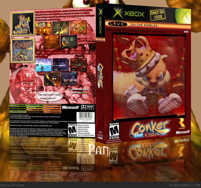
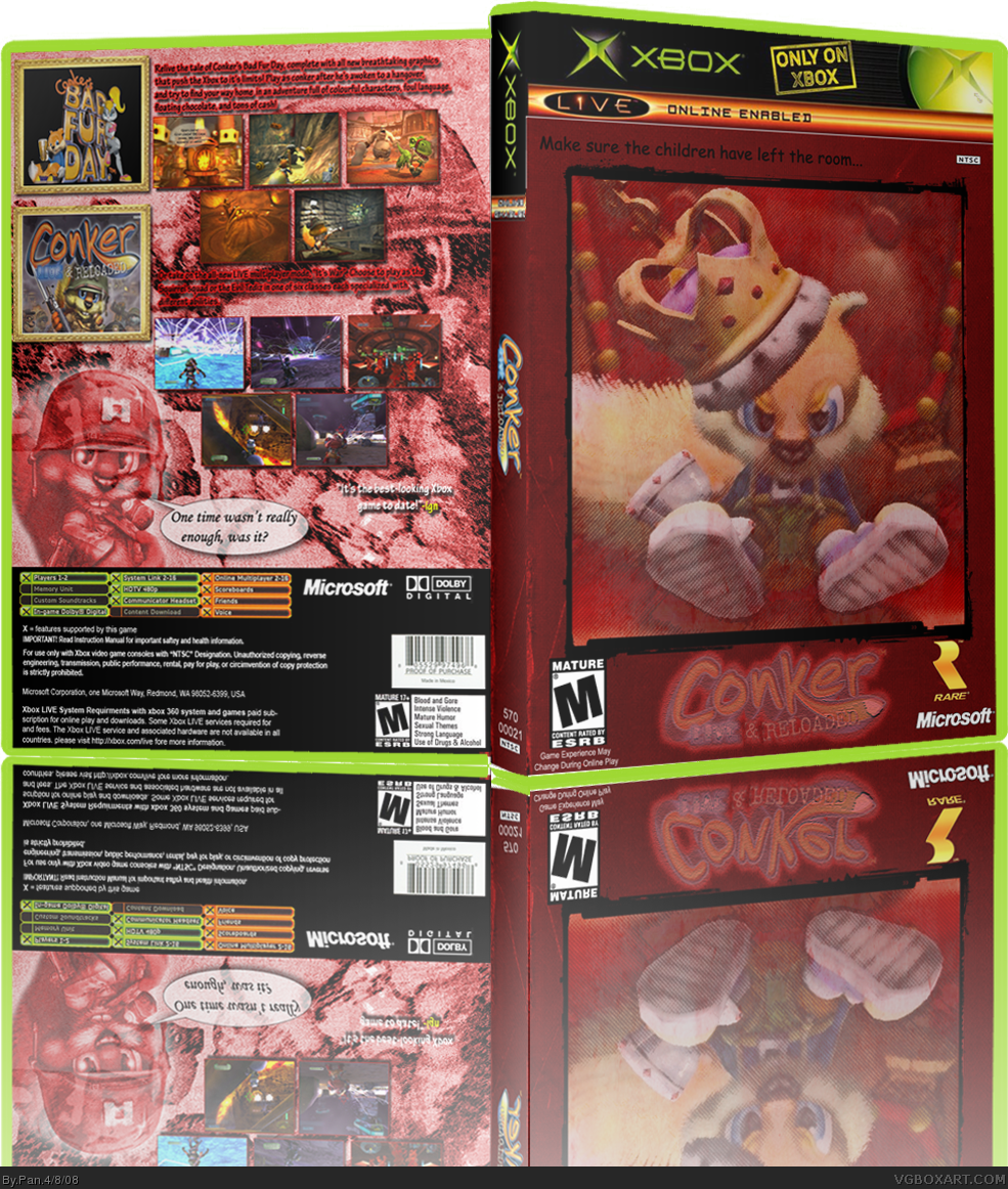
[ Buy Conker: Live... at Amazon ] By Pan 48 on April 8th, 2008 Download Printable [ Box updated on June 14th, 2008 ] [ original ] Conker: Live and Reloaded Box Cover Comments Comment on Pan's Conker: Live and Reloaded Box Art / Cover. Cancel Reply Pan 48 [ 1 decade ago ] Wow, this one took awhile, it's 3 AM now. XP Printable version may still need some work, but I'm sick of messing with it for now. [ Reply ] Saint 4 [ 1 decade ago ] I wouldn't post a box this late, it will get no attention. [ Reply ] Pan 48 [ 1 decade ago ] #2, Thought about that, but I'm still at the stage where I can only post 1 box per day so I did it anyway. [ Reply ] Reed 36 [ 1 decade ago ] #2, Doesn't matter. It's not like it disappears or anything. It's still at the top of the list this morning. [ Reply ] evklinken 3 [ 1 decade ago ] Looks good, though that logo is VERY hard to see. Overall 3/5. You could do better because you made some amazing boxes. [ Reply ] Dersnap 41 [ 1 decade ago ] You'll be a Veteran one day, I know it. :) The only problems are the logo placement and color (you can't see it very well) and the reflection (it just looks like you turned the box upside down and left it that way), good overall. [ Reply ] Veronica 41 [ 1 decade ago ] I don't like how faded the images on the front are. But I think it's rather nice. Edited at 1 decade ago [ Reply ] Pan 48 [ 1 decade ago ] I took the time to fix the printable version of this old box up. I upscaled it to 200 DPI, redid all the back info by hand, used a nicer looking Xbox border, and unfaded the games logo. [ Reply ]
 Conker: Live and Reloaded Box Cover Comments
Wow, this one took awhile, it's 3 AM now. XP
Printable version may still need some work, but I'm sick of messing with it for now.
[ Reply ]
I wouldn't post a box this late, it will get no attention.
[ Reply ]
#2, Thought about that, but I'm still at the stage where I can only post 1 box per day so I did it anyway.
[ Reply ]
#2, Doesn't matter. It's not like it disappears or anything. It's still at the top of the list this morning.
[ Reply ]
Looks good, though that logo is VERY hard to see. Overall 3/5. You could do better because you made some amazing boxes.
[ Reply ]
You'll be a Veteran one day, I know it. :)
The only problems are the logo placement and color (you can't see it very well) and the reflection (it just looks like you turned the box upside down and left it that way), good overall.
[ Reply ]
I don't like how faded the images on the front are. But I think it's rather nice.
Edited at 1 decade ago
[ Reply ]
I took the time to fix the printable version of this old box up.
I upscaled it to 200 DPI, redid all the back info by hand, used a nicer looking Xbox border, and unfaded the games logo.
[ Reply ]