Are you going to provide credit for the fan art DMS? It's a top notch piece of work no doubt. The TP logo size ruins it a little bit for me, it feels a little cramped there. I think you should make it smaller.
First of all apologies for not commenting, I was having some ISP problems last night.
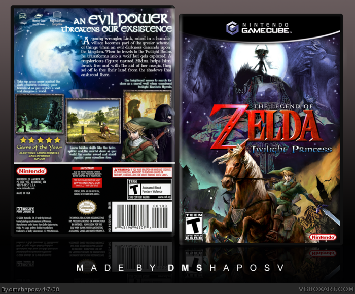
Anyway, I 'll first start of by saying that I wanted to go for a totally different look for a Zelda box which sort of reflected the darker mood of the game ,unlike the earlier ones that have followed in the footsteps of LK's massively popular box. :)
For my composition I need some artwork to be in a certain way, so credit to 19works who made the artwork of midna with the moon and the environment behind link on teh front cover. I needed to modify them to make them look like the official art by giving them a slightly "sketchy" impressionist look. Everything else is official artwork editted or modified by me as usual.
You can pretty much imagine I went over a million layers airbrushing//blending stuff and was getting sick and tired of this box towards the end that I even spelled "existence" wrong as LK pointed out and couldn't be bothered to fix it (I noticed it mins before uploading). ;P - I actually want to keep the wrong spelling as it'll remind of my madness towards the end of the box. Gahhhh.
Also credit to Techne for the template, which again was modified by me to suit the game. BTW EG that logo is the exact same size as that on the official box and anything smaller and bigger looked disproportionate.
Anway thanks for the comments and favs, sorry for writing such a big comment/rant/novel, lol. I wanted to say loads of stuff last night but damn ISP!
Holy hell, I want that box. O_O Words can't describe how much I wish that was the official box. Not saying the official one is bad (I love the artwork), but this one...just, wow. 100% win, 5/5.
 The Legend of Zelda: Twilight Princess Box Cover Comments
Is nice. b(o.o)b
Edited at 1 decade ago
[ Reply ]
Really great. fav+
[ Reply ]
Bummer for you, Al.
Haha #1, you said boob.
[ Reply ]
.
?
!
:D
[ Reply ]
#3, very funny. -.-
[ Reply ]
Fail. You suck at life, kill yourself, noob. 1/5
[ Reply ]
This is my favorite box on the site.
[ Reply ]
#3, lol
Fantastic, DMS! ;)
[ Reply ]
>_0
[ Reply ]
i see the light.
[ Reply ]
I should just stop making boxes now, because I am never ever going to even come close to topping this.
[ Reply ]
Are you going to provide credit for the fan art DMS? It's a top notch piece of work no doubt. The TP logo size ruins it a little bit for me, it feels a little cramped there. I think you should make it smaller.
[ Reply ]
Too many different colors on the front as for me. But back looks awsome.
+ Fav
[ Reply ]
n00b
[ Reply ]
Damn, that was fast.
[ Reply ]
Fastest Hof ever!
[ Reply ]
Better than LKs in my opinion, LOVE the moonlight effects!
[ Reply ]
Really nice. Lots of fading xD
[ Reply ]
DMS didn't comment ONCE, why not, DMS?
[ Reply ]
I wish this were real. 5/5 +fav!
[ Reply ]
#19, Yeah...come on DMS, show us some love! :D
Btw...you spelled "existence" wrong for the back tagline. :P
[ Reply ]
i hate missing out on such Awesomeness :D +Fav!
[ Reply ]
First of all apologies for not commenting, I was having some ISP problems last night.
Anyway, I 'll first start of by saying that I wanted to go for a totally different look for a Zelda box which sort of reflected the darker mood of the game ,unlike the earlier ones that have followed in the footsteps of LK's massively popular box. :)
For my composition I need some artwork to be in a certain way, so credit to 19works who made the artwork of midna with the moon and the environment behind link on teh front cover. I needed to modify them to make them look like the official art by giving them a slightly "sketchy" impressionist look. Everything else is official artwork editted or modified by me as usual.
You can pretty much imagine I went over a million layers airbrushing//blending stuff and was getting sick and tired of this box towards the end that I even spelled "existence" wrong as LK pointed out and couldn't be bothered to fix it (I noticed it mins before uploading). ;P - I actually want to keep the wrong spelling as it'll remind of my madness towards the end of the box. Gahhhh.
Also credit to Techne for the template, which again was modified by me to suit the game. BTW EG that logo is the exact same size as that on the official box and anything smaller and bigger looked disproportionate.
Anway thanks for the comments and favs, sorry for writing such a big comment/rant/novel, lol. I wanted to say loads of stuff last night but damn ISP!
Edited at 1 decade ago
[ Reply ]
One question.
How excited were you when you got the cover to flow so good?
LOL
[ Reply ]
It looks really great, I like the front more than the back. +fav
[ Reply ]
As usual, looks amazing. ;)
[ Reply ]
@#24,I went into a hissy fit like a jap school girl.
[ Reply ]
Holy hell, I want that box. O_O Words can't describe how much I wish that was the official box. Not saying the official one is bad (I love the artwork), but this one...just, wow. 100% win, 5/5.
[ Reply ]
It really evokes an epic feel. The artwork transition is seamless on the front. As usual +fav.
[ Reply ]
Fantastic!
[ Reply ]
need...printable...please?
[ Reply ]
April 7th, 2008 !!!!!
[ Reply ]