Very cool.
At first i thought you just used one picture for the front, then i looked in full view and saw the blending and grunge effects you added.
Really nice job.
Hmm okay! Well i think this box is very nice. I do prefer your other Bioshock box though but maybe thats because I like the other-style Big Daddy more. And I think this would look better with the official Bioshock logo?
I don't like this one. The logo could easily go below the Little Sister, and your logo is pretty boring. The back is REALLY plain. It could use some characters at least.
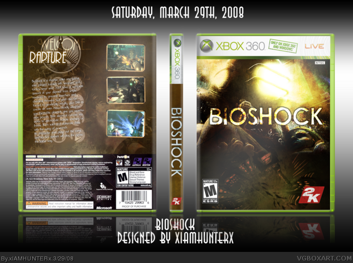
The brown and yellow scheme feels balanced and compliments each other nicely. I'm also diggin' the simple, but effective layout for the back. Great job! :)
 BioShock Box Cover Comments
Fixed from yesterday, full view fo' sho', new custom temp, don't tase me bro.
*gang sign*
Edited at 1 decade ago
[ Reply ]
cool temp 5/5 +fave
[ Reply ]
Dont like the temp, the Xbox Live thing is messed up at the top.
[ Reply ]
Very cool.
At first i thought you just used one picture for the front, then i looked in full view and saw the blending and grunge effects you added.
Really nice job.
[ Reply ]
#3, No it's not, that's what they're doing now.
link
It's on Vegas 2, Bloodshot, and PES08.
[ Reply ]
#5 Wow.... really? God that sucks =/
[ Reply ]
#6, I actually think it looks better. >_>
[ Reply ]
should i get this game?
[ Reply ]
#8, YES. FOR THE LOVE OF ALL THINGS HOLY, GET BIOSHOCK. RIGHT NOW.
[ Reply ]
#7 Are you sure your right?
link
And its on the new GTA link
[ Reply ]
#10, Trust me, I have Vegas 2. I'll do a scan later. And I saw it at Target on those other two games.
[ Reply ]
I like it dude =d
[ Reply ]
Hahahaha, you spelled "the" wrong.
[ Reply ]
+se...
I mean +fav
[ Reply ]
#13, That'd be funny if I did, like you, but I didn't.
[ Reply ]
#11 Maybe its different in Europe and the US?
[ Reply ]
Perhaps. :P
Either way, please don't downgrade the box because of a cosmetic preference with the temp.
[ Reply ]
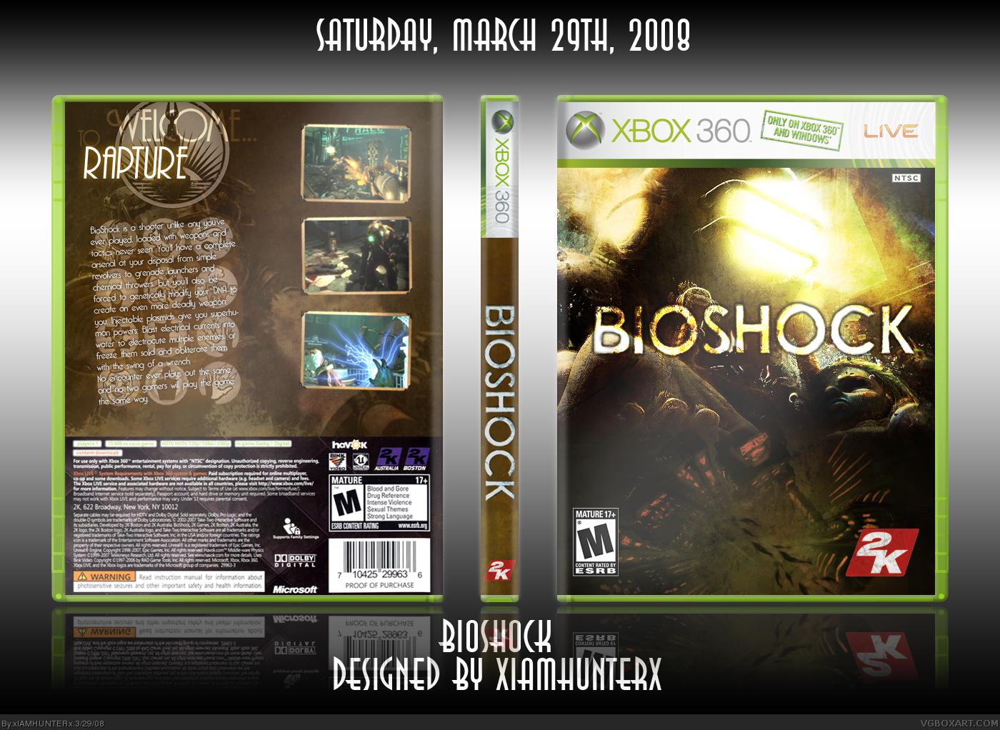
Hmm okay! Well i think this box is very nice. I do prefer your other Bioshock box though but maybe thats because I like the other-style Big Daddy more. And I think this would look better with the official Bioshock logo?
[ Reply ]
That is the official, just without the background, which covered up too much of the art.
[ Reply ]
I don't like this one. The logo could easily go below the Little Sister, and your logo is pretty boring. The back is REALLY plain. It could use some characters at least.
[ Reply ]
#20, That's why you full view.
And why do people not understand that if it were below the Little Sister, it would be TOUCHING THE ESRB?!
[ Reply ]
#21, it wouldn't be tocuhing the ESRB.
[ Reply ]
Well, it would barely be above it.
Look, I just tried moving it down. It doesn't look good.
[ Reply ]
you hardly changed it. when i said "don't slant text" i didn't mean "just straighten it SLIGHTLY".
[ Reply ]
I love the back copy right background.
I see you have the same screen shot border =O lol
Edited at 1 decade ago
[ Reply ]
#25, Oh balls, that's right. Credit to ElCrazy for the screen borders. >__<
And thanks. :P
[ Reply ]
Fantastic box, man.
The brown and yellow scheme feels balanced and compliments each other nicely. I'm also diggin' the simple, but effective layout for the back. Great job! :)
[ Reply ]
#27, Wootz. :P
[ Reply ]
muito bom recomendo
[ Reply ]