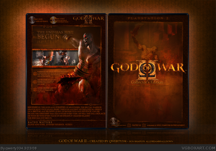
(Okay, so first of all, please don't go bashing on me about using an unofficial template and not putting legal info or the official ESRB logo. This is a Collector's Edition.)
For this box, I wanted to portray the epic, brutal, bloody feel of God of War II.
Looking back at my first box, I can truly say I've improved not only at Photoshop, but also at my artistry.
I think. XD
I love critisism, comments, and faves.
[ps] I know there's been a lot of God of War boxes lately.. but I started this way before the trend.
[ps2]<-(haha) View in full please. ;)
Thanks for the stunning comments, everybody. ^___^
#29 - I see what you're saying, but that was a stylistic choice I made... If he was just in normal colors and wasn't blended, the box wouldn't have that true Collector's Edition feel.
#31 - Is it jealousy I'm sensing? *bumps Hunter's box*
 God of War II: Collector's Edition Box Cover Comments
(Okay, so first of all, please don't go bashing on me about using an unofficial template and not putting legal info or the official ESRB logo. This is a Collector's Edition.)
For this box, I wanted to portray the epic, brutal, bloody feel of God of War II.
Looking back at my first box, I can truly say I've improved not only at Photoshop, but also at my artistry.
I think. XD
I love critisism, comments, and faves.
[ps] I know there's been a lot of God of War boxes lately.. but I started this way before the trend.
[ps2]<-(haha) View in full please. ;)
Edited at 1 decade ago
[ Reply ]
I'm loving this, so stylish.. Faved
[ Reply ]
love the way Kratos is blended on the back, but i think his arm should be there, not just a stump! :D
Edited at 1 decade ago
[ Reply ]
sweet
[ Reply ]
MMMMMKAY. +FAV
[ Reply ]
Thanks everybody. :D
#3- Yeah, I should fix that..
[ Reply ]
OH MY GOD!!! THIS IS FUCKING AWESOME!!! YOU WIN!!!!!
[ Reply ]
Fanfreakintastic!!! +Fav!
[ Reply ]
This is sick!!!
[ Reply ]
Sick!
[ Reply ]
#9-10, sick.
=P
[ Reply ]
Thanks for all the sick comments!
XD
[ Reply ]
That's like...godly! haha, get it...godly, god of war. Ok I'm done. LOL XD
I love how this turned out, the special collector's edition feel gives the box its own distinct style. Superb job, my friend. ;)
[ Reply ]
Noice.
qwerty
qwerty
qwerty
Sorry, it's just so fun to type.
[ Reply ]
Fantastic.. love it! ;)
See you used JUST Kratos in the end! ;)
Edited at 1 decade ago
[ Reply ]
sweet qwerty (that is fun to type)
[ Reply ]
congratulations on the hall :)
Edited at 1 decade ago
[ Reply ]
I would have went with out the PS2 stuff logo and ESRB rating things but this shit is SICK!
[ Reply ]
Hahaha, thanks everybody.
qwerty qwerty qwerty qwerty qwerty qwerty
^Yep it is fun to type.
qwerty qwerty
Ok I'll stop now.
qwerty
MEE IZ hypErz fROM eastor KANDIE
Edited at 1 decade ago
[ Reply ]
haha, just how old are you exactly, 10? LOL. :P
[ Reply ]
i leterally quit .... lol jk awsome box thoe +fav
[ Reply ]
192 views and it is in HoF
i like that
[ Reply ]
#20- Haha, no I'm 15. My parents just treat me like a 10-year-old. XD
[ Reply ]
#23, lmao
[ Reply ]
Eh... i still don't like the characters on the front =(
But overall, box looks great. And Kratos on the back cover is awsome.
+ Fav
[ Reply ]
Beautiful.
[ Reply ]
exellent case ! 5/5
[ Reply ]
WIN.
[ Reply ]
Very well made, although I kinda feel kratos gets lost in the front cover where as he should've been the most prominent thing on it. ;)
Great work on the back, though.
[ Reply ]
wow. Very nice. 5/5. +fav
[ Reply ]
Bob Saget, NOW I know why mine didn't get as much attention. >___<
[ Reply ]
Thanks for the stunning comments, everybody. ^___^
#29 - I see what you're saying, but that was a stylistic choice I made... If he was just in normal colors and wasn't blended, the box wouldn't have that true Collector's Edition feel.
#31 - Is it jealousy I'm sensing? *bumps Hunter's box*
[ Reply ]
Oh...wow.
[ Reply ]
#32, Haha, not at all, just sheer admiration. :P
[ Reply ]
qwerty is also a linkin park song
[ Reply ]
O.O
Fav
[ Reply ]
Awesome!
[ Reply ]