#9, I was thinking of doing something like yours lol
#10, I don't understand the second sentence XD
#11, the screens are there, they're just blended :P
im trying to make a box kinda like this but im having trouble with the background and stuff like that so if somebody could help me i would appriciate it
 Sonic the Hedgehog Box Cover Comments
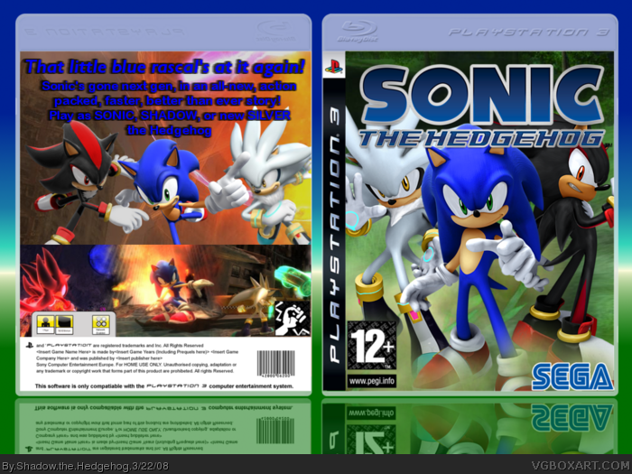
Second box in the Trilogy. Last one is Silver the Hedgehog, which while be the hardest :D
[ Reply ]
cool
[ Reply ]
Honestly, I hate the back. The font is boring, and it's very empty. The screenshots need somesort of border over them, and blue jsut doesn't work.
[ Reply ]
#3, Weren't you the one that suggested the font?
[ Reply ]
#4, I suggested ARIAL ROUNDED. :P
That's just normal Arial, I believe.
[ Reply ]
#5, No its Arial Rounded. I had to illegally download it to get it <_<
[ Reply ]
#6, I see, I was looking at the tagline font.
[ Reply ]
#7, Oh thats verdanna or something. I forget XD
[ Reply ]
Cool shadow. I'm looking forward to the Silver the Hedgehog one, to see if it beats mine! XD
Yeah i don't like the font for the back though.
[ Reply ]
Good. 75 out of 100. That three times the Super Size Me cover! DON'T WATCH IT!!!
[ Reply ]
Maybe have a bit less going on in the back, and include screens.
[ Reply ]
#9, I was thinking of doing something like yours lol
#10, I don't understand the second sentence XD
#11, the screens are there, they're just blended :P
[ Reply ]
#12, Front is sweet, I agree with changing up the back tagline style though. Perhaps white text with a blue stroke? :)
[ Reply ]
#13, What's a stroke? XD
[ Reply ]
im trying to make a box kinda like this but im having trouble with the background and stuff like that so if somebody could help me i would appriciate it
[ Reply ]