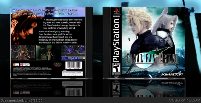
The back is not bad but it could be better. There's a ton of art for this so you can use something more exciting.
I suggest you rearrange the back so you could fit a tagline in and that you use a subtle drop shadow for the screenshots instead of the black outline thing.
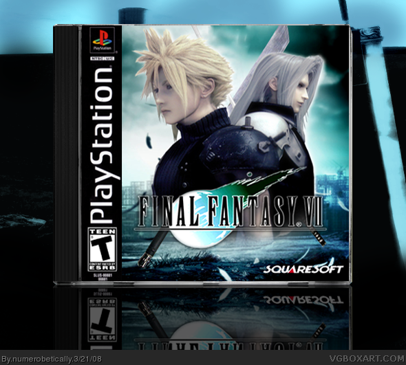
I like the front, looks epic. But that back... well.
I'm not feeling it. And to tell you the truth it was the front that sold me, but if i flipped it over, i might give it a chance.
 Final Fantasy VII Box Cover Comments
<3
[ Reply ]
temp is mine, haha i took a picture of a crash bandicoot case and edited it. i think it turned out alright.
#1 thanks :)
Edited at 1 decade ago
[ Reply ]
Really effective, good job.
[ Reply ]
Is there a back coming, I would so fav if there was .... :(
[ Reply ]
Nicely done. :)
[ Reply ]
I like it, It's pretty, It's as good as Noodles:)
Edited at 1 decade ago
[ Reply ]
+fav, i really like it
[ Reply ]
Good Job!
[ Reply ]
#1, omg I was gonna say the same thing!
[ Reply ]
yeah there is. i just had to go to the gym before dinner and now i'm exhausted and guess what? now i'm not even hungry...
anyway, there WILL be a back, i promise, i'm working on it right now
thanks for the faves!
[ Reply ]
Very clean. Excellent temp.
[ Reply ]
This is very nice, i like your temp as well. I have to agree with the comments up there. Needs a pretty back =] Well done.
[ Reply ]
i'm about 3/4 of the way done, all i need to do is a description pretty much :)
[ Reply ]
okay so i updated the wrong version at first but now it's the right one, so it's all good. tell me what you think of the back
[ Reply ]
The back is not bad but it could be better. There's a ton of art for this so you can use something more exciting.
I suggest you rearrange the back so you could fit a tagline in and that you use a subtle drop shadow for the screenshots instead of the black outline thing.
[ Reply ]
#2 thats what i did to! you works is very very good im lgvin it!
[ Reply ]
Not bad, the back is kinda plain, still good though =) a little cutting problems with aeris on the background, other then that is awsome 3.5/5
[ Reply ]
Wow, your definatly getting better! Love the front but the back is a tad simple. Pleasing to look at though.
[ Reply ]
#15 i didnt know there was a lot of art, i thought it was limited. so i'll make the back better :)
[ Reply ]
i like this set up better. it's pretty much the same, only rearranged and more contrasting, and i added a tagline
[ Reply ]
Pretty nice.
[ Reply ]
Looks great, though the back is a bit bland.
88 out of 100.
[ Reply ]
#21 thanks :) so you think it's better?
[ Reply ]
I'd suggest a shorter and more concise tagline for the back. :)
Nonetheless, great job overall, numero.
[ Reply ]
#5, Well, of course YOU would say that. :P
#24, Same goes for you.
[ Reply ]
#24 i'd be happy to do that but i can't think of one >.<
[ Reply ]
I like the front, looks epic. But that back... well.
I'm not feeling it. And to tell you the truth it was the front that sold me, but if i flipped it over, i might give it a chance.
Good job tho.
[ Reply ]
These images were taken right off of google! 2/5 for low effort
[ Reply ]