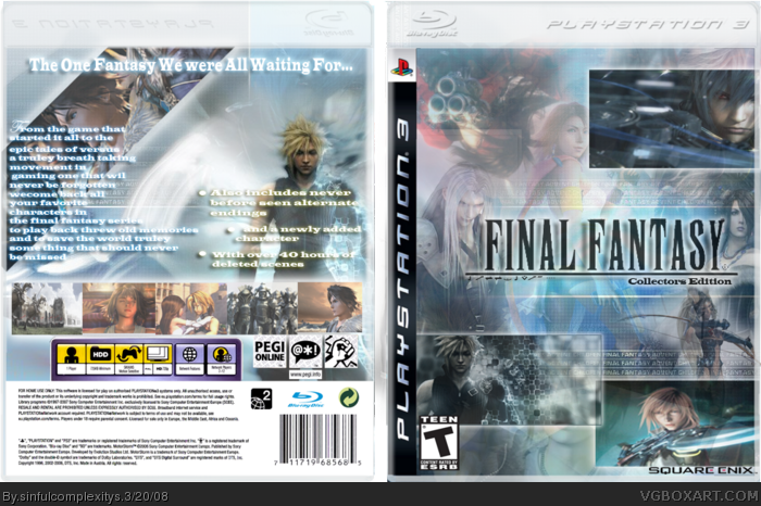
Okay, the box isnt the best, you need more better text that matches, you have 3 different fonts and colors. Also I think a better title would have been better. The temp is bad too. One last suggestion is you stretch out images, dont do it lol. Other than that, you are in the right direction, your boxes are getting better.
 Final Fantasy: Collector's Edition Box Cover Comments
my newiest box enjoy all comments and fav's welcome @(*.*)@
Edited at 1 decade ago
[ Reply ]
Not bad, like the idea alot. Well done =]
[ Reply ]
#2, well thanks wow i expected a little more then one comment and one fav for this box but mehh i geuss i can deal with it
[ Reply ]
Sometimes this happens, its happened to me alot this week. I guess its just off days for us ahhaa =] Chin up, this site is for fun.
Edited at 1 decade ago
[ Reply ]
This is very nice. But it has an NTSC front and a PAL back.
[ Reply ]
#5, o wow just noticed that will work on that right away
[ Reply ]
Okay, the box isnt the best, you need more better text that matches, you have 3 different fonts and colors. Also I think a better title would have been better. The temp is bad too. One last suggestion is you stretch out images, dont do it lol. Other than that, you are in the right direction, your boxes are getting better.
[ Reply ]
#7, well thanks for the help i will make sure to work on that @(*.*)@
[ Reply ]